Tuesday, March 31, 2015

Two-fer Tuesdays: Comfortable with Duplicity

A twice-monthly pairing of book covers that just seem to go together. Click on either of these images to open up an enlargement.


Temptresses tend to be pretty standard feature in espionage fiction, as these two look-alike paperback fronts appear to make clear. The cover on the left comes from the 1959 Corgi Books edition of Agent of the Devil. That novel was written by Hungarian-Austrian author-publisher János Békessy under his well-known pseudonym, Hans Habe. It was originally released in 1956 as Im Namen des Teufels (In the Name of the Devil), but was translated into English and first published in the UK two years later as Agent of the Devil. (I’ve also seen editions carry the title The Devil’s Agent.)

Sadly, the only write-up I could locate online about Agent of the Devil’s plot is this one from GoodReads, posted five years ago by a reviewer known as “Velvetink”:
Written in 1958, the New York Times hails Agent of the Devil as a “nerve-shattering spy classic.” Maybe in 1958 it shocked people. For 2010, it’s a bit ho hum. The author, Habe, was an intelligence officer during WWII for the U.S. Army in command of Psychological Warfare operations on the Italian front, and later a journalist, and he uses his knowledge of intelligence agencies a little too educationally here … [The book] is saved only by the character George Droste falling in love and his love for his adopted son.
Credit for the illustration showing a woman in red, reclining before a presumed spy, goes to James E. McConnell, a British book and magazine cover artist known for painting historical and Old West scenes, though he also branched out to create the covers for science-fiction novels. The terrific blog Pulp Covers: The Best of the Worst offers a small collection of McConnell’s book art here.

You will probably recognize the front of Legacy of a Spy (right) as the work of Robert McGinnis, whose talents I showcased on this page last October. Can it be a coincidence that this Crest Book cover, like McConnell’s for Agent of the Devil, comes from 1959?

Legacy of a Spy was the debut novel by Henry S. Maxfield (1923-2013). A World War II airplane navigator, who later became a Central Intelligence Agency employee during the Korean War and eventually established himself as a real-estate broker in New Hampshire, Maxfield earned some critical plaudits for Legacy of a Spy, including this brief assessment by Kirkus Reviews:
Bill Slater, known as Montague, the best agent in U.S. counterespionage, here becomes Bruce Carmichael, when he isn’t Slater, to hunt down those responsible for the disappearance of Webber in the Consulate in Zurich, who suspects Wyman of betraying information. Slater is tricked by the first move …; attacks the enemy spy net organizationally; evades an assassin; skis to safety. Brisk.
Furthermore, Legacy of a Spy was adapted by Hollywood in 1967 as The Double Man, an action flick set largely in the Austrian Alps, starring Yul Brynner and Brit Ekland. Maxfield went on to publish a second novel, Another Spring (1974), “about life in a small New Hampshire summer resort,” and followed that in 2007 with Justice Justice, about a newly elected U.S. president who, disappointed with the state of legal ethics, determines to appoint a non-lawyer, Bradford Justice, to the Supreme Court of the United States.

Can You See the Fear on Their Faces?

Check out Curtis Evans’ excellent collection, in The Passing Tramp, of 20th-century paperback cover art by Rudolph Belarski (1900-1983).

Monday, March 30, 2015

That’s What I Call Saucy


As odd as it may seem now, there was once--back in the 1960s, early ’70s--a fairly profitable market for paperback fiction about spouse swapping. A good number of those novels came from William Hamling’s Greenleaf Publishing, which owned imprints such as Nightstand Books, Leisure Books, and Companion Books. Now-prominent authors on the order of Lawrence Block, Ed McBain, Donald E. Westlake, and Harlan Ellison wrote for those imprints (under noms de plume, of course). But most of the cover artwork seemed to be executed by Robert Bonfils.

Born in Kansas City, Missouri, back in 1922, Bonfils later served a stint with the U.S. Army during World War II, studied at the Art Institute of Chicago, and eventually went to work in Chicago for the prestigious art agency of Stevens, Hall, Biondi creating illustrations for advertisements, magazines, record jackets, and children’s books. During the 1960s--the “swinging ’60s,” remember--he started working for the Greenleaf imprints, turning out as many as 50 cover illustrations a month, many of them decorating vintage sleazeworks such as Swap Now, Pay Later, The Swapping Urge, Swappers All, Make Her Swap, Acapulco Swap, and the distinctly non-Shakespearean The Swapping of the Shrew.

Bonfils’ artistry was generally far superior to the quality of the novels on which it featured (often uncredited), but his silliest, least appealing cover might have been for Spicy Meatball Swap, a 1971 Companion release credited to H.C. Hawkes (whose other titles included the literary classics For Couples Only and Threesomes, Foursomes, and Moresomes). Somehow it’s hard for me to imagine anybody looking at the cover of Spicy Meatball Swap on a newsstand--or, more likely, tucked onto a shelf in some poorly lighted back room of a bookstore--and thinking, Oh, yeah! I have to read that immediately! Or maybe after lunch ...

Tuesday, March 24, 2015

Once Around the Web, Please

Way back in 2010, Rebecca Kalin, the daughter of renowned artist Victor Kalin, launched an excellent Web site devoted primarily to her father’s numerous paperback illustrations. More recently, she’s created this second site, which features other examples of his work, including record covers and portraits of famous folk.

• Because I’ve occasionally showcased the covers of Ross Macdonald’s Lew Archer private-eye novels on this page, my eye was caught recently by this gallery of Macdonald’s works in the blog Fragments of Noir. It includes several examples of artist Mitchell Hooks’ beautiful Archer paperback fronts from the 1970s (The Far Side of the Dollar and The Underground Man, for instance). Damn! I was busy collecting Macdonald’s work back then; I could have--and should have--bought all of those Hooks editions, rather than a mere handful. But I reasoned that I didn’t need duplicates of works I already owned. What a fool I was!

• No matter how obscure the theme, it’s almost always possible to dig up vintage paperback covers to illustrate it. Consider this set, from Pulp International, of book fronts featuring men with women in their arms--only some of them conscious.

This could have been another choice along that line.

• And Andrew Nette, the Australian writer responsible for the blog Pulp Curry, has assembled this collection of covers from The World of Suzie Wong, a 1957 novel penned by Richard Mason and adapted three years later as a film starring William Holden and Nancy Kwan. I’m particularly fond of the 1963 Horwitz Publications edition he’s embedded at the top of his page, though this is a better representation of that book. (Look also at the link for another Suzie Wong cover, by James Avati, that Nette doesn’t mention.)

Tuesday, March 10, 2015

Two-fer Tuesdays: Neck and Neck

A twice-monthly pairing of book covers that just seem to go together. Click on either of these images to open up an enlargement.


It can be easy sometimes to understand why literary reductionists dismiss crime and mystery fiction as being merely about murder and mayhem. Certainly that’s the impression a person might be given, if the covers posted above were his or her only references.

On the left we have Yesterday’s Man, a 1965 release from Leisure Books, which by then had a history of publishing soft porn penned (pseudonymously) by the likes of Robert Silverberg, Lawrence Block, and others. This paperback novel, too, was by an author with a far better future: Ed McBain (aka Evan Hunter), who by ’65 had established himself as the man behind the 87th Precinct series of police procedurals. According to blogger Jerry House, during the 1960s and ’70s McBain delivered to Leisure “a book a month for a flat fee of $1,000.00 cash,” which he used “to finance some of his baser habits.” These works appeared under the byline “Dean Hudson.” As House observes, such soft-core fiction was “pretty mild; most of today’s women's romance books are more graphic. The formula was simple: any type of plot (logical or not) with sex scenes every so-many pages. Metaphors for sex and body parts were preferred, and no really bad words.” House suggests there were at least 74 “Dean Hudson” titles (Wikipedia puts the count at 93), some of which might actually have been composed by McBain’s writing students.

The front of Yesterday’s Man shows a young woman stripped down to her dainties, being strangled by a man at the edge of a lake--or maybe it’s a creek; or could it be an iceberg? (It’s damnably hard to tell!) The artwork was by Robert Bonfils, who began his illustration career in Chicago during the 1950s, and went on to create some of the most provocative and over-the-top paperback covers of the late 20th century. You can enjoy more of his artistry here.

A remarkably similar pose, equally violent, is struck by the couple on Night Extra, by William McGivern. That novel was originally published by Dodd, Mead in 1957, but the cover shown above is from the 1960 paperback edition of Night Extra, released by Fontana Books, an imprint of William Collins, Sons (now part of HarperCollins). The blog Mystery*File offers this plot synopsis of the tale:
A big city reporter (which McGivern was at one time) investigates the murder of a woman whose body was found in the house of a reform mayoral candidate. It soon becomes clear that the entrenched political machine has engineered a frame-up and appears likely to succeed in destroying a feared political opponent.

The novel is set in an unnamed East Coast city that suffers from pervasive corruption. Anyone who fights against the corruption places their job, if not their life, in jeopardy. Crusading reporter Sam Terrell spends much of the story trying to convince witnesses to come forward and tell what they know. He also must navigate through the city’s numerous layers of civic, political and bureaucratic corruption in order to find allies who might advance his investigation.
Credit for the illustration on this Fontana title goes to John L. Baker, a native of Birmingham, England, who was born in 1922 and went on to create fronts for a variety of Agatha Christie novels as well as other crime and thriller novels.

Tuesday, February 24, 2015

Two-fer Tuesdays: Have Lust, Will Travel

A twice-monthly pairing of book covers that just seem to go together. Click on either of these images to open up an enlargement.


There should be no question in your mind as to why I think these two paperback fronts go together. The artwork for both comes from George Gross (1909-2003), who produced hundreds of cover illustrations for U.S. pulp publications in the mid-20th century (such as Mystery Novels Magazine, Baseball Stories, and Detective Book Magazine), as well as for men’s adventure mags (Male, Cavalcade, Argosy, Man’s Illustrated, Saga, and True Adventures).

The Dubrovnik Massacre was published by Ace Books in 1981. It’s one of more than 250 entries in the popular Nick Carter-Killmaster spy-adventure series, released between 1964 and 1990. As Wikipedia explains, the title character “is an update of a pulp fiction private detective named Nick Carter [who first appeared] in 1886. … [Here he] serves as Agent N3 of AXE, a fictional spy agency for the United States government. The novels are similar to the literary James Bond novels--low on gadgets, high on action. Sexual encounters in particular are described in detail.” That male-enticing sex element is much in evidence in Gross’ illustration, the foreground of which shows a man and a woman in most amorous embrace, while the larger figure of an armed agent Carter looms in the background. Although these novels credit “Nick Carter” as star and author, they were actually penned by a wide variety of writers, among them Michael Avallone, Manning Lee Stokes, Craig Nova, Dennis Lynds, and Robert J. Randisi. The Dubrovnik Massacre was reportedly produced by Henry Rasof and Stephen Williamson.

At first glance, you might suppose the Dubrovnik version of Gross’ illustration came first, and that it was trimmed some to be used for Love Hunters (above, right). But you’d be wrong. In fact, Love Hunters was published by Softcover Library in 1966, a decade and half before the Nick Carter adventure reached print. The artwork on Love Hunters shows a young couple making out on a beach somewhere, both of them attired in bathing suits (rather than the underwear the pair seem to be wearing on The Dubrovnik Massacre), with a surfboard in the background. Again, sex is reflected in both the illustration and the cover lines (“The surfing crowd started early and loved fast--as if love were going out of style”).

Love Hunters carries the byline “Dean McCoy,” but that tale was actually written by Dudley Dean McGaughey, a Californian who, according to this short biography on the Mystery*File site, was born in 1906 (or perhaps 1909) and died in 1986. Quite prolific, he produced primarily crime and western fiction, using noms de plume such as Dean Owen, Dudley Dean, and Owen Dudley. However, “to make ends meet, one must assume, in the 1960s he turned to the genre of adult fiction, churning out a long list of ‘sleazy’ but non-explicit novels for Beacon under the name of Dean McCoy.” (Softcover was apparently an imprint of Beacon, one of the mid-20th-century’s most successful publishers of sexually oriented mass-market paperbacks). Love Hunters ranked among almost two dozen Dean McCoy novels, others carrying names such as No Empty Bed for Her (1962), The Love Pool (1964), Free-Loving Wives (1965), and Group Sex (1965).

Hmm. The Beacon/Softcover editors weren’t even remotely subtle with their book titles, were they?

READ MORE:Killmaster Art by George Gross,” by Christopher Mills (Atomic Pulp and Other Meltdowns).

Thursday, February 19, 2015

Looming Threats


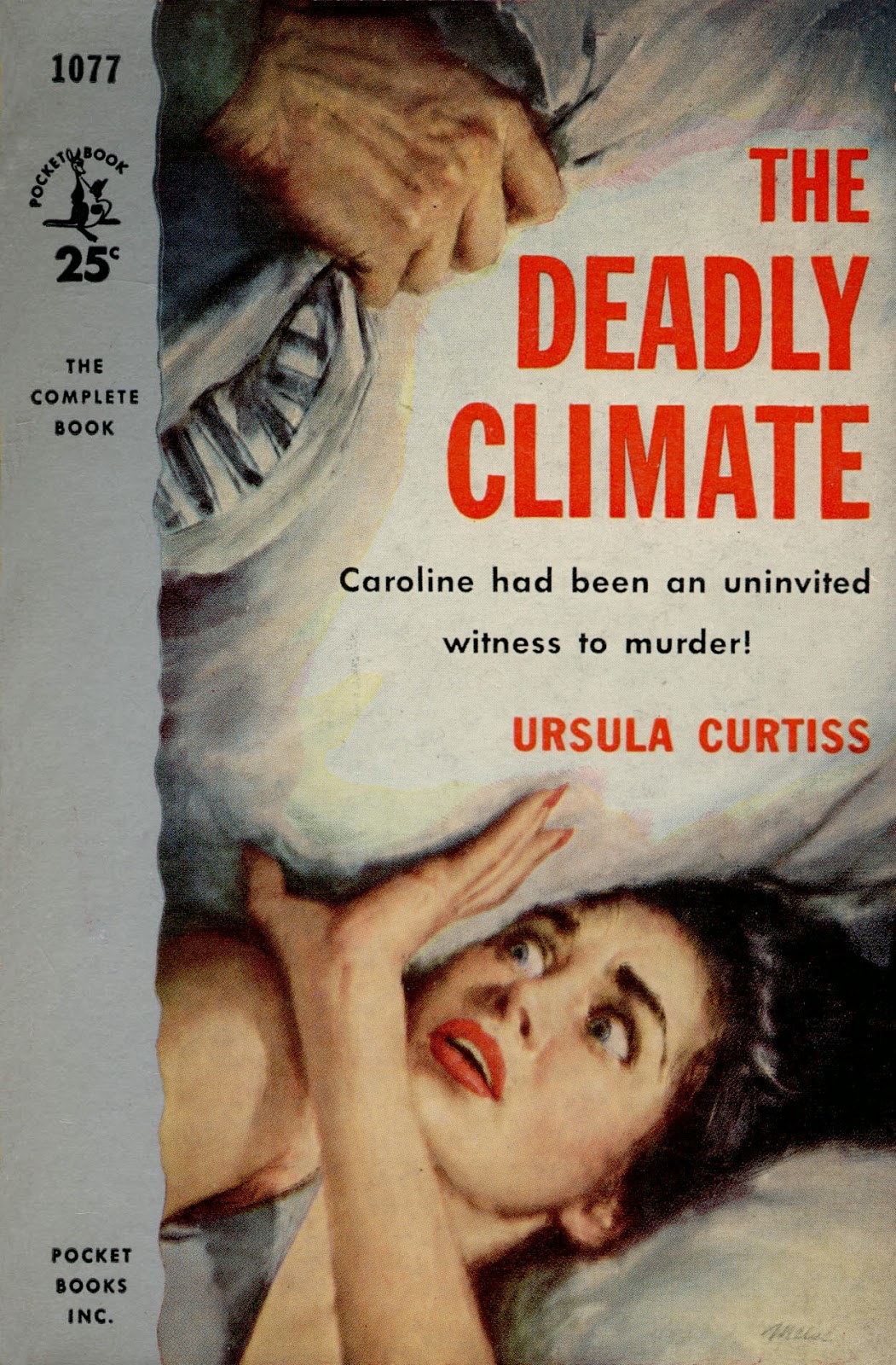
I was fairly unfamiliar with author Ursula Curtiss (1923-1984) until this year, but I’ve now showcased two of her novel fronts in the last two months. The first came from Out of the Dark (1964), which I incorporated into Killer Covers’ sixth-anniversary succession of posts last month. And now we have The Deadly Climate, carrying a dramatic illustration by James Meese and published in paperback by Pocket Books in 1955. It’s a work I thought of recently while reading about how Republicans in the U.S. Congress--often derided for being “at war with science”--sought, in quite farcical fashion, to acknowledge the existence of climate change, while simultaneously denying that human activity contributes to such dangerous environmental developments.

A daughter of Golden Age police procedural writer Helen Reilly, Curtiss penned almost two dozen mystery and suspense novels over her 36-year-long career. I believe The Deadly Climate was her fifth book, released originally by Dodd, Mead & Company in 1954. Writing about this novel last fall in Pretty Sinister Books, John Norris delivered the following synopsis of Curtiss’ tale:
Caroline Emmett has been sent to a rest home in Wicklow, Massachusetts, upon orders from her doctor. There she will recuperate from pneumonia and mental duress following her discovery of her husband’s dallying with a woman half his age. Walking in the countryside she finds to be more therapeutic than any treatment from her nurses and doctors at the rest home. One evening she takes a detour from her regular path and climbs up a hill. She witnesses the brutal beating of a woman at the hands of a bulky figure wearing a man’s raincoat. Or so she thinks. He shines his flashlight on her, leaving it there for several minutes, and Caroline flees. Bad weather--rain and wind--force her to seek shelter before she can return to her room. She manages to gain entry to the home of the Olivers, where she tells her story while they listen with a mixture of disbelief and curiosity. She’ll remain here for the next twelve hours while the killer in the raincoat tracks her down.

This is familiar territory, to be sure--the eyewitness to a crime who seems to have imagined everything. Of course no body is found where Caroline said she saw the attack. But don’t expect the story to fall into the trap of a well-worn formula and an obvious unfolding of events. Enter Carmichael, the editor and owner of the local newspaper, with a nose for news and a healthy dose of common sense. He is the only one who believes Caroline. With the permission of a lackadaisical and skeptical policeman named Trunz the newsman heads out to the crime site to do some real work. He quickly finds two sets of footprints in the mud and a woman’s patent leather shoe. Size 9. Something bad has happened he is sure. And he begins his dogged search for the woman with one shoe. Or her dead body.
Curtiss’ novel obviously has naught to do with ideology-driven right-wing efforts to separate the modern warming of Earth’s atmosphere from the deleterious behavior of big industries and other human endeavors. Yet when I look at that pillow being pressed down toward the woman’s face in Meese’s painting, I can’t help but imagine a time when our climate might similarly threaten all of humankind, unless short-sighted, science-eschewing politicians stop discounting the existence of environmental change and start trying to reduce its potentially disastrous effects.

FOLLOW-UP: It appears the James Meese cover art from The Deadly Climate was later used (though it was flopped) on the cover of the April 1961 edition of Mike Shayne Mystery Magazine.

READ MORE:Friday’s ‘Forgotten” Books—Voice Out of Darkness,” by B.V. Lawson (In Reference to Murder).

Tuesday, February 10, 2015

Two-fer Tuesdays: Curtains for Cuties

A twice-monthly pairing of book covers that just seem to go together. Click on either of these images to open up an enlargement.


Philadelphia-born and notably prolific reporter-turned-author Robert Leslie Bellem (1902-1968) is best known for having created hard-boiled Hollywood private eye Dan Turner. But as author-blogger James Reasoner explains in this post, The Window with the Sleeping Nude (Handi-Book, 1950) “isn’t a Dan Turner yarn.
The hero is store detective Barney Cunard, who’s in charge of security at the biggest department store in an unnamed town. Barney arrives at work one rainy, hung-over morning to find a nude blond female mannequin on his desk. He’s barely started trying to figure out how and why it got there when something else happens that has to be connected to this mystery. The body of one of the store’s window dressers is discovered in a bed in one of the store’s window displays, dressed only in lingerie and stabbed in the heart. Obviously, the killer replaced the mannequin with the corpse and left the mannequin on Cunard’s desk for some unfathomable reason.

But this is one of those novels where very little that seems obvious turns out to be true. The plot twists and turns with dizzying speed as all the action takes place in just a few hours. In that short period of time, there are several more murders and a kidnapping. Cunard gets hit on the head and knocked out, guzzles rye, runs around in the rain, and finally figures everything out from clues that Bellem cleverly plants along the way. Of course, as a veteran of the Spicy pulps, Bellem manages to find excuses for several of his female characters to wind up in various stages of undress. This novel reads very much like it could be an expansion of one of Bellem’s hundreds of pulp stories, but I don’t know if that’s the case or not.
The cover illustration on The Window with the Sleeping Nude is credited to Victor Olson (1927-2007), a graduate of New York City’s Art Career School, whose work I mentioned last fall on this page. Fortunately, when Pulpville Press--a reprint publisher of some note--brought this novel back into print in 2009, it did so with Olson’s original artwork intact.

I wish I had as much information to share about The Corpse in the Picture Window (Ace, 1961). But I don’t. I can tell you that the author, Bruce Cassiday (1920-2005), was born in Southern California and penned fiction in a variety of genres, ranging from spy and mystery to action-adventure. The Corpse in the Picture Window was issued as a “double novel,” the flipside of that volume being If Wishes Were Hearses, by J. Harvey Bond (né Russell R. Winterbotham). Who did the cover artwork is a mystery; one source suggests it might have been Ernest Chiriacka (aka Darcy), but I’m skeptical of that. If anyone knows the actual illustrator’s identity, please share it in the Comments section below.

Monday, February 9, 2015

Can I Trade Some Rain for Sunshine?


The renowned Mitchell Hooks painted covers for 18 Ross Macdonald novels during the 1970s, all of them Bantam paperback editions. I own a few of those, including Find a Victim, The Chill, and The Blue Hammer. However, I don’t have this 1977 Bantam release of The Way Some People Die, Macdonald’s third novel featuring Los Angeles private eye Lew Archer (originally published in 1951). Because the weather here in Seattle has been so dreary of late, this sunny Southern California cover just screamed out for my attention. It reminds me that summer is only five months away!

(To see another artist’s very different façade for The Way Some People Die, check out this first entry in Killer Covers’ sixth-anniversary series of posts.)

Babe and Bullets, Oh Boy!


Probably like most readers, I think of British author John Harvey in relation either to his long-running series about Nottingham police detective Charlie Resnick (Darkness, Darkness) or his trilogy of mysteries featuring retired Detective Inspector Frank Elder. However, the now 76-year-old, Dagger Award-winning Harvey penned a number of other books before he debuted those two series, four of which showcased American-style English gumshoe Scott Mitchell, touted as “the toughest private eye--and the best.”

The first of the Mitchell outings was Amphetamines and Pearls (1976), followed closely by The Geranium Kiss (1977), Junkyard Angel (1977), and Neon Madman (1977). All good titles, though I’ve never come across any of the actual books here in the States.  I did, though, recently happen onto the 1977 Sphere paperback front of Junkyard Angel. It’s a photographic façade, but a rather memorable one, combining ample imagery to draw the eyes of male readers. A well-kept cover of Junkyard Angel is shown above, while a front-and-back scan of a more used copy can be enjoyed below.


READ MORE:John Harvey Cover Gallery,” by Steve Holland
(Bear Alley).

Tuesday, January 27, 2015

Two-fer Tuesdays: Frozen Assets

A twice-monthly pairing of book covers that just seem to go together. Click on either of these images to open up an enlargement.


Because I live way out here in more temperate Seattle, I’m missing all the snowstorm woes currently being inflicted upon New England. But that doesn’t mean the cold has not been on my mind. In fact, my wife and I spent a good chunk of last night watching “Blizzard 2015” TV coverage, and I woke this morning with the desire to devote this week’s Two-fer Tuesday installment (the first since early December--my apologies) to the chillier side of mystery fiction.

Above and on the left, you’ll find the 1957 Signet New American Library paperback edition of The Flesh Was Cold (a book originally published in 1950 as The Angels Fell). This “medium-boiled detective thriller” was the 11th novel by Bruno Fischer (1908-1992), a Berlin-born sports reporter turned pulp-fictionist, who in the late 1930s ran as a Socialist candidate for the New York state senate. And though The Flesh Was Cold was not technically an entry in Fischer’s post-World War II series about New York City private investigator Ben Helm (who apparently doesn’t make a showing until the novel’s second half), it is often lumped in among those.

Credit for the illustration fronting this edition of The Flesh Is Cold belongs to the renowned Robert Maguire.

Now please direct your attention to the paperback façade opposite Maguire’s. I hadn’t intended to revisit the bulging portfolio of Robert McGinnis, after my month-long celebration of his creativity last October. However, this front from the 1962 Signet paperback issue of Carter Brown’s The Ice-Cold Nude, featuring series P.I. Danny Boyd, provides excellent proof of McGinnis’ many talents as a painter, not to mention his fondness for the female form. The painter later created another, different cover for the 1969 Signet edition of The Ice-Cold Nude, which you can enjoy here.

Two-Timers!

“Beacon Books was a [19]50s outfit that published a lot of low-end trash,” writes Gary Lovisi, “but what great trash!” Mick Sidge, from the blog Sleazy Digest Books!, makes that case again, in this new gallery of Beacon’s duplicate covers.

Click here to find more memorable Beacon fronts.

READ MORE:Digest Art Meets Star Books Australia!,” by Mick Sidge (Sleazy Digest Books).

Saturday, January 24, 2015

Six for Six: Triple Cross

Celebrating half a dozen years of Killer Covers postings.


Triple Cross, by John Roeburt (Belmont, 1962).
Also published as Murder in Manhattan and There Are Dead Men in Manhattan, this was the second novel in Roeburt’s trilogy of mysteries featuring J. Howard “Jigger” Moran, “a disbarred Illinois attorney and sometime cabbie who now cruises the streets of Manhattan at night, keeping an eye open for the main chance, when he's not shooting craps.”


Illustration by Robert Maguire. The image is reminiscent of another one credited to Maguire, which likewise shows a woman sharing an intimate moment ... while reaching for a man’s gun.

READ MORE:John Roeburt – Corpse on the Town,” by William F. Deeck (Mystery*File).

Friday, January 23, 2015

Six for Six: A Race of Rebels

Celebrating half a dozen years of Killer Covers postings.


A Race of Rebels, by Andrew Tully (Popular Library, 1961).
Illustration by Mitchell Hooks.

Thursday, January 22, 2015

Six for Six: Death on the Nile

Celebrating half a dozen years of Killer Covers postings.


Death on the Nile, by Agatha Christie (Fontana, 1960).
Illustration by Eileen Walton.

Wednesday, January 21, 2015

Six for Six: Out of the Dark

Celebrating half a dozen years of Killer Covers postings.


Out of the Dark, by Ursula Curtiss (Ace, 1964).
Illustration by Bob Schinella.

Tuesday, January 20, 2015

Six for Six: Yankee Pasha

Celebrating half a dozen years of Killer Covers postings.


Yankee Pasha, by Edison Marshall (Dell, 1959).
Illustration by Harry Schaare.

Monday, January 19, 2015

Six for Six: The Way Some People Die

On January 19, 2009--six years ago today--I acted rather impulsively and created a book-design blog, the one you’re reading now, Killer Covers. For some time before that, I had produced occasional posts about crime-novel fronts in The Rap Sheet. But such covers interested me enough to try building a blog focused specifically around them. Little did I know what I was getting into. Yes, there’s much to be said on the topic of book design, especially if one focuses, as I do, on vintage paperbacks. Too much, in fact. It’s sometimes been challenging to divide my efforts between Killer Covers and The Rap Sheet.

Nonetheless, the last half-dozen years have presented me with numerous welcome opportunities to collect obscure paperbacks from the past and share with you, my faithful readers, what knowledge I’ve gleaned regarding their cover artists. As a way of celebrating this latest anniversary, I shall spend the next six days showcasing novel fronts I discovered within the last twelvemonth. One cover per day through Saturday. The artists won’t all be new to regular readers of this blog, but I hope the works themselves will bring fresh delights to everybody.


First up: The Way Some People Die, by John Ross Macdonald (Pocket, 1961). Illustration by Charles Binger. California-born author Kenneth Millar (1915-1983) employed his real name when he started penning crime novels in the early 1940s, but subsequently adopted the pseudonym John Macdonald, which he hoped would prevent his works from being mistaken for those by his then better-known wife, Margaret Millar. Of course, this change only created confusion with his fellow wordsmith, John D. MacDonald, author of the Travis McGee adventures. Millar eventually altered his nom de plume to John Ross Macdonald, and later to Ross Macdonald. The Way Some People Die was his third novel starring Los Angeles private eye Lew Archer.

READ MORE:Ross Macdonald: The Way Some People Die,” by Peter (Postmodern Deconstruction Madhouse).

Playing the Links

Yeah, yeah, I know: Things have been pretty darn quiet on this page ever since Christmas Day. But hey, I was exhausted after putting together year-end wrap-ups for The Rap Sheet (see here, here, and here) as well as Kirkus Reviews (here and here), and I needed a break. I am back on the beat now, though, bringing you first some links to design-related stories elsewhere on the Web.

• I’ve written infrequently in the past about 1950s British “girlie” paperback cover artist Reginald Heade, both in The Rap Sheet and in Killer Covers. Those efforts pale in comparison, though, to the gallery Rob Baker has assembled for the blog Flashbak. As he explains,
Heade’s lurid covers adorned pulp paperbacks of authors such as Hank Janson, Roland Vane, Michael Storme, Paul Renin, Gene Ross and Spike Morelli. The artwork often pushed to the absolute limits of what was legally allowed for the time. Heade also worked in comics and drew “The Saga of the Red”, “The Captain from Castille”, “Sexton Blake versus the Astounding John Plague” and “Robin Hood” in Knock-Out (1949), and “The Sky Explorers” in Comet (1952-53).

After [World War II] Heade had moved to Barons Court in Westminster and this was where he died in 1957 aged just 56. There were no obituaries in the press and to this day not much is known about the English pulp-fiction cover artist.
Flashbak’s entertaining array of Heade works includes the fronts from such intriguingly titled books as White Slaves of New Orleans, Dame in My Bed, Plaything of Passion, and Me and My Goul.

• Fragments of Noir offers collections of covers by artist Lou Marchett (about whom you can learn more here) and those taken from the novels of James Ellroy.

• In his blog, Illustrated 007, Peter Lorenz showcases a new set of James Bond audiobook fronts from Audible UK (more on those here). He also presents a new interview with Brian Bysouth, who, he explains, “has created adverts, storyboards, covers and hundreds of iconic film posters in his 40-year career,” though “007 collectors probably know him best for his work on the posters for For Your Eyes Only, A View to Kill, and The Living Daylights.”

• If you’re interested in the history of paperbacks, check out this splendid piece by Louis Menand in a recent edition of The New Yorker, looking back at the history of those cheaper editions and how they “transformed the culture of reading.”

• Finally, the Classic Film and TV Café’s Rick29 has dug up some of the much-prized comic-book tie-ins to vintage American television programs, including The Wild Wild West and The Man from U.N.C.L.E. You can enjoy those right here.

Thursday, December 25, 2014

Have a Holly, Jolly Christmas!


Actually, whether you’re celebrating Christmas, Hanukkah, or Kwanzaa, those of us at Killer Covers wish you the very merriest holiday season! The magazine cover embedded above comes from the December 11, 1912, edition of Puck. (Hat tip to Print.)

Tuesday, December 9, 2014

Best Face Forward


Perhaps you haven’t noticed them yet, but The Rap Sheet’s 20 nominees for “best crime novel cover of 2014” were posted earlier today. You can take a cruise through the gallery here.

I spent the last 12 months gathering possible contenders for this annual competition. To those, I recently added suggestions from Rap Sheet readers, and then cut the list in half (a painful process, believe me). The finalists this year include book fronts produced on both sides of the Atlantic, boasting a wide variety of designs--from covers that emphasize creative uses of type to others on which moody photographs or illustrations are central. Although I have my favorites among the bunch, I think any of them is qualified to win.

But you be the final judge. Click here and choose as many covers as you think are deserving of praise. Voting will remain open until midnight on Sunday, December 21, after which the results will be tallied and announced in The Rap Sheet.

What are you waiting for? Cast your ballot now!

UPDATE: The top six winners of The Rap Sheet’s 2014 Best Crime Fiction Covers contest were announced on December 30.

Monday, December 8, 2014

Borrowed Beauty?


Twice over the last four months, the pop-culture blog Pulp International has exhibited paperback book fronts featuring the work of French illustrator James Hodges--first here, and now here. That second post collects 15 of Hodges’ Détective Pocket covers, most if not all of which were published during the 1960s. There’s no question that Hodges created eye-catching book façades, but three of those Pulp International showcases bear a rather startling resemblance to work that has appeared before on this page by other artists.

Above, for instance, you will see Hodges’ effort for Festival des Maccabees, which looks more than a little like the work Harry Bennett did for Alone at Night, a 1963 Gold Medal paperback by Vin Packer (aka Marijane Meaker). Below, Hodges’ cover from Razzia Sur le Drogue is compared with the 1960 Bantam edition of Ross Macdonald’s The Three Roads (which I once applauded here), while his art for Pieges a Loup is matched up with Mitchell Hooks’ front for The Long Saturday Night, by Charles Williams (Gold Medal, 1962). Far be it from me to suggest Hodges supplemented his imagination by cribbing from the work of American book-cover artists, but …

You can ogle more of Hodges’ artistry here.


Lehr’s Epic Eye

Yes, they’re decorating science-fiction yarns rather than crime novels, but Paul Lehr’s paintings are nicely highlighted in this post from Battered, Tattered, Yellowed & Creased. Another site, Melt, offers additional artwork by Lehr--“one of the greatest future-fantasist painters of the post-pulp era”--right here.

Tuesday, December 2, 2014

Two-fer Tuesdays: One-Two Punch

A twice-monthly pairing of book covers that just seem to go together. Click on either of these images to open up an enlargement.


People who ask too many questions have a habit of paying for their inquisitiveness with bruises and broken bones. Or worse. That seems especially true in crime and mystery fiction, where protagonists often sustain injuries far more numerous and serious than those of us in the real world might be willing to endure. Just consider these two covers as cautions against being too nosy in the presence of suspects or lawbreakers. Likewise the paperbacks showcased above.

The first novel façade under consideration--from the 1953 Dell Books edition of The Big Fist, by Clyde B. Ragsdale--was painted by Carl Bobertz (1899-1974), whose résumé also included fronts for paperbacks by Ellery Queen, Rex Stout, Helen Nielsen, Frank Kane, A.A. Fair (aka Erle Stanley Gardner), and others. (You can enjoy more of Bobertz’s covers here.) It provides a rather, uh, punchy introduction to a tale that a review in Ohio’s Toledo Blade said “exemplifies a novel written in the undergrowth of the jungle of American life in a chaotic era.” That critique, by Robert A. Brainerd, appeared in print on July 16, 1950, and goes on to explain that The Big Fist focuses around Hosy Whittle, a guy who follows his father’s simple philosophy (“A good pair of dukes is a man’s best friend. You can’t go wrong with a good fist to back you up.”) as he
stomps boldly and mercilessly through a life of murder and cruelty, against law and against men who become obstacles along the way to Easy Street. Easy Street is the dominating and propelling force of Hosy Whittle’s existence. … From an Oklahoma city, to the oil lands of Texas, to the cotton fields of Southern California, Hosy Whittle bootlegs in the days of the Volstead Act and lives the way of “the big fist.” His aliases are changes of name only.

The steel and muscle of the boom in a Texas oil town, uncertain and shadily flamboyant, provides Hosy Whittle with a setting that heightens the drama of his character. Those elements in other men that are similar to his own, he can understand. Battles are won for him by preying on the weaknesses of his opponents and forcing their like strengths into physical combat. … Hosy Whittle’s saga of big fists and Easy Street unwinds in the manner of the ballad, a ballad of rambling proportion, of many climaxes, of erratic pitch.

“The Big Fist” is the kind of novel a reader would expect of Clyde Ragsdale, once he is familiar with his background of riding freights and sleeping in grain fields through the boom and bust of the ’20s and ’30s.
Pulp International has more to say about the author’s history:
Ragsdale was editor of the Texas City Sun newspaper. He took a disliking to the gambling dens that had sprung up around Galveston County, because, in his view, tolerance for gambling would soon lead to prostitution, drugs, and worse. So he published editorials, had reporters write stories on the evils of gambling, publicly questioned the sheriff’s abilities, and even once led Texas Rangers to a hidden cache of 320 slot machines. To our knowledge, he was never beaten up in front of his girl like the unlucky fella on the cover of 1950’s The Big Fist, but he was targeted by threats serious enough to finally convince him to stick to writing.
Now let’s switch our focus to the second of today’s highlighted book fronts, from the 1960 Pocket edition of The Big Blackout, by Don Tracy (originally released in hardcover a year before that). An online biography of Tracy (1905-1976) explains that the author’s first novel, Round Trip (1934) “was an unblinking and unflattering look at a tough reporter, a drunkard whose vices leave him in the gutter more often than not,” but it was Tracy’s second work of fiction, Criss-Cross, that earned him special recognition--and even comparisons to James M. Cain. (Criss-Cross later became the basis of Burt Lancaster’s 1949 film noir of the same name.) August West, writing in Vintage Hardboiled Reads, offers these remarks about the plot of The Big Blackout, which he calls a “well-written and sharp” novel:
The story is about Johnny Thompson, who struggles to earn a decent buck during the 1930s Depression era. Right now he’s an ex-boxer with a flat nose working as an armored car delivery guard. His biggest problem is coming up with enough cash to take out the girl he is obsessed with, Anna. Anna loves money and the cushion[ed] life it brings. Johnny can’t compete with Slim, an acquaintance of his who has plenty of dough usually obtained by shady dealings. Anna ends up marrying Slim for his money, which tears the guts out of Johnny. But the trio continues a “friendly” relationship, and Slim takes a liking to Johnny. Eventually Anna and Johnny play around behind Slim’s back. Johnny knows he is being used by Anna, but he doesn’t care just as long he can spend time with her. Slim offers Johnny a chance to make some big money, by being the inside man in robbing a payroll carried by his delivery truck. Johnny takes the offer and it changes his life, and the lives of Anna and Slim, forever.
Credit for the artwork on this edition of The Big Blackout goes to Robert K. Abbett, whose efforts have been noted several times before on this page. Tracy’s yarn was adapted (very loosely) in 1960 as an episode of Thriller, Boris Karloff’s anthology TV series.

Don Tracy went on to compose a variety of other novels, including a nine-book series starring Giff Speer, “a master sergeant and undercover agent in the U.S. Army Military Police.” Among the Speer installments is the engagingly titled Naked She Died, which was featured in Killer Covers’ fifth-anniversary celebration.

Monday, December 1, 2014

Short Subjects

• It’s always interesting to see what different artists will do, when assigned to come up with covers for the same book. Here you’ll find three treatments for the front of Macamba, Lilla Van Saher’s novel (first published in 1949) about “a group of characters in Curaçao, and how one in particular struggles to deal with his biracial background as he grows to manhood.” Dance must be a chief feature of the book, because the illustrators all used it as a theme for their work.

• I have no memory of Del Rey Books’ three-volume cycle of Star Wars universe novels, published during the early 1980s and starring the character Lando Calrissian (played on-screen by Billy Dee Williams). Fortunately, Christopher Mills resurrects those paperbacks in Space: 1970. The cover paintings are by Williams Schmidt.

What a splendid novel façade by Harry Schaare!

This is beautiful horror-fiction artwork by Rowena Morrill.

• And Flavorwire collects two dozen covers from Jack London novels, all featuring wolves (with good reason, of course).

Sunday, November 30, 2014

This Seems Seasonally Appropriate


Murder for the Holidays, by Howard Rigsby (Pocket, 1952; originally published by William Morrow in 1951).
Illustration by George Mayers.

Tuesday, November 18, 2014

Two-fer Tuesdays: Lush Life

A twice-monthly pairing of book covers that just seem to go together. Click on either of these images to open up an enlargement.


I’ve long been a fan of paperback fronts created by Ron Lesser. The Web site for publisher Hard Case Crime offers the following brief biography of this artist: “In addition to painting covers for numerous paperback crime novels in the 1950s and ’60s, Ron Lesser is a successful and versatile historical artist and created Western movie art for High Plains Drifter, Paint Your Wagon, and The Way West, and the storyboards for the dream sequence in A Man Called Horse. The highly respected New York Art Directors Club, in existence since 1921, has twice honored Lesser for Best Movie Art of the Year and The Society of Illustrators, founded in 1901, has bestowed on him numerous Gold Medals for his paintings.” To date, his work for Hard Case has decorated Lester Dent’s Honey in His Mouth, Max Allan Collins’ Quarry in the Middle, and Jack Clark’s Nobody’s Angel. But over his career, he has created façades for paperback tales by Frank Kane, Erle Stanley Gardner, Jonathan Craig, Richard S. Prather, Harold Q. Masur, Thomas B. Dewey, John D. MacDonald, and others. You’ll find additional selections from his portfolio here.

And of course, the cover of The Love Lush (Pyramid, 1965)--shown above and on the left--was executed by Lesser, as well. It’s an eye-catching piece, featuring a shapely brunette whose deceptive languidness conceals a raw animal energy. (OK, I may be reading a bit much into that art, but I’ve been staring at it for quite a while now.) It’s easy to see why Lesser’s canvases are often mistaken for the work of Robert McGinnis: Both men paint their female subjects with a loving appreciation for intimate details.

The Love Lush first appeared in 1957 under the title Bachelors Anonymous. A 2011 review of the book in Pornokitsch calls it “a novel of two halves. Or, more accurately, it is two completely different novels wrapped in the same cover. The first half is the silly story of ‘Hearts Ahoy’--a group that’s less ‘therapy for sex addicts’ and more an underground guerrilla movement battling the feminist overlords. The second half, called ‘The Three Mr. Browns,’ is a thoroughly serious tale of international espionage. The two are connected by a minor character and the glue of the book’s spine.”

Although you would not recognize it immediately from the byline, author Vivian Connell was a male--“an Irish writer who wrote a number of novels and plays. The Chinese Room (1942) was his biggest popular success, selling over 3 million copies,” reports this page about the late 1960s film adaptation of that book. “It was reprinted a number of times in hardback and paperback. The New Republic (9 November 1942) review said, in part: ‘A curious novel about the private life of a British banker that functions on three levels: as a mystery, as a clinical study of the disintegration and reintegration of a marriage, and as a what-not shelf for the sexy and exotic.’” Kirkus Reviews called The Chinese Room “an uninhibited novel largely about sex, which wanders now and again into perversion, psychiatry, and Oriental eccentricities. The publishers claim affinity with D.H. Lawrence, which might be recognizable only in the very obviously exerted efforts of the characters to find physical passion.”

Connell had previously penned A Man of Parts (1950) and Monte Carlo Mission (1954), the latter of which won him plaudits here as a “master of the sophisticated suspense novel. … Meet Corinna Lang, a goddess of the movies, who was bored with mammoth swimming pools, small MG’s, fat directors, and slim leading men. Bored with the whole great golden illusion of Hollywood, this smart cookie decides a mere vacation in Monte Carlo would be just too tame. She’s looking for adventure, and has the right amount of moxie and courage to take advantage of it when she finds it! Take a journey with this enchanting heroine to the wicked, extravagant Riviera where the golden Corinna, undertaker of a top-secret mission, lives in the shadow of international intrigue, and matches her quick wit with the most dangerous men in Europe.” That sort of yarn sounds a lot more up my alley than The Love Lush, but I still adore Lesser’s cover for the former release.

So let’s move over this week’s second paperback cover, from The Lady Is a Lush, by novelist Orrie Hitt--“the shabby Shakespeare of Vintage Sleazecore.” That novel was published by Beacon in 1960, and this review calls it “a dark one, a very good one.” I’ll leave it to you to read the entire critique, but I do want to quote the last, summarizing paragraph: “Love does not exist in an Orrie Hitt universe. People pretend at love, through the haze of booze and fornication and poverty. ‘Poverty and sex went hand in hand on the South Side’ is one line, and that seems to sum it all up in this bleak but great little lost novel of a lost American literature.” If you’d like to read more, note that in 2012 The Lady Is a Lush was made available in e-book format by Prologue Books. Unfortunately, the “teen romance” cover of that edition pales by comparison to the original, the artwork for which was reportedly unsigned.

Asian Archetypes to Amorous Attractions

Yes, yes, I know: I frequently draw attention to book jackets I’ve spotted in Pulp International. But that’s only because the people who keep that blog up and running (whoever they are--they don’t seem to identify themselves on the site) have such terrific taste. Which means, of course, that their taste is similar to mine.

The latest three posts of note in Pulp International are this one, showcasing “Asian-styled mid-century paperback fronts”; this other one, which focuses on “yet another subset of post-pulp literature”--the hot-rod or racing novel; and a third, looking back at 1970s soft-cover works that boast photographs of British actress-model Gillian Duxbury.

You can thank me later.

Friday, November 14, 2014

Illustrating the “Ultimate Reckoning”


Above is the latest book jacket credited to British artist Matt Taylor, whose illustration for the 2011 Penguin paperback reprint of John le Carré’s Tinker, Tailor, Soldier, Spy won that edition top honors in The Rap Sheet’s 2012 Best Crime Novel Cover contest. Haunting, moody, with lovely color contrasts and nice fade-away details at the bottom of the image, this front for the UK version of David Bezmozgis’ The Betrayers (Viking) is even more captivating in relation to Little, Brown’s considerably less inspired U.S. release of Bezmozgis’ novel.

Here’s what Amazon says about the book’s plot:
These incandescent pages give us one fraught, momentous day in the life of Baruch Kotler, a Soviet Jewish dissident who now finds himself a disgraced Israeli politician. When he refuses to back down from a contrary but principled stand regarding the settlements in the West Bank, his political opponents expose his affair with a mistress decades his junior, and the besieged couple escapes to Yalta, the faded Crimean resort of Kotler's youth. There, shockingly, Kotler comes face-to-face with the former friend whose denunciation sent him to the Gulag almost forty years earlier.

In a whirling twenty-four hours, Kotler must face the ultimate reckoning, both with those who have betrayed him and with those whom he has betrayed, including a teenage daughter, a son facing his own moral dilemma in the Israeli army, and the wife who once campaigned to secure his freedom and stood by him through so much.

Stubborn, wry, and self-knowing, Baruch Kotler is one of the great creations of contemporary fiction. An aging man grasping for a final passion, he is drawn inexorably into a crucible that is both personal and biblical in scope.
I haven’t read Bezmozgis’ The Betrayers (which should not be confused with Donald Hamilton’s 1966 thriller of the same name), but Amazon’s write-up doesn’t make it sound like a crime or mystery novel. Which is too bad, because Taylor’s cover (with type design and art direction by Richard Bravery) might otherwise earn this work a place among the rivals for the 2014 Best Crime Novel Cover competition. Perhaps further investigation is needed.

Tuesday, November 4, 2014

Two-fer Tuesdays: Counterculture Combo

A twice-monthly pairing of book covers that just seem to go together. Click on either of these images to open up an enlargement.


I seem to have read a great deal about the 1960s lately, between novels such as John Lawton’s Sweet Sunday and Walter Mosley’s Rose Gold, and Frank Rich’s essay in New York magazine about the troubled year, 1964. So it’s no surprise that my eyes were caught recently by a couple of cover images in my collection that remind me of that era of pot smoking and love-ins and anti-war protests.

First up is The Hippy Cult Murders (MacFadden-Bartell, 1970), by Ray Stanley. Evidently inspired by the twisted tale of Charles Manson, this is more a horror novel than anything else. A blog called The Mighty Blowhole (no, I didn’t make that up) describes its plot this way:
Pure Manson-sploitation in which a charismatic hippie named Waco gets a vision that fear is the greatest power, and the god of fear is Zember. Along with his friend Whitey he plans to gather a family of hippies and impregnate a “pure” girl with the son of Zember. They head off to L.A. where Waco brains a couple of girls with a meat-tenderizing hammer that Zember compelled him to buy, then he carves Z’s on their bodies … Waco slowly starts gathering a group together, targeting homeless teens (mostly girls, who all become group sex objects) and it gets too large to keep living in his bus and tent, so he decides he needs to rent some land. He finances this by murdering some wealthy couples during a wife-swapping orgy, raping and terrorizing them before stabbing them all to death. It all gets to be too much for Whitey, who also resents playing second fiddle to Waco all the time and thinks the “Zember” business is bullshit, so he starts causing trouble. Whitey’s disposition only gets worse when Waco cuts one of his fingers off and gangrene sets in. As cops follow the really sloppy trail Waco’s leaving (he’s too crazy to have much sense about covering his tracks and even does his crimes in a VW bus with flowers painted all over it), Waco’s planning an orgy where he’ll marry a young girl who’s “pure” enough … but Whitey’s fed up and planning to spoil things. There’s plenty of sex, violence, drugs, and weirdness, and it’s lurid enough not to be disappointing even though it’s still pretty restrained and not nearly as graphic as it could have been. The writing is solid, matter-of-fact stuff without a lot of flash to the style but plenty of detail, and it keeps the story compelling. It’s a very hard-to-find book I wouldn’t say it’s worth the crazy prices people are asking for it now (nothing is), but if you find an affordable copy then it’s well-worth the read.
Hmm. I don’t know. I’m still not sold on Stanley’s mass-market paperback, especially after reading this other review that says “The Hippy Cult Murders is not a particularly remarkable or memorable piece of work. It has enough cheap visceral thrills peppered throughout to at least keep you turning the pages, but you also get the feeling that the author (about whom nothing is known) is afraid to get his hands really dirty and take full advantage of all the potential he had at his fingertips.” The same critique notes, though, that the cover art--executed by somebody identified as “O’Brien”--“is a great piece of psychedelic sexual violence.” No question there.

Is it pure coincidence that “O’Brien” is also the last name of the author responsible for our next book? Tom O’Brien, that is. And the novel is Hippie Harlot (Cougar, 1967). I haven’t found much information about this “adults only” yarn, but this page says the story involves a guy named Jim, who has “just been released from the army and returns to his hometown of Patterson, New Jersey, to loaf around while he sets out on his (rather poorly realized) dream of being a writer.
Jim gets to make [passionate love with] a lot of broads before a couple of his friends die, in what passes for a plot in this pretty aimless tale. … There’s no real hippie theme in this book, other than the general desire of the central characters to write bad poetry rather than have to go to work. In fact it’s more of a beat-exploitation novel with its numerous references to hard drinking and hints of socialism. The novel ends with Jim declaring true love for his English-schoolteacher squeeze. Could we get a squarer ending? Bah, give me druggie housewives over this rubbish.
The story may be rubbish, but the cover--featuring a shapely guitar-strumming flower child--is a classic, having been reproduced on posters and refrigerator magnets. This book’s clever and altogether cute backside is no less remarkable. Unfortunately, I don’t see the artist’s name available online. For all I know, it’s “O’Brien,” too.