Showing posts with label Obits. Show all posts

Friday, April 4, 2025

Never to Be Matched: McGinnis Is Gone

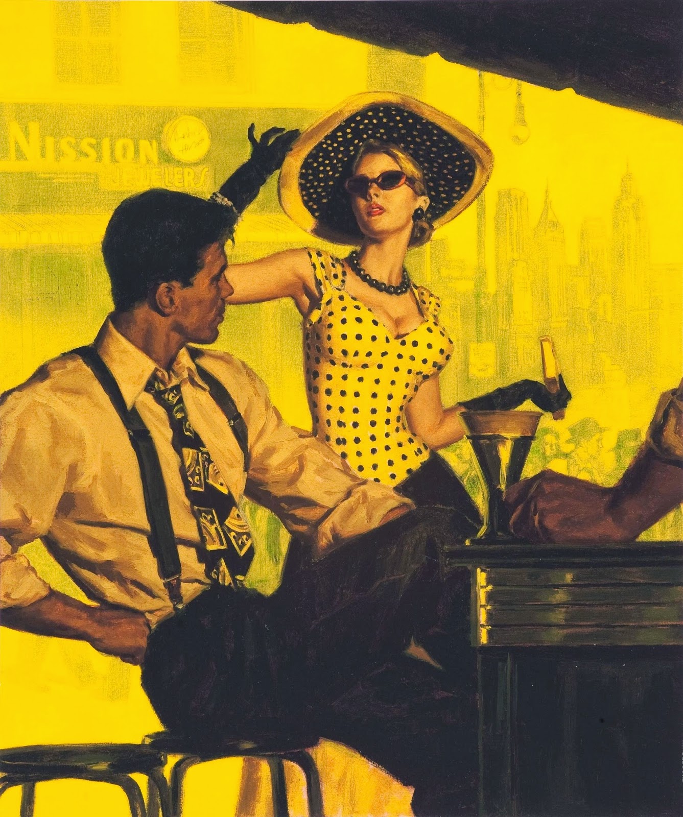
(Above) The Case of the Duplicate Daughter, by Erle Stanley Gardner (Pocket, 1962). Cover illustration by Robert McGinnis.


Art Scott, co-author of the gorgeous 2014 book The Art of Robert E. McGinnis, brought me the sad news today that McGinnis—who became famous by painting covers for paperback books and posters for Hollywood films—died in Old Greenwich, Connecticut, on March 10. That was just a month after I posted on this page my latest tribute to him, tied to his 99th birthday.

Here is an excerpt from McGinnis’ obituary, written by two of his children and posted at the online memorial site Legacy.com:
Bob was one of the most prolific illustrators of the 20th century. It’s likely you have seen one or more of his artwork images somewhere. They appeared in magazines such as The Saturday Evening Post, National Geographic, Good Housekeeping, McCall’s, Reader’s Digest and Guideposts; on very many book covers (especially paperback books, spanning many genres, from Detective to Mystery to Gothic to Historical Fiction to Romance to Fantasy); in the form of personal-project paintings that included many Old West scenes; and also on movie posters for culturally significant movies (and also on soundtrack album covers). In our biased opinion, Bob was the very best of the James Bond/007 artists, having created exciting images for the posters for movies such as Thunderball, You Only Live Twice, Diamonds Are Forever, Casino Royale (parody movie), and Live and Let Die. In 1993, Bob was inducted into the Society of Illustrators Hall of Fame. This was a tremendous honor for Bob. He said he had to have three drinks before walking up to the podium to deliver his acceptance speech; he was a shy and unpretentious person.

Born in Cincinnati on February 3, 1926, Bob never allowed the limited vision in one of his eyes to slow him down: playing as number 74, left tackle, on the Ohio State University undefeated team of 1944, working as a teenage apprentice at Walt Disney Studios (he met Walt), and serving on boats in the Merchant Marines right before WWII ended. He was a man’s man. Among other things, he loved fishing with friends and his son, socializing with other artists and cartoonists and writers (he was friends with some of the top illustrators and gallery artists of his generation), and playing poker with a group of friends. He reveled in being surrounded by nature, whether it was as a kid roaming the fields of his grandparents’ farm in Oxford, Ohio, or later paddling a canoe on Ahmic Lake in Ontario, or fishing amid the Catskill Mountains, or jogging around Tod’s Point with his dog, Nellie.

Much is written about Bob, in books and magazines and online, regarding his massive talent and output. He was an active, competitive and innately hard-working person, and, most of all, he loved to draw and paint. His drive to succeed and his endurance at the easel enabled him to leave behind a body of work that will never be matched. …

Remember Bob the next time Ohio State beats Michigan in football. Or when you see the
Breakfast at Tiffany’s movie poster image of Audrey Hepburn with a cat perched on her shoulder. Our father created that!
This is so sad. I was hoping Robert McGinnis would be around to celebrate the centenary of his birth next February. That is not to be. Fortunately, he left behind a profusion of outstanding artworks, some more of which I am likely to post here soon. Stay tuned.

READ MORE:Robert McGinnis (1926-2025),” by Matthew Field (MI6).

Thursday, February 6, 2025

Raging Beasts and Riveting Busts

Mort Künstler, the Brooklyn, New York-born artist best known for painting paperback book covers, illustrations for men’s magazines, and depictions of historical events, died on February 2 at age 97. The newspaper Newsday recalls that as a young man, Künstler
was a member of four college teams. He even received an athletic scholarship to attend UCLA after three years at Brooklyn College but had to leave in his first semester when his father had a heart attack. After returning to Brooklyn, he studied art at Pratt Institute, where his backup career choice as an illustrator and fine artist took root.

Künstler would go on to paint about 4,000 magazine covers, movie ads and canvases for NASA, the U.S. Postal Service (a depiction of Black soldiers in the Indian Wars in 1994), institutions and private collectors. His paintings are in the permanent collection of more than 50 museums and his work has been featured in more than 20 books. He was the subject of an A&E documentary in 1993.

His specialty was images of the Civil War, and historians and art critics considered him the premier historical artist in the country—one known for his detailed research and accurate depictions of scenes from Colonial times through the Space Age.

In 2006, M. Stephen Doherty, editor of
American Artist magazine, wrote, “Künstler is now known as America’s foremost historical artist” and since the late 1970s “has been recognized as a distinguished fine artist.”
Like probably most readers of this blog, though, I am more familiar with Künstler’s year’s working for periodicals and book publishers.

(Above) Two examples of Mort Künstler’s work for men’s magazines. Top: From Stag, May 1972, art by Kunstler as “Emmett Kaye.” Bottom: Male, February 1965. (Hat tip to Robert Deis)


A biographical sketch at his Web site says that, after apprenticing with elder artist George Gross, Künstler started out in the early 1950s seeking employment as an advertising illustrator—just as ad agencies were “increasingly moving towards television rather than print media. This loss of revenue caused magazines to fail or merge, as more illustration work was being replaced by color photography.
However, Mort worked hard and thrived in this competitive environment. By the mid-1950s he had become a skilled working artist receiving jobs from many of the most prominent and popular publishers of the day. Book publisher Dodd, Mead & Company, and magazines such as The Saturday Evening Post, Classics Illustrated, Sports Afield, Boys’ Life, Outdoor Life, and Magazine Management’s Men’s Adventure, Male, and True Magazine regularly published his work for covers and interior illustrations. They liked his dynamic illustrations, which focused on themes of man’s encounters with nature, criminals and mobsters, damsels in distress, espionage, and military conflicts. They were gripping, rich in detail and immensely popular.

Mort completed at least three cover illustrations and two inside illustrations every month for one publisher, Magazine Management Company, alone. It’s the main reason he used pen names such as Martin Kay and Emmett Kaye: the editors didn’t want it to look like one person was doing all of the magazines’ illustrations.
If you would like to revisit Künstler’s book and magazine art, both Flickr and Pulp Covers host excellent examples of that work. Or take a rewarding spin through the blog he wrote for 15 years.

His Web site notes that during the 1970s, Künstler began receiving assignments from mainstream magazines such as Newsweek and Good Housekeeping. It was during that same period that he started painting movie posters (for The Poseidon Adventure, for instance). In 1979, he was hired by NASA as official artist for the Space Shuttle Columbia, and three years later, Künstler was commissioned to create artwork for the CBS-TV mini-series The Blue and the Gray. That convinced him to concentrate on imagery from the American Civil War and U.S. history. Samples of his work in that field can be enjoyed at this link.

Mort Künstler was an exceptional artist, who could capture drama, danger, and the delicacy of a beautiful woman in the stroke of a brush. He will be sorely missed, but his work lives on and will likely continue to earn new fans well into the future.

Thursday, January 23, 2025

A Cartoonist’s Existential Crisis


Jules Feiffer, the Pulitzer Prize-winning American cartoonist and author, passed away last week at age 95. Cause of death: congestive heart failure. “[He] left an abundant legacy across a range of artistic media,” Etelka Lehoczky recalls in an obituary for National Public Radio. “The history of graphic art, literature, film and the theater bear the imprint of his ever-distinctive, ever-wayward pen.”

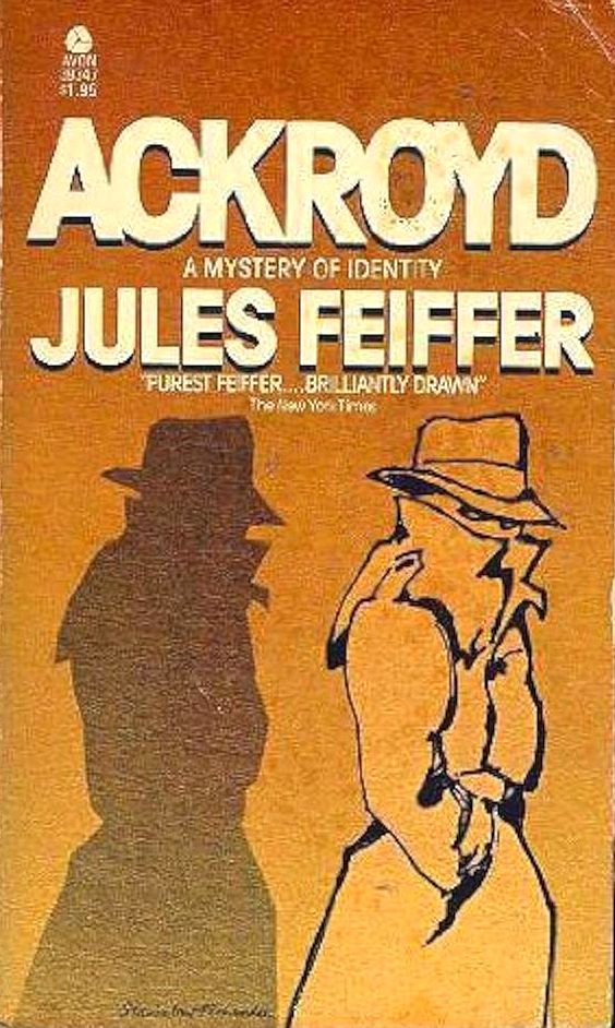
But Feiffer is most familiar to the most people for his artwork, whether it be his satirical cartoons, his comic strips, or his illustrations, many of them reprinted in books, such as 1958’s Sick, Sick, Sick: A Guide to Non-Confident Living. In addition, however, he left behind two novels: 1963’s Harry the Rat with Women and 1977’s Ackroyd, the latter of which is subtitled “A Mystery of Identity.” On The Thrilling Detective Web Site, Kevin Burton Smith calls it
a rather strange book, taking the form of the diary of Robert Hollister, a neurotic young man who has decided to become a private eye named Roger Ackroyd (a tip of the fedora to Agatha Christie’s classic The Murder of Roger Ackroyd) by posting an ad in the Saturday Review. But Robert/Roger becomes obsessed with one of his very first clients, Oscar “Rags” Plante, a newspaper sports columnist/novelist and his wife Annabelle, whose parakeet has gone missing.

The case? Investigate the bad case of writer’s block that Rags claims he’s suffering from.
Smith explains that this book “covers several years of Robert/Roger’s (and Oscar’s) life, and as their characters slowly merge, we’re treated to a sort of blurry (but often amusing) existential crisis.”

I read Ackroyd decades ago, and still have the 1978 Avon paperback edition featured above, though I can’t seem to lay my hands on it just now. When I started writing this post, I logically assumed that Ackroyd’s cover must have been painted by Feiffer; he did, after all, create the fronts for other books (Norton Juster’s The Phantom Toolbooth being a prime example). Yet that was incorrect. There’s a signature at the bottom of the illustration, and it clearly reads “Stanislaw Fernandes.” Fernandes is an artist, born in 1945, who I know best for his science-fiction and fantasy covers.

(Above) Stanislaw Fernandes’ signature on Ackroyd.


Never in a million years would I have guessed that Feiffer’s “funny, but not funny enough” novel (to quote Smith again) would have shared a cover artist with classics by Arthur C. Clarke, Stanislaw Lem, and Michael Moorcock. The world never ceases to surprise.

LISTEN UP:Remembering Pulitzer Prize-winning Cartoonist Jules Feiffer” (National Public Radio’s Fresh Air).

Friday, November 17, 2023

A Tale of Paperbacks and Predators

(Above) Assignment—Moon Girl, by Edward S. Aarons (Fawcett Gold Medal, 1972), part of his Sam Durell espionage series.


Roger Kastel, who created the artwork for two of Hollywood’s iconic film posters and painted a variety of collectible paperback book covers, passed away on November 8. He was 92 years old.

In its obituary, Deadline recalls that
Kastel’s best-known work included imagery central to the posters for Jaws and The Empire Strikes Back. He also illustrated vivid book covers for the likes of John Steinbeck’s East of Eden, Jackie Collins’ Hollywood Wives and H.G Wells’ The Invisible Man.

His
Jaws illustration was originally created for Peter Benchley’s novel on which the film was based. Describing the process of its creation, Kastel remembered, “I did a very rough sketch, and [the publisher] said, ‘That’s great, just make the shark realistic and bigger. Make him very much bigger!'”

It worked. Benchley’s book was a bestseller and Universal [Pictures] execs, knowing a good thing when they saw it, used Kastel’s art in the movie poster.
Born in White Plains, New York, on June 11, 1931, he went on to graduate from White Plains High School, attend the distinguished Art Students League in New York City, and then serve for four years with the U.S. Navy during the Korean War. His Web site says Kastel had begun drawing cartoons in his teens, but finally “sold his first [paperback cover] illustration in the early 1960s and illustrated paperback book covers and movie posters over the next forty years.” It’s said that during his career, Kastel produced more than 1,000 illustrations for the major book publishers in New York.

But it was his ominous painting for the front of the 1975 Bantam Books paperback reprint of Jaws that earned him international acclaim. When Universal reused that illustration on its movie placard, it reportedly marked “the first time that a poster image became a merchandising product in itself.” The Jaws gig also scored Kastel the commission to create the publicity poster for George Lucas’ 1980 Star Wars sequel, The Empire Strikes Back (a creation he based on classic Gone with the Wind artwork). In addition, says The Hollywood Reporter, Kastel “came up with the posters for such other films as Doctor Faustus (1967), starring Richard Burton and Elizabeth Taylor, and The Great Train Robbery (1978), starring Sean Connery.”

Roger Karl Kastel was a long-standing member of the Society of Illustrators, and his talents were recognized in books such as 200 Years of American Illustration, by Henry Clarence Pitz (1977), and The Illustrator in America: 1860-2000, by Walt Reed (2001). He died of kidney and heart failure at a hospice facility in Massachusetts, leaving behind his wife of 66 years, the former Grace Trowbridge.

I showcased a number of Kastel’s book covers in a piece I wrote some years ago about the 40th anniversary of Jaws’ big-screen debut. But another one (Assignment—Moon Girl) is to be found atop this post, and below are two more I happened across more recently: The Skeleton Coast Contract, by Philip Atlee (Gold Medal, 1968), and A Woman Called Fancy, by Frank Yerby (Pocket, 1966).


You should also enjoy reading this interview Michael Stradford conducted with Kastel while he was researching his 2021 book, Steve Holland: The World's Greatest Illustration Art Model.

Friday, April 29, 2022

Bouquets for Bama: A Preview


(Above) The Midas Man, by Kenneth Robeson (Bantam, 1960), featuring artist’s model Steve Holland.


Following artist James Bama’s demise on April 24—just four days short of what would have been his 96th birthday—tributes to his work and longevity flooded the blogosphere and social media outlets.

“James Bama enjoyed several memorable careers as an illustrator, but [he] was arguably best known for his 60+ paintings of Bantam’s paperback series revival of Doc Savage, featuring his good friend, model Steve Holland as his subject,” recalled Michael Stradford, a director of Creative Content for Warner Home Entertainment and the author of last year’s beautiful release, Steve Holland: The World’s Greatest Illustration Art Model (Primedia).

“While there are dozens, maybe scores, of authors who have influenced me, I think there are only a handful of artists who made me who I am today,” added prolific fictionist James Reasoner. “James Bama was certainly one of them. My discovery of the Doc Savage series really made me aware of the pulps for the first time and started my on-going love affair with them.”

(Right) Bantam’s The Man of Bronze (1964), with cover art by James Bama.

“His vision of Doc Savage was a huge part of my childhood (and ongoing) obsession with the character,” wrote novelist Win Scott Eckert. “While I understand that [Walter M.] Baumhofer’s portrayal of Doc on the original 1930s pulp magazine covers may be more accurate, when I read Doc novels, I see Bama’s version in my mind’s eye. I can’t help it.”

Such praise didn’t come unearned.

The story goes that James Elliott Bama was born on April 28, 1926, in Washington Heights, then a booming middle-class neighborhood of New York City’s Manhattan borough. He demonstrated an early interest in and aptitude for artistic pursuits, honing his talents by copying the comic strips of Alex Raymond (Flash Gordon) and Hal Foster (Tarzan). “I was four months shy of eight years old when Flash Gordon came out in 1934 and I kept copies of that comic strip for 10 years, until I was 18,” Bama told the blog MensPulpMags.com in 2014. “I’d go to the candy store every Sunday and wait for the newspaper truck to come. I must have known how good he would be. Alex Raymond grew and grew and grew as an artist. He was incredible, and he was my first hero. I loved Hal Foster’s comic strips, too. In fact, I originally wanted to be a cartoonist.”

“As a teenager,” recalls an obituary, Bama “attended the Fiorello LaGuardia High School of Music and Art. His father died suddenly when Jim was fourteen, and since his mother had become an invalid after a stroke, he had to work after school and do the housecleaning.” The United States entered World War II in 1941, when Bama was only 15. He had to wait three more years, until 1944, to enlist in the Army Air Corps, “and was trained as a navigator and stationed in several southern states. The war ended before he would have gone overseas, but he still qualified for the G.I. Bill, and thus was able to go to the Art Students League, where he studied under the illustrator Frank J. Reilly.”

Once done with art school, Bama began soliciting commissions for illustrations, including assignments from paperback book publishers. His first cover art was for the 1949 Avon release A Bullet for Billy the Kid, by Nelson Nye—the project that introduced him to Steve Holland, a TV actor and model whose image would later grace myriad Bama covers. In 1951 the artist started a 15-year stint with New York’s Charles E. Cooper Studios, described in the book History of Illustration (2019) as “a renowned agency specializing in glamour illustration for advertising and women’s magazines … The illustrators received 50 percent of each advertising commission secured by the company’s account executives.” Wikipedia explains that “Bama had a 22-year career as a successful commercial artist, producing paperback book covers, movie posters and illustrations for such publications as Argosy, The Saturday Evening Post and Reader's Digest, and his numerous clients included the New York Giants football team, the Baseball and Football Halls of Fame and the U.S. Air Force.” He also created illustrations for such men’s adventure magazines as Stag, For Men Only, and Male.

Bama’s reputation as a hyper-realistic painter helped win him the commission, in the early 1960s, to provide cover art for a brand-new softback line of Doc Savage editions issued by Bantam Books. The hero protagonist of those pulpy tales (real name Clark Savage Jr.) was a scientist, doctor, martial artist, inventor, and “master of disguise” who “rights wrongs and punishes evildoers.” He was initially introduced in the March 1933 edition of Doc Savage Magazine, a Street & Smith periodical. Doc’s developers were publisher Henry W. Ralston and editor John L. Nanovic, but his printed escapades were credited to “Kenneth Robeson,” a house pen name behind which hid a melange of scribblers, most notably Lester Dent, who was involved with the series through 1949.

In 1964, Bantam purchased rights to the Doc Savage yarns and the company’s art director, Len Leone, hired Bama to portray their lead character—now sporting a distinctive widow’s peark—on a fresh line of releases. Bama, in turn, recruited Steve Holland as his cover model. He eventually “painted 62 of the first 67 covers with mind–blowing vigor and meticulousness,” says ThePulp.Net. “Every one of those covers is a miniature masterpiece to be marveled at.”

Between doing Doc Savage fronts, Bama fit in his work for other American paperback publishers. His burgeoning portfolio soon included paintings for mystery, romance, western, and historical novels, as well as non-fiction titles. Authors as diverse as James M. Cain, Stewart Sterling, Louis L’Amour, Mary Shelley, James Jones, Philip Roth, Joan Didion, Gustave Flaubert, and William Goldman benefited from his expertise. The artist even created the art for a rather well-known early entry in the Star Trek tie-in series.

But Jim Bama had wearied of the hard-scrambling Manhattan scene. In 1964 he wed Lynne Klepfer, a New York University art history major whom he’d met the year prior, and had engaged as a book-cover model. Four years on, the couple relocated to Cody, Wyoming, and subsequently purchased a home in not-far-distant Wapiti. It was there that Bama started painting contemporary western scenes and subjects, working on his own fine art during the day, while laboring at night for publishers. “I never came out here with the idea to be a western artist,” Bama has been quoted as saying. “It just happened, and that’s the way it should be.”

(Right) Little Star, Bama’s portrait of a “beautiful Navajo maiden.”

By 1971, Bama had hooked up with art dealers in New York, and turned his focus from paperback cover art to painting likenesses of Native Americans, cowboys, and buffaloes. Over the next three decades, he generated one arresting canvas after the next. Of a one-man show Bama mounted at Gotham’s august Coe Kerr Gallery, art critic Gerrit Henry opined:
Bama’s is western art that any self-respecting art critic is automatically required to sneer at. But it’s hard to sneer. In a supernaturalistic style that makes New York Photo Realism look like Action Painting, Bama paints heroes of the contemporary West. … He takes the true stuff of American myth, Olympian figures of a dying past, and reinstates them in our cultural consciousness …
Sadly, Bama’s eyesight began to decline in the early 2000s, and he was compelled to forsake painting after a half-century-long career. His work remained popular, though, thanks in part to examples of his artistry being collected in book form. The Western Art of James Bama was released in 1975, followed by James Bama: American Realist (2006) and James Bama: Personal Works (2012).

Reports are that when Bama passed away last weekend, it was at his Wyoming home. He was soon afterward cremated.

Looking back, I’m surprised to discover that Jim Bama’s artistic virtuosity has been celebrated only twice before on this page, once in a round-up of his “teenager-in-torment” paperback fronts, and again for his art fronting a 1967 book about James Bond creator Ian Fleming. That changes today. In tribute to the talents of this late, great American painter, I’m readying a series of posts that display a breadth of his illustrative efforts, not only book fronts but also magazine spreads and even his box art for monster model kits. The opening installment will appear this coming Monday, May 2, with more entries set to roll out over the next two weeks.

Stay tuned.

Thursday, January 7, 2021

The Hite Stuff

Although I am late in doing so, I wish to direct your attention to this piece in The Stiletto Gumshoe, which recounts how famous American paperback artist Robert McGinnis employed, among his many models, one Shere Hite. That’s right, the very same Ms. Hite who composed such well-thumbed classics of sexology literature as Sexual Honesty, by Women, for Women (1974) and The Hite Report on Female Sexuality (1976). Hite died last September 9 at age 77.

Thursday, January 9, 2020

A Bit of This, a Bit of That

• Before we venture too deep into 2020, let’s look back for a moment at 2019’s “best” book covers, as judged by the sites Literary Hub, Spine, and The Casual Optimist. What do you think?

• Hah! Just as we thought all along:Why Do So Many Book Covers Look the Same? Blame Getty Images.”

• “When it comes to book covers,” grouses James Davis Nicoll of the science-fiction site Tor.com, “sales departments have often had more clout than the poor beleaguered author. Covers are designed to catch the eye and spur sales; any resemblance to what is actually in the book may be coincidental. … It would be easy (like shooting fish in a barrel) to offer examples of hilariously inappropriate cover art from the days of my youth. I could eke a compelling essay out of the covers that forced me to explain (yet again) to my teachers that no, I had not brought pornography to school. I’ve decided to take the high road: Here are five covers that delivered exactly what they promised (even if that might seem unlikely …).”

• The fine James Bond-oriented blog Artistic License Renewed conducts an interview Michael Gillette, the San Francisco-based artist “who created a beautiful set of officially licensed James Bond book covers for the Ian Fleming Centenary in 2008.”

• That same page recalls the typography on early editions of Ian Fleming’s Bond tales, published in the UK by Jonathan Cape.

• Since its inception back in December 2018, The Stiletto Gumshoe blog has become a favorite of mine. Partly because its anonymous author seems to share my fascination with book-cover illustrations. Recently, he (or she) introduced me to Bertil Hegland (1925-2002), “a Swedish illustrator known in the Scandinavian market for popular children and teen book series covers—including the Nancy Drew series (apparently called ‘Kitty’)—as well as hard-boiled mystery and crime fiction covers.” The blog has so far posted two compilations of Hegland’s arresting work, which you’ll find here and here.

• By the way, if you’d like to enjoy more Hegland fronts, check out this small gallery in Pulp International and these pages showing his efforts on behalf of John D. MacDonald.

• Finally, let me say a slightly tardy good-bye to Minnesota-born industrial designer and visionary artist Syd Mead, who passed away on December 30. As The Architect’s Newspaper explains, “Mead began his career in the late 1950s and early ’60s at Ford Motor Company before going on to create designs and illustrations for brands like U.S. Steel, Phillips, Sony, and others, including architecture firms. He is perhaps best known, however, for his enduring, iconic designs on sci-fi films like Tron, Star Trek, Alien, and most famously, Blade Runner. His elaborate cars, spaceships, robotic suits, and cities—all hand-drawn and colored—presented futures that were utopian and dystopian at the same time, sleek and gritty, fantastical and real. As he told Curbed in a 2015 interview: ‘I painted architecture as a visual romance.’” Mead died at 86 years of age, reportedly from complications from lymphoma cancer.

Thursday, April 7, 2016

Covering the Blog Bases

• Last July, Killer Covers celebrated Bastille Day by posting a handsome collection of book fronts with French connections. I wish I had been aware at the time of this gallery, in Pulp International, of paperback covers featuring Paris’ renowned Eiffel Tower. But now we can add to that assortment this provocative 1960 specimen.

• I know I refer often—probably too often—to Pulp International. But it’s only because that cheeky, art-oriented blog manages to find such cool stuff. Such as this somewhat racy selection of half a dozen covers illustrated by New Yorker George Gross (1909-2003). Or these fine façades “featuring characters getting more from their daily [showers] than just a squeaky clean feeling.” Or how about a couple of remarkably similar Gold Medal Books fronts from the 1950s? Careful—these links might not be safe to open at work.

• Speaking of look-alikes … I came across this other entry from Pulp International, which recalls a 1972 German film originally titled Die Klosterschülerinnen, but subsequently brought to English-speaking audiences as Sex Life in a Convent. If you can’t already guess what the plot involves, the Internet Movie Database (IMDb) explains, “the problems girls face in the unisex environment of a convent school are revealed in a series of vignettes.” Pulp International offers some still shots from the flick (which are definitely NSFW), but what’s as interesting as anything else here is the appealing yet suggestive poster created to promote the Italian release of this picture as Educande fuori … femmine dentro. Am I imagining things, or does the lithe young woman in that illustration bear a striking similarity to the mischievous miss in Robert McGinnis’ painting for the 1967 Signet edition of The Deadly Kitten, by Carter Brown? Click on the images embedded below to compare them for yourself.


This 1981 sleaze paperback, issued in accordance with Hustler magazine, gives new meaning to Jack the Ripper’s less often employed nickname, “Saucy Jack.”

• There’s some beautiful cross-hatched artwork here.

• “Bullets in the Bedroom”? That doesn’t exactly sound like a recipe for conjugal bliss or a good night’s slumber …

• I’ve written before on this page about mid-20th-century “sexpionage fiction.” But now Los Angeles cop-turned-author Paul Bishop addresses the matter further (or should I say “undresses the matter further”?) in his latest Venture Galleries column.

• Have I previously seen this 1958 Panther cover for Dashiell Hammett’s Red Harvest? Maybe not. But it’s only one of many different editions of Hammett’s fiction that have appeared since he began publishing novels in the 1920s. Bear Gallery offers a selection of fronts that might be unfamiliar to American readers.

Good news from Spy Vibe: “Beginning this August [publisher Hermes Press] will be re-printing the original Phantom novels from Avon (first published 1972-1975). Hermes will release the entire series of fifteen paperback books with their original painted covers by artist George Wilson!” Wow, those are some beautiful books.

• Robert Deis has posted, in Men’s Pulp Mags, an interesting and well-illustrated interview with Basil Gogos, “the most widely known and revered painter of movie monster paintings in the world.” In addition to his creepier creations, Gogos produced other illustrations for books and men’s adventure publications, including this outstanding attraction.

• Finally, Down the Tubes reports that Scottish-born artist Ken Barr, who “is perhaps best known … for his Commando covers, but was [also] an innovative artist whose covers for publishers such as Marvel and a wide variety of book publishers are highly regarded,” has died at age 83. Enjoy more of Barr’s artwork here.

Sunday, July 5, 2015

Make a Note of It

• Why just use a good piece of art once, when--with a little manipulation--you can use it twice? Author-blogger Bill Crider spots a pair of look-alike paperbacks from the 1950s.

• Meanwhile, the Euro Crime blog has gathered together recent novel fronts displaying Britain’s iconic red phone boxes.

• Ragged Claws Network showcases five Sax Rohmer novels with very handsome cover artwork by Joseph Lombardero (1922-2004). It also features some of Lombardero’s science-fiction covers, for which he was probably better known.

• Pulp International presents its own fine gallery of paperback façades, this one themed around hitchhiking. “The hitchhiker,” it relates, “has been a central element of many a mid-century thriller, with the results of these rides ranging from hot sex to bloody murder, and several outcomes in between.”

• I hadn’t realized it before, but at least three of the paperback fronts I included in my updated gallery of “suburban sin” novels--Suburbia After Dark, The Empty Bed, and The Sex Rebels--featured famous artist’s model Eva Lynd.

Beautiful Robert Barnard covers, illustrated by Greg Harlin.

• Back in May, when I reported in The Rap Sheet on the title and story direction of Anthony Horowitz’s forthcoming James Bond novel, Trigger Mortis, it appeared that UK publisher Orion had settled on the cover design for that 320-page book. But The Book Bond suggests there’s still some tweaking going on.

• And which do you prefer, the British cover or the American cover of Horowitz’s novel? I’m frequently partial to the UK versions of books, but I have to say, I favor the U.S. martini-and-babe front of Trigger Mortis to the British rocket plans version.

• Finally, a belated adios to renowned painter and illustrator Earl Norem, who died on June 19 at the ripe old age of 91. As the lifestyle and entertainment site Unfinished Man notes, “Mr. Norem was known for his paintings of Masters of the Universe as well as MANY other pop-culture properties, defining the looks and ‘universes’ for many fans. He was still working as an artist up until his last day. His last project was for Mars Attacks. Mr Norem was incredibly influential on several generations of artists and many of us were fortunate enough to be able to meet him at PowerCon. He was prolific, one of a kind and he will be deeply missed.” You can enjoy much of his magazine and comic-book artistry by clicking here and here.

Tuesday, May 12, 2015

“Glen Was a Shooting Star, a Miracle”


I was shocked to read this morning that Glen Orbik, an artist now best known for the exceptional, pulpish fronts he created for the Hard Case Crime line of paperback mysteries and thrillers, died yesterday from cancer. He was in his early 50s.

Although biographical information about Orbik runs rather thin on the Web, it seems he was born in 1963. He moved with his mother to western Nevada in the early 1970s, and graduated in 1981 from Douglas High School in the town of Minden. Orbik went on to study art at the California Art Institute (then located in the Los Angeles County community of Encino), receiving at least part of his instruction from Fred Fixler, an advertising illustrator, movie-poster painter, and book-cover artist who had founded the school. On his Web site, Orbik explained that his original intention had been to draw superheroes for a living, but his horizons were soon expanded. “After a few years,” he writes,” I took over many of Fred’s classes at the school … when he retired from teaching and have continued off and on for over 20 years.”

Orbik eventually did win the opportunity to paint superheroes, working for DC Comics on its Aquaman series in particular, but also contributing to its Detective Comics, Batman, Flash, and American Century lines. In addition, he took on assignments for Marvel Comics. Although Orbik listed among his influences Gil Elvgren and Norman Rockwell, he had a particular interest in vintage crime-fiction paperback covers of the 1950s and ‘60s, especially those created by Robert McGinnis, Robert Maguire, and Robert E. Schulz. Not long after the 20th century became the 21st, he got the chance to follow boldly in their footsteps by signing on to paint covers for Hard Case Crime. Founder-editor Charles Ardai sent me a note today, recalling his experience with Orbik:
I met Glen almost exactly when we started Hard Case Crime [in 2004], but I’d known his work before that--his gorgeous, lush, realistic paintings from the covers of comic books had made me salivate many times. I was thrilled when he agreed to paint the cover for Branded Woman, by Wade Miller [2005], which instantly became and still remains perhaps my single favorite cover we’ve ever published.

But that one’s got a lot of competition, even just within the two dozen covers he painted for us. Look at the roster--
Joyland, by Stephen King [2013], Thieves Fall Out, by Gore Vidal [2015], Money Shot, by Christa Faust [2008], the cheeky Arthur Conan Doyle Valley of Fear we did [in 2009] … not to mention my own novels, Fifty-to-One [2008] and Songs of Innocence [2007]. I have the original painting for Fifty-to-One hanging in my home, and I look at it a hundred times every day. Never get tired of it. It’s just gorgeous. Everything Glen did was.

Glen had a unique ability to paint completely realistically--his people are living, breathing, fleshy figures with idiosyncratic features, like someone you might meet on the sidewalk or on a subway--while still bringing in a larger-than-life element through dramatic angles and shadows and colors and other tools of his trade. It was jaw-dropping. Every time I got a new painting from him, it was like Christmas morning.

Plus, he was a pleasure to work with. The ultimate nice guy, easy-going, thoughtful, funny, smart, collaborative, willing to go out on a limb and try something crazy to see if it would work. I loved, loved, loved working with him. And the prospect of not getting to do that anymore hurts maybe even more than the prospect of never seeing another new Glen Orbik painting.

I miss him. Just a couple of months ago, he raced to the rescue and painted a girl for us for the cover of Lawrence Block’s new novel,
The Girl with the Deep Blue Eyes, when we needed to replace the one we’d gotten earlier from another artist. He did it in record time, despite being in pain, despite having only one functioning eye. And it came out gorgeous.

Glen was a shooting star, a miracle. Losing him is like losing Jim Henson, like losing Robin Williams. Such talent. Such a cruel fate.
Facebook has been active all day long with Orbik’s former students and his other admirers expressing their regrets at his too-early passing. One of the best characterizations of this artist’s talents, though, comes from a blog called Noir Whale. Chad de Lisle wrote there a few years ago about having discovered Orbik’s artistry “while perusing books on Amazon. I noticed that his soft-edged style was perfectly suited to the foggy morality of noir and pulp capers. Since then, I’ve taken great interest in his work and consider myself a dedicated fan. His femme fatales hover on the dangerous brink of passion, the beautiful bait concealing the deadly hook. The difference between a good noir artist and a great noir artist is narrative. Those artists that can weave a story with acrylic are the masters; Glen Orbik is a master.”

So let’s take a precious moment or two to appreciate his work--his men with their tough-guy façades, his young women with their gravity-defying breasts, his general noirish style. Displayed below are not only some of Orbik’s finest Hard Case book fronts (two of which--Brainquake and Joyland--have been contenders in The Rap Sheet’s annual Best Crime Fiction Covers rivalry), but also an Aquaman cover and a handful of his efforts for American Century.


ADDITIONAL DELIGHTS: The Spanish-language Web site ImagEnArte offers an even more extensive collection of Glen Orbik’s artwork, featuring Batman, Superman, Spiderman, various science-fiction pieces, and so many of his curvilinear young women!

Wednesday, April 15, 2015

Closing the Book on Nappi


I was very sorry to hear this morning, via Facebook, that Rudy Nappi--an American artist-illustrator whose work graced the covers of so many paperback novels published in the mid- to late-20th century--passed away this last March 13 in his most recent hometown of Charlotte, North Carolina. Nappi was in his early 90s.

From what I’ve been able to dig up from the Web, he was born Joseph Rudolph Nappi in New York City in 1923, studied at the Art Students League, served with the U.S. Air Force during World War II, and wed a nurse, Margarete “Peggy” Schubert, in 1951. Nappi went on to become a commercial artist as well as “one of the most prolific of all the great pulp artists,” to quote from a blog called The Red Pill Room, written by Ian Ironwood. In addition to creating the immediately recognizable fronts of such paperbacks as Queer Patterns (1952), Reefer Girl (1953), French Alley (1954), and The Bedroom Bolero (1960)--not to mention the covers embedded at the top and bottom of this post--Nappi was responsible for updating the look of two popular mystery series for younger readers. As this site explains,
Over a period from the 1950s through to the late 1970s, Rudy Nappi was the principal cover artist for the U.S. Hardy Boys and Nancy Drew series, developing in the process what is generally regarded to be the definitive and most recognizable portrayals of all three characters. As one would expect, a healthy selection of artwork from Nappi‘s portfolio was employed by the British publishers, starting with Sampson Low, who used 14 of his cover illustrations.

When [publisher] MacDonald [& Company] took over the reigns in 1968, six out of the eight titles that they published featured Nappi’s handiwork on their dust-jackets. Subsequently, Collins used Nappi covers for six original series titles in 1980 (volumes 50, 51, 53-56), in addition to the softcover
Hardy Boys Adventure Activity Book and the revised edition of The Hardy Boys Detective Handbook.
Nappi’s cover for The Secret of the Forgotten City (Grosset & Dunlap, 1975), the 52nd Nancy Drew adventure, is displayed on the right.

Ironwood, concentrating on the work this painter did for more adult fiction releases, declared Nappi to be his blog’s “Prefeminist Artist of the Month” back in January 2013. He wrote in an obituary just last month that Nappi “always managed to capture a sense of erotic urgency and arousal that other ‘pin-up’ artists rarely did. …
From a marketer’s perspective the kind of work Nappi did is an increasingly lost art; once illustration ruled the advertising marketplace, and Chicago, New York, and other metropolitan areas bristled with commercial artists doing their work the old-fashioned way, with pencil, ink, and paper.

When commercial photography became sophisticated enough to be used in marketing, the periodicals of the mid-20th century began to move away from illustration and toward illustrative photos; while that, too, is an art, the work that Nappi and his colleagues cut their teeth on dried up over time. Only on novel covers and the occasional bit of nostalgia did you see a hint of this again.

What is ironic is that the “sleazy” work that these artists did, and Nappi in particular, was brilliant illustration that conveys some very primal and powerful emotion. In the way that master artists do, Nappi’s technique became refined over time, and according to the dictates of the market. But for me his best work continues to be the mid-century pulp illustrations he did so masterfully.
I showcased one of those pulpish fronts (from 1959’s Blonde Bait, by Ed Lacy) in a 2010 post on this page, but hadn’t yet devoted any further attention to his talents. Fortunately, others have more than made up for Killer Covers’ lack of Nappi façades. Try any or all of the following links to enjoy more of his memorable artistry:

Pulp Covers: The Best of the Worst
American Gallery
Vintage Romance Covers
Fluidr
Vintage Paperbacks & Digests

Finally, blogger Ironwood notes that Rudy Nappi died only three days after his wife, who went on March 10 of this year. This must indeed be a hard time for their family, but they can rest assured that although the artist is gone, his work lives on and will continue to be appreciated by so many of us.

Thursday, March 21, 2013

Oh No, Mitchell Hooks Is Gone


This is sad news, indeed. Canadian artist Leif Peng reports in his blog, Today’s Inspiration, that noted U.S. illustrator Mitchell Hillary Hooks--whose work has been showcased several times on this page--has died. I don’t see any obituaries online, but according to Wikipedia, Hooks perished on Monday, March 18, at age 89.

Born in Detroit, Michigan, in 1923, Hooks was influenced early on by newspaper cartoon strips--Jungle Jim, Secret Agent X-9, and especially Alex Raymond’s Flash Gordon. “I’ve always had an affinity for anatomical drawing,” he later explained, “and, in retrospect, I can attribute my abilities to the long hours spent studying Raymond’s beautiful drawings.” After graduating from Cass Technical High School in Detroit, Hooks worked for General Motors, converting two-dimensional blueprints into three-dimensional drawings. Following a stint in the U.S. Army during World War II, he relocated to New York City, where he found opportunities in the commercial art field before winning magazine-illustrating assignments (from The Saturday Evening Post, Cosmopolitan, etc.) and establishing a career painting artwork for paperback book jackets.

Over the years, I’ve collected a number of crime novels featuring Hooks’ work; in fact, I just ordered a copy of the 1963 Signet softcover edition of Wade Miller’s Guilty Bystander, because it boasts a beautiful Hooks cover (though I understand the story inside is also quite good). After hearing that the artist had died, I went through my scans of his book fronts and pulled out just a few of my favorites, which I am posting here. As far as I’m concerned, his talent cannot be celebrated frequently or fervently enough.

If you would like to learn more about Hooks and his career, I recommend digging up the posts Peng has written about this artist over the years. You should find them all by clicking here.


UPDATE: A short obituary for Mitchell H. Hooks has finally been posted here. It doesn’t tell much more than we already knew about his career or the circumstances of his having “died unexpectedly.” But this obit does correct the date of his death--March 18, not the previously listed March 17 (I’ve fixed that information above). And it reinforces the sense that Hooks was generous with his time and talents. “Inducted into the Society of Illustrators Hall of Fame in 1999,” the item reads, “his warm and unassuming manner encouraged many hopeful young artists who sought his inspiration. A fan remarked, ‘He was such an iconic figure in the golden age of illustration.’” Hooks will certainly be missed.

READ MORE: The James Bond-focused Web site MI6 notes that artist Mitchell Hooks gave the world [its] first look at a stylized Sean Connery as 007 on the 1962 Dr. No poster ...”