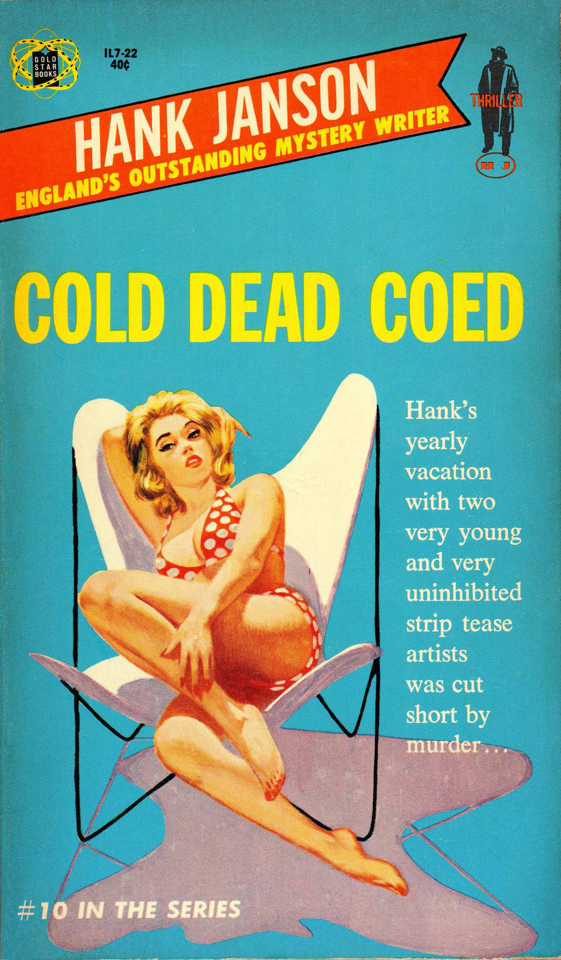
Curtains for a Lover, by “Robert Dietrich,” aka E. Howard Hunt (Lancer, 1962). This was Hunt’s seventh novel starring Washington, D.C.-based accountant-cum-detective, Steve Bentley. Enjoy Ron Lesser’s original artwork here.
When I asked
Charles Ardai, the editor of Manhattan-based book publisher Hard Case Crime, for a comment about once-prominent U.S. paperback artist Ron Lesser, he was quick to respond.
“I’m delighted you’re going to be featuring Ron on the site!” wrote Ardai, who has purchased at least three paintings from Lesser for use on Hard Case releases over the last decade. “He’s a terrific guy, and one of the last painters of the paperback-only era still working today. Like his contemporaries, but unlike most current painters, he’s got the training and skill at draftsmanship and anatomy to give the people he paints that extra degree of realism that makes classical painting just leap from the cover of a book. He works traditionally, not digitally, and that shows too: you can tell when a painter is manipulating pigment rather than pixels. You can see
Robert McGinnis’ influence in his work, and at his best I think his work is in that league, which I mean as the highest possible praise—very few painters have ever come close to McGinnis, even at their best.”
Lesser, at 76 years old, isn’t nearly as quick to toot his own horn when I ask him how his artistry compares with that of the numerous paperback illustrators he competed against during the mid- to late-20th century, most of whom are no longer around. “I would sound like an ass if I answered that question,” he remarked in a recent e-mail note. “I am not that conceited.”

Lesser later explained that he’s talked occasionally with his agent about assembling a handsome book-length collection of the paintings he has devised over the last half-century, but jokes that there may be no market for such an opus. As an alternative, he suggests “maybe a pamphlet, about three pages [long].”
(Right) Ron Lesser
But really, three pages wouldn’t even begin to tell the story of Lesser’s influence on what was once a thriving business in paperback-cover art, much less elucidate the many successes he has seen since that market dried up.
Born in the central New York City borough of Manhattan, Lesser was the only child of a father in the ice-cream trade and a housewife mother. As early as his grade-school years, he developed an interest in drawing and painting, which eventually led him to enroll at the city’s eminent
Pratt Institute, and subsequently at the
Art Students League of New York (ASL), where he studied with
Frank J. Reilly. As Lesser’s Web site
explains, “Reilly taught drawing, painting, color theory, and educated Ron in what he needed to learn most—the fundamental principles behind creating art.” Lesser fashioned his first paperback cover illustration while he was still an ASL pupil; he continued to generate such canvases into the 1990s, by which time he had produced “several thousand paperback covers”—the majority of them for crime and Western novels—and become one of the field’s foremost practitioners. Meanwhile, he took on assignments painting advertisements

as well as Hollywood movie posters, the latter enterprise resulting in his design for such iconic placards as those plugging the 1973 picture
High Plains Drifter and the James Coburn/Kris Kristofferson flick,
Pat Garrett and Billy the Kid, which also debuted that same year.
Keeping busy was important to Lesser for more reasons than one. He had a family to support, having met and proposed to a woman named Claudia (a onetime back-up singer for Nat King Cole) when they were both 18. “I was a baby,” he remembers. “My parents disapproved. It was a problem for many years.” After their marriage, the couple bore a son, and Lesser enlisted Claudia periodically as one of many cover models he used over the years. Sadly, Claudia passed away in 1998.
Book and magazine illustration saw its heyday from about the 1930s through the 1970s. After that, publishers started cutting back on the expense of commissioned paintings. Cheaper photography encroached on demand for drawn art, and the 1990 introduction of
Adobe Photoshop substituted computer manipulations for what artists had previously accomplished by hand. At the height of his long career, Lesser had turned out cover illustrations for books by John D. MacDonald, Frank Kane, Carter Brown, Richard S. Prather, and many others. As demand for such works fell off, Lesser—then in his 50s—painted and sold what have been called “visual sagas of the Old West and Civil War.” In the years since, says his Web site, Lesser’s work “has graced the covers of the most prestigious Civil War publications and has been exhibited at the Gettysburg National Park Museum and the National Civil War Museum,” both of which are located in Pennsylvania. In addition, he has painted action scenes focusing on polo horses and their riders, historical still-lifes, distinctive celebrity images, and “romantic fantasy” works.
Lesser currently lives on New York’s Long Island, where I reached him via e-mail. He was kind enough to answer my myriad questions about his life and career, and to separate cover paintings he’s actually done from others that have been mislabeled (on the Web) as demonstrating his talents. During our interview, we talked about his education as an artist, his early work for “big-time illustration agencies,” his “sexy girly covers” for paperback crime fiction, his movie-poster endeavors, his preferred models, and his continuing labors on behalf of book publishers and movie-production companies. Ron Lesser doesn’t seem remotely inclined toward giving up his artistic occupations at any time soon.

And he might not have to—after all, Robert McGinnis is 92 and still turning out beautiful canvases.
J. Kingston Pierce: How did you develop your interest in art? Were there people in your family or among your friends who influenced you to become an artist?
RL: I loved comic-book drawings when I was very young, around 9 to 12 years old. Especially the best-drawn comics. I loved
Alex Raymond—he was the cartoonist best known for
Flash Gordon. I loved
Milton Caniff—he made
Terry and the Pirates and
Steve Canyon. I liked
Al Capp, who made Li’l Abner and Daisy Mae. Also
Superman,
Batman, etc. I still love Caniff and Alex Raymond, both outstanding artists.
JKP: At what point in your boyhood did you start to draw? And what were you drawing then—your own comic books, perhaps?
RL: I don't remember when I started to draw, probably when I was around 12. Probably comics.
JKP: You showed artistic potential early in life. How was that potential demonstrated, and was it your parents who recognized it?
RL: That is a tough question. My parents showed little interest in my “artistic potential.” It was never discussed.
JKP: Biographical notes available online say that you graduated from New York City’s
High School of Music & Art. In what year did you graduate from there?
RL: I believe it was 1958.
JKP: After leaving high school, you studied at the Pratt Institute of Art in New York. During what years were you a student there?
RL: I went to Pratt in 1958, but stayed less than a semester.
JKP: You dropped out of Pratt early? Why?
RL: I realized that my goal was to be an illustrator and I would never achieve my goal at Pratt. The illustration program was for amateurs. I went to the dean and told him I was leaving. He tried to talk me out of leaving, but I would not be persuaded. I would never reach my potential if I stayed at Pratt. For me, it was a waste of time.
JKP: So, I am given to understand that shortly after leaving Pratt, you enrolled in the Art Students League of New York (ASL). Was it an eye-opening or intimidating experience to be among students as concentrated as you were on artistic expression?
RL: At the League I studied with the great teacher of drawing, painting and illustration, Frank J. Reilly. I certainly was intimidated at first. The best students were outstanding. And these were
students. I realized that if I was to succeed I had a lot to learn. I was talented, but not close to competing as a professional.


 Ron Lesser recruited his wife, Claudia, as a model in many of his paperback covers. Above are six of the artist’s favorite fronts on which she appears: The Crossroads, by John D. MacDonald (Crest, 1960); The Temptress, by Carter Brown (Signet, 1966—see Lesser’s original artwork here); So Willing, by Sheldon Lord and Alan Marshal (Midwood, 1960); The Deep Blue Good-by, by John D. MacDonald (Fawcett Gold Medal, 1981); Concerning a Woman of Sin, edited by Daniel Talbot (1960); and The Name Is Jordan, by Harold Q. Masur (Pyramid, 1962). Claudia also modeled for Curtains for a Lover, shown atop this post.
JKP:
Ron Lesser recruited his wife, Claudia, as a model in many of his paperback covers. Above are six of the artist’s favorite fronts on which she appears: The Crossroads, by John D. MacDonald (Crest, 1960); The Temptress, by Carter Brown (Signet, 1966—see Lesser’s original artwork here); So Willing, by Sheldon Lord and Alan Marshal (Midwood, 1960); The Deep Blue Good-by, by John D. MacDonald (Fawcett Gold Medal, 1981); Concerning a Woman of Sin, edited by Daniel Talbot (1960); and The Name Is Jordan, by Harold Q. Masur (Pyramid, 1962). Claudia also modeled for Curtains for a Lover, shown atop this post.
JKP: I’ve read an abundance of favorable comments about Reilly’s teaching style and his ability to inspire students. But how did he come across to you? And was Reilly especially influential in your own artistic development? What classes did you have with Reilly?
RL: I only studied with Reilly at the League, no other teacher. The ASL is not like a “normal” school or college. There are no grades, no graduation. You enroll with a specific teacher, not with a series of teachers and classes.
Reilly was much more than influential. I would never have learned to draw and paint if I had not studied with Reilly. A Reilly class was like going back in time to what is now considered the “Golden Age of Illustration.”
He taught me the tradition and techniques of the French Fine Arts Academy of the 19th and 20th centuries. Reilly was a link to
Jean-Léon Gérôme,
Paul Delaroche,
Jules-Joseph Lefebvre [as well as to] American artists
George Bridgman,
Dean Cornwell, and
Howard Pyle. I do not believe anything like that exists today. I also attended his classes at Woodstock [New York] in the summer; those were for landscape. I really do not recall exactly how I came to enroll with Reilly. I am sure I must have heard about him at Pratt.
JKP: Were you also studying art beyond the classroom, too?
RL: I went to the
Metropolitan Museum of Art many times to look at the amazing paintings there. Since the Met is a public museum, all paintings are open to the public, but only a portion are on exhibit. [Others can be retrieved by request.] I remember I gave whoever was in charge of this sort of thing a list of paintings I wanted to see. Several months later I received a notice to appear at a date certain at the museum. I went down into the bowels of the Met with the slip I was given, along with a guard. A huge door was opened. The guard pulled out the paintings I requested to study. It was like a Norman Rockwell cover for
The Saturday Evening Post: The guard sat in a chair with a newspaper looking bored and thinking what kind of nuisance and fool I was. Hundreds of paintings in the museum, and I was making all this work for him. All the while I was getting as close as I could to these marvelous paintings to study their craft.
JKP: How long did you wind up studying with Reilly at the ASL?
RL: Four years. The last year, I was a monitor—like a student teacher.
JKP: So in what year did you graduate from the Art Students League?
RL: One does not “graduate” from the League. I went back to visit on occasion. Reilly left the League soon after I left his class, to set up his own school. That was a mistake. He needed the League. He died shortly after he left.
JKP: What did you do for work in those first years after leaving the ASL? Did you move into commercial art/illustration, or did you take another path? Were you working freelance or for a company?
RL: I was making paperback covers while I was at the ASL. I was with the
Fredman-Chaite Studios for a short time. There were several big-time illustration agencies that partnered with illustrators through the late ’30s and ’50s. The agencies took their cut from advertising jobs. [But] the illustrators were not required to give the agency a cut from editorial work, magazines, paperback covers, etc. The idea being, from the agencies’ point of view, [that] magazine commissions were good for promotion, [helping] to acquire the advertising jobs which paid a lot more. However, photography was rapidly moving into the space that the illustrator had had to himself for years. So by 1965 the large
illustration agencies, like Fredman-Chaite and [Charles E.] Cooper Studios, went out of business. When I was starting I made Western and sexy crime babes to be used for paperback covers on spec, and sold them. Since Westerns were for the most part generic, as were the sexy girls, they were not hard to fit for a
cover.

 Ron Lesser produced two full-color promotional posters for the 1970 film Ryan’s Daughter. “My wife posed for all three, of course,” he says. “It was not common for one artist to make three paintings for the same movie. The [James] Bond movies were an exception.” Lesser also created a third, black-and-white poster, which was used in newspapers and can be seen here.
JKP:
Ron Lesser produced two full-color promotional posters for the 1970 film Ryan’s Daughter. “My wife posed for all three, of course,” he says. “It was not common for one artist to make three paintings for the same movie. The [James] Bond movies were an exception.” Lesser also created a third, black-and-white poster, which was used in newspapers and can be seen here.
JKP: How did you start selling movie-poster art to the Hollywood studios? Were you mostly doing that on spec, too? And what was your first movie poster sale?
RL: Movie art was never on spec, except on this one occasion for [Metro-Goldwyn-Mayer’s 1970 romantic drama]
Ryan’s Daughter. That was my first movie painting, for
Ryan’s Daughter. I came onto that opportunity very late. While at my agents’ office, I noticed some artists were making sketches for the movie. I asked what that was about. I was told they were making sketches for
Ryan’s Daughter, a big-time movie directed by David Lean. I wanted to get in on that. Remember, I was a novice at that time—no résumé at all. My agents laughed at the idea [of me winning the job]. I was told that every illustrator with a reputation in New York was working on
this. There were meetings that they attended with the client. No way could I expect to get this opportunity. But I would not be deterred. Somehow, I was given a
fact sheet and acquired some movie stills. I made two paintings. They were submitted to MGM … and they loved them both. I won the contest!
JKP: How many film posters have you painted over the years?
RL: Probably over 100, if you include ads for television.
JKP: I’ve heard that your favorite from among those posters was the one you did for the 1973 film
High Plains Drifter.
RL: Only because it became an iconic poster and led to several Clint Eastwood movie commissions. Other than that it is not my favorite.
JKP: Which leads me to ask, of course, which
was your favorite?
RL: Probably both paintings I made for
Ryan’s Daughter. Claudia was my model for both of these paintings.
JKP: Were you actually employing her for that work?
RL: She was not employed. I did not pay Claudia. She did not like to pose, although she was a very good model. As soon as I could afford to pay models, I stopped using her most of the time, although I could get her to pose when I wanted to. One time I lost all of a [model pose] shooting I took in New York City, and I recovered by shooting Claudia. I’d left the photography on the subway.
JKP: Do you continue to take on movie-poster assignments?
RL: Of course, but there are very few opportunities for movie art today. I recently did the art for
Atomic Blonde with Charlize Theron. [You can see his work
here.] That was a pleasure painting the beautiful Charlize Theron. I have always loved to paint gorgeous women. Beautiful women are the most fun for me to paint.
JKP: Let’s move on to the subject of your book covers. Do you remember which of those was the first one you worked on?
RL: Reilly had several contests during the year [at the ASL]. I came in second in

one contest. It was [for] a Western scene and was used by the client, Berkley Books, [on a 1960
William O. Turner novel] titled
War Country. I think that was the first time I was published.
*
JKP: Approximately how many paperback book covers have you painted over the years?
RL: I made several thousand covers. Too many to list a favorite. I was awarded several gold medals and best-of-show certificates from The Society of Illustrators. [I also won] Best Movie Art from the Art Directors Club of New York. That painting was for [the 1974 science fiction/fantasy film]
Zardoz, starring Sean Connery.
JKP: I’m surprised to say I don’t know the answer to this: Have you painted covers for hardback books as well as paperbacks?
RL: Yes, many covers.
JKP: Which paperback publishers kept you the busiest?
RL: Dell, Fawcett/Gold Medal, New American Library/Signet, Harlequin, Avon—really, all of them.
JKP: How have you usually gone about creating book-cover art?
RL: I am assuming you are talking about a commission. During my major illustration career, the client paid for all expenses. I would photograph the job using models. Often I would make sketches after the photography was done. If additional photography was needed, I usually could piggyback the additional photography [on] the next session. This was not a problem, since I was always booked for several months, so there was always another job.
JKP: And can I assume you didn’t actually
read the books for which you were creating art, but that publishers gave you suggestions of what they’d like to see in your finished
work?
RL: That would depend on the type of cover. You are right, I never read the books. The “girly books” rarely fit the book cover [art]. I had two different paperback careers. For the first nine to 10 years, I made Western and girly covers. I am best-known for my “sexy girly covers.” However, for the years I was
very successful, I made mass-market covers with famous authors. That was for about 15 years … For these covers, the art did fit the story.
JKP: I am most familiar with those sexy girly covers. When you say you later “made mass-market covers with famous authors,” to which authors do you refer? Two or three names will suffice.
RL: Jack Higgins, Helen Hooven Santmyer, Peter Albano.
JKP: Have you had some favorite models for your paperback work? It looks as if the extremely popular
Steve Holland might have appeared on some of your Westerns—is that correct?
RL: I used Steve Holland a lot; however, he was used so much by so many artists, that some publishing companies asked me not to use him. The only other time I can think of that a company asked me to use a model less, because I used her so much, was Harlequin Books. The model's name is Jane Minion. I hope she will not have an issue with my naming her. She was the best female model I ever used.
 Here’s a selection of Ron Lesser cover art featuring model Jane Minion. Above: The full, original painting for Goodly Heritage, by Beverly McGlamry (Ballantine, 1986—published cover here). Below: When Dragons Dance, by Elliot Tokson (Avon, 1982); Cover Stories, by Robert Rosenblum (Dell, 1980—original artwork here); The Armor and the Veil, by Jeanne Lancour (Dell Emerald, 1982); and Flowers of Betrayal, by June Triglia (Onyx, 1981—original artwork here). Click on these images for enlargements.


 JKP:
JKP: Did you paint your book covers in oil, or in some other medium? And what size canvases did you prefer for such assignments?
RL: Early in my career, I used water-based designers’ colors with
casein white. Most of my career I used oil. Size varied.
JKP: You’re probably best known for having painted the fronts for crime and Western novels. But have you also created covers for many romance novels, or for works of science fiction?
RL: I made several hundred covers for Harlequin [in the 1980s]. I was given a two-year contract from Harlequin. I was required to make at least one cover a month. That was to leave me time for other publishing covers and different subjects. However, Harlequin gave me so much work for the length of the contract, that there was no time available for anything else. I refused to renew, because I did not want to do another romance cover. I still continued to paint for Harlequin, but not exclusive. No science fiction.
JKP: You created a large quantity of book covers during the 1960s and ’70s. Not long after that, though, publishers started to substitute photographs for drawn or painted artwork. What was that transition like? Did it seem sudden and frightening, or was there ample forewarning? And was the reason for the switch-over based solely on money (photos being cheaper), or were there other considerations in play back then? I’m interested to know your perspective.
RL: The transition from art to photography for paperback covers did not happen until 1992, for the most part. During the ’60s through the ’80s, there was not a problem regarding photography and Photoshop. However, since 1985 there has been very little movie art done. The movie posters were all done in California
using movie stills. Advertising using illustrators had been long gone, back to the early ’60s.
Yes, [the transition] was sudden. Overnight, many excellent illustrators were out of business. The publishing companies discovered Photoshop. They could get a cover made for $1,000 instead of $3,500 to $5,500. That was the biggest reason. I switched to galleries, painting Western art.
JKP: In recent years, you’ve begun painting paperback covers again, this time for
Hard Case Crime. Did Charles Ardai have to do much persuading to get you back

into the business, or were you ready to tackle such art again? And can we expect to see more of your work on Hard Case releases in the near future?
RL: I loved painting [Ardai’s] covers. As to my doing more for Hard Case, you’ll need to ask Charles. [
Editor’s note: Ardai tells me, “We don’t currently have any covers assigned to [Lesser], but I was chatting with his representative just the other day about the possibility of getting him involved with our comic-book line at some point, so who knows? We don’t publish nearly as many new books per year now as we did a decade ago, so we don’t have as many covers to assign, but it would certainly be fun to work with Ron again at some point.”]
JKP: You’ve firmly established your artistic reputation as a realist. What made you inclined toward fine realism, while many others preferred more abstract expression?
RL: I do not recognize abstract or any other -ism as a legitimate form of art, except fine realism.
JKP: At what point did you become interested in Old West still-life paintings, as opposed to Western book-cover art?
RL: I have a large collection of western material, Indian weapons and material. About three years ago I made
this series.
JKP: How did a New Yorker become enamored of Old West subjects? Can we credit your work on Western novel covers for that?
RL: I loved making Western paintings. Not as much as painting sexy babes, but after that.
Jimmy Bama and
Frank McCarthy were New York artists. Bama was also a Reilly student.
JKP: Finally, let me ask what projects you’re working on now.
RL: I started this new series of paintings about seven weeks ago. It is market- and sales-driven. The series is the “Timeless Beauty of European Medieval Village Streets.” I plan to make these paintings as long as they sell. I have never made paintings for vanity reasons. Since I left Reilly I have always been a commercial artist.
 Two pieces from Lesser’s new “Timeless Beauty of European Medieval Village Streets” series. Above: “Beautiful Ancient Village of Provence, France.” Below: “Ancient Village Street in Southeastern France.” More can be found here.
 * Subsequent to this interview being posted, I was contacted by Killer Covers reader Rubén “DaCollector” Azcona. He suggested that Lesser had erred when he identified 1960’s War Country as the first book on which one of his paintings was featured, and said an example of Lesser’s art had earlier appeared on a different Western novel, 1958’s Lead in His Fists, by “Tom West,” aka Fred East (Ace D-276). Naturally, I asked Lesser about this, and he agreed that Azcona was right, but added: “I really do not like the [Lead in His Fists] painting.”
* * *
To see more of Ron Lesser’s fine-art work, check out the following Web sites: Going to the Sun Gallery, Whitefish, Montana; Aspen Grove Fine Art, Aspen, Colorado; West Lives On Gallery, Jackson Hole, Wyoming; and River Road Gallery, Wilton, Connecticut.