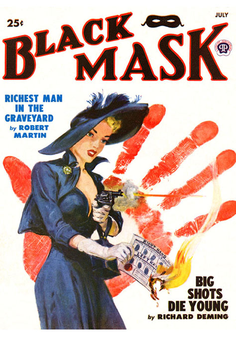
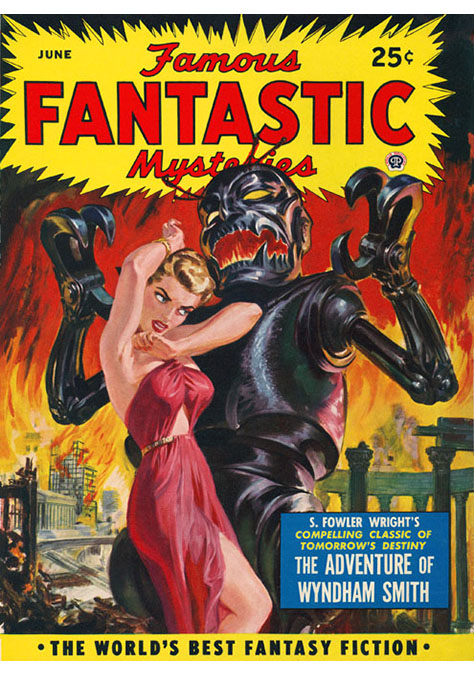
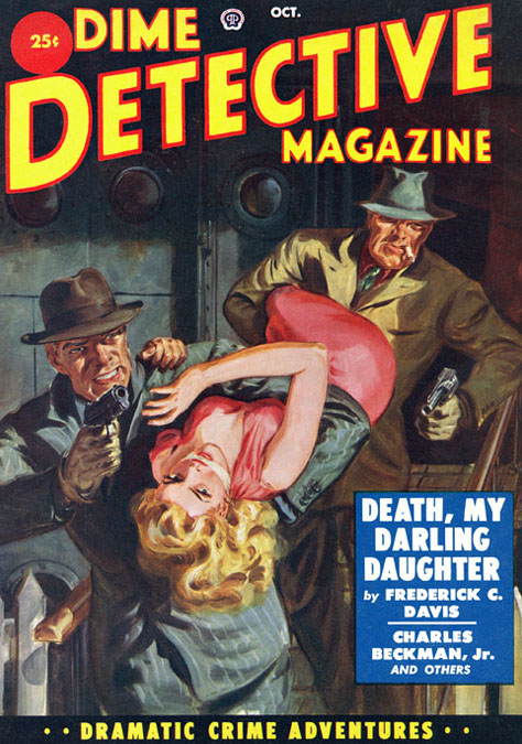
Women with desire and devilry in their eyes. Detectives with pistols in their paws and not enough luck to fill a matchbox. Damp, deserted roadways. Hot-sheet motels. Women in peril, their faces contorted with terror. Alleyways where young toughs threaten old fools. Bedrooms where the innocent go to sleep forever. Women with legs the length of Panama. Nightclubs where booming gunfire plays a discordant rhythm against the music.
And women. Did I mention women? The more shapely and insufficiently attired the better.
During the mid-20th century, these were essential ingredients of the illustrations decorating American crime, mystery, and thriller novels, especially the paperbacks. Inspired by the dissident, dystopian aesthetic of film noir and the sensationalistic fronts of cheaply produced pulp magazines that had done so much to popularize crime fiction, the artists behind these novel covers offered the browsers of bookstore shelves and drugstore spinner racks a world where anything could go wrong, and usually did. Their vision was fraught with lust and sadism, avarice and paranoia, slow-boiling fear and quick-firing violence. But if the society that artists such as
Robert McGinnis,
Paul Rader,
Ernest Chiriacka, and
Mitchell Hooks (who gave us the cover of 1962’s
The Kilroy Gambit, shown above) portrayed was often ugly, the art itself could be captivating. Many of them had honed their talents in the employ of slick periodicals and advertising agencies, before an increasing dependence on photography in those fields drove them to seek alternative work painting movie posters and paperback covers. Together they ushered in what
Max Allan Collins, a prolific mystery novelist who’s also composed non-fiction works about genre book art and pin-up girls, calls “a wonderful golden age where utter sleaze meets genuine artistry.”
If you’ve been reading Killer Covers for a while, you know what a fan I am of these vintage crime-fiction fronts. So I was delighted recently to be invited to write about some of my favorite such jackets for a national mystery magazine. Unfortunately, after I submitted the piece I had outlined, the editor decided that it really ought to go in an entirely different direction. I was left not only with a suddenly orphaned article, but more importantly, the results of three short interviews that had no new home.
 Right: Robert Maguire’s 1957 cover for Wild Town, by Jim Thompson.
Rather than let my work go entirely unpublished, I’ve decided to post on this page the interview responses I collected for the original article. I had addressed several questions about vintage crime-fiction covers to three authorities on that topic:
Charles Ardai, the editor of
Hard Case Crime; the aforementioned Collins, author of the
Nate Heller detective series and the man behind
a continuing line of Mike Hammer novels; and David Saunders, the son of renowned illustrator
Norman Saunders and creator of the excellent Web site
Field Guide to Wild American Pulp Artists. I’m sorry that their comments about the importance of classic illustrated book covers and why the commercial marketplace has slowly become less welcoming of those “old-timey” jackets won’t appear in the magazine piece for which I had designated them. But at least you can appreciate their wisdom below.
Q: Nowadays, so many of the crime/mystery/thriller novels are similar, featuring shadowy and running figures, desolate roadways, spooky-looking trees, or distressed furniture in shabby rooms. And stock photography not only dominates but is often duplicated on book covers. Earlier and illustrated works, though--especially those published during the mid-20th century--seemed to be significantly more interesting. What do you think has changed about public tastes and publishing demands that’s led to our modern cookie-cutter book fronts?
Charles Ardai: Well, it takes a lot less time and effort--and talent of a less uncommon variety--to grab some clip art, plop down some [type] fonts and backgrounds, apply some effects in Photoshop or Illustrator, and call it a day than it does to commission a painting and work with the artist to get memorable results. To start with, only a handful of painters in the world can paint in the style and at the level of skill that, for instance, we require for Hard Case Crime, and the ones that can are generally in high demand (not necessarily by book publishers, but by Hollywood, by ad agencies, by package designers, and so on). Now, not every book publisher would need our particular style--but they’d all require a comparable level of skill, and that’s not easy to find. Even if you find it, and you can work with the painter’s schedule, and you’re willing to pay an extra several thousand dollars, you also have to wait weeks (if not months) for the painting to be done, and there’s always the risk that it won’t come out quite the way you hoped it would. And who knows if it really will sell more copies in the end? You’d like to think that a truly brilliant cover would help boost sales, and maybe it would--but that’s a very high bar. The average painted cover probably won’t sell better than a generic modern-style cover. So why would a publisher tolerate the extra cost, delays, risk, and work? Unless, of course, the old-style painted look is an integral part of their line’s identity, as it is for Hard Case Crime; then you do it. But if it’s not ... the temptation to go with something simpler, cheaper, quicker, and safer is a powerful one.
Also, there are people who think that covers that look painterly and old-fashioned might actually sell
less well--no matter how beautifully painted--than the modern-style generic stuff I think of as “supermarket covers,” simply because the readers who buy best-sellers at supermarkets are looking for something that screams “modern,” not something that looks strange or old-timey. As much as I love it personally, there are a lot of readers who apparently won’t pick up a book that looks old-fashioned.
Max Allan Collins: I’ve been at this since 1971, and until Hard Case Crime, I haven’t had a cover I really loved. I only agreed to write
The Last Quarry [2006] when editor Charles Ardai bribed me with the opportunity to have a Robert McGinnis cover.
Things evolved, or rather devolved, throughout the 1950s and ’60s until the disaster that was the ’70s.
Dell did wonderful deco covers, like
the mapbacks, in the ’40s, but starting in the late ’40s,
Signet paved the way and, ironically, so did smaller publishers who viewed themselves (rightly) as an extension of the pulps.

 Left: James Avati’s covers for The Big Kill (1959), by Mickey Spillane, and The Case of the Daring Decoy (1960), by Erle Stanley Gardner.
So you had illustrated covers, with the garish sex-and-violence pulp aspect merging with the fine-art sensibility of
James Avati,
Stanley Meltzoff,
James Meese,
Lou Kimmel, and others. The talent in magazine illustration and advertising art of the ’30s and ’40s was mind-staggering, everybody from Cole Phllips to Norman Rockwell, from James Montgomery Flagg to Norman Rockwell. As the ’50s progressed, and photography replaced illustration, a lot of incredible talent migrated to paperback covers and movie poster art. Pulp artists like Rader and Saunders made the transition, too--sooner than the slick magazine guys.
And you have a wonderful golden age where utter sleaze meets genuine artistry. This lasts till the early ’60s, when what was perceived as a more modern look came along--a single stark image against a solid color, usually a beautiful woman in the McGinnis or
[Robert] Maguire mold.
Avati’s [Mickey] Spillane covers were particularly striking, although it’s said he didn’t like them or maybe he just didn’t like Spillane. This more simple, uncluttered design opened the door for photo-art covers, for crime paperbacks, particularly--you had, for example,
McGinnis dolls on Perry Mason covers being replaced by photos of beautiful women. Paperback covers had caught up to magazines, in a bad way, substituting photography for illustration. Pin-up calendars suffered the same fate around the same time.
David Saunders: One of the biggest and most influential powers in America today is conservative demagoguery. It wraps itself in the American flag and spouts the plain-spoken common sense of Will Rogers, while inexorably guiding the American public down the path toward a new and improved Fascist Democracy. The illustration art of the mid-20th century still reflected the pre-World War II ideals of the Enlightenment, when every person was supposed to fulfill his or her own creative potential by working to express the “god-like” within us all. This approach to art was best identified with Michaelangelo. After WWII the consolidated power of the military-industrial complex led to the absolute and corrupt power of “mass marketing,” which has redirected the message of all illustration art toward honing the most perfectly effective message that will sell the most. That is why Hollywood produces movies that cost $100 million to make and stay in circulation for two weekends to gross $132,000,000, and then are totally thrown out, because they have no long-term creative value.
Q: It’s said periodically that some of the sexier covers of yore simply wouldn’t be acceptable nowadays. Do you think that’s true? And if so, why?
Charles Ardai: Today, a lot of books are sold in large chain stores that make their money primarily by selling packaged goods--bologna, potting soil, diapers--and these stores take great pains to ensure they won’t offend any of their customers. Not a problem when your product is bologna or potting soil; the packages for those products are unlikely to stir any controversy. But book covers (and magazine covers, for that matter) might. And these retailers won’t stock books whose covers contain elements they feel might be risqué enough to cause some fraction of their customers to write nasty letters or start a boycott or simply start shopping at the next store over. Since these retailers wield a lot of power (by dint of the large fraction of all book sales they control), publishers are loath to cross them. So any cover image that might be “too sexy” or sensitive in some other way is likely to get nixed before it’s even seen by the buyers for these stores--and if it’s not, it’s likely to get nixed by those buyers when they do see it.
 Right: Robert McGinnis’ illustration for the 1961 Dell edition of Stranger in Town, by Brett Halliday.
Why were things different in the old days? For one, a lot more books were sold in venues that only sold printed material--newsstands, in particular. For another, a larger fraction of the people buying books in the old days were men, who might be expected to be more tolerant of “naughty” artwork; today, the book-buying audience is much more heavily female. There was probably also more tolerance in the culture for material that some people today would consider offensive. I’m of two minds about this: on one hand, I’m glad people are more sensitive today and that we don’t see magazine covers featuring grotesque racist caricatures; on the other hand, I think the fear of giving offense has led to some absurd acts of timidity, such as covering up a female model’s bellybutton or her bare feet. I’d like to think there could be a middle ground, where we’d have the freedom to show images you might not want your kids to see, while still avoiding the worst and ugliest imagery of our benighted past. But of course that position, enlightened and Aristotelian as it might sound, basically boils down to, “I’m glad not to see covers that would offend me, but I’d like to see more than don’t offend me even if they might offend you.”
Max Allan Collins: They are accepted only in the retro sense--when they can be perceived with irony. It’s one of the worst byproducts of feminism. The sense of fun, danger, sexuality and sensuality is somehow offensive. I say lighten up and enjoy the ride.
David Saunders: I am always mystified by why certain things have no popularity nowadays. Many of the finest works of art are “unpopular.” I am so mystified by this that I can only ascribe it to some profound unknown deity, which I call by the mystical name Mass-Mar-Kating! Everything about this all-powerful god, Mass-Mar-Kating!, is unknowable, but for some reason it is consistently drawn towards “pre-existing franchises” and “optimal purchasing groups.” Why do three movies on earthquakes come out in the same year? Why do three movies on asteroids come in the same year? Why do three movies on vampires all come out in the same year? Why do three animated
CGI (computer-generated imagery) movies on ants come out in the same year? Why are reality TV shows popular? Who the fuck is
Lindsey Lohan?
Q: Do you think changes in readership have affected the style of crime-novel covers? Because there are so many more women reading in the genre today than there were half a century ago, are covers featuring half-naked lovelies and curvaceous femmes fatales a thing of the past?
Charles Ardai: Yes. More female readers means fewer covers aimed squarely at the male gaze, and that’s not entirely a bad thing. But it’s a mistake to think that women don’t like gorgeous, sexy painted cover art. We hear from plenty of female readers who love our covers, the sexier the better. Part of the reason is that the women on our covers may be half naked in some cases, but they’re not weak or subservient or cowering before a buzz saw. The women on our covers are much more likely to be an aggressor than a victim.
Max Allan Collins: That’s the conventional wisdom. You’d have to ask Charles Ardai how much of the Hard Case audience is female--I do think plenty of women enjoy the retro look, with or without the irony. Keep in mind that both men’s magazines and women’s magazines use beautiful females on their covers. It’s a more attractive sex.
Things have turned weird. We were told, flatly, that there couldn’t be a gun on a Mike Hammer cover. No gun. And my pleas for a beautiful woman on the covers have fallen on deaf ears, except for the wonderful (if retro) covers of the
Hammer collections at Penguin.
Really, this isn’t about women. It’s about men and women. Sex and violence are the heart of the crime genre, at least the noir variety--sex is life and violence is death, and those are the big topics, the key interests. But a handsome man somehow doesn’t imply a beautiful woman in the wings. A beautiful woman, however, does imply an off-camera male interest. Steamy is good--
The Postman Always Rings Twice,
Lana Turner in white,
Body Heat, Kathleen Turner in not much of anything, that is noir. Love, passion, strong enough to kill over. It’s a missed opportunity when covers are cold and cookie-cutter, and can’t convey that heat.
David Saunders: I am not an expert on the sociology of American readership or the development of feminist tendencies in the U.S.A., so I am not qualified to give an authoritative answer to this question. I happen to only read classic literature and vintage paperbacks. I turned off the TV in 1968. I hate all mass-media advertising. I am mystified by various developments in modern fiction, such as semiotics, fractured chronologies, and parallel universes. Today I am happily reading
The Roar Devil [1935], by Kenneth Robeson, a Doc Savage Bantam paperback novel with a cover painted by “
Boris” in 1977. In my unqualified opinion, sexual fantasy will always be a personal matter of choice, which is as varied as the flavors of ice-cream ... [and which can] differ from day to day. Many people are not aware of how influential the illustrations are. I like Duke Ellington’s comment, when asked about BeBop Music: “There are only two kinds of music in my opinion. Good music and bad music.” Likewise, it is not the degree of “curvaceousness” so much as the quality of the illustration. Most of the terrible illustration I see nowadays is bad because it is based on rotten drawing skills.
Q: Despite the fact that most covers these days are photographic, there’s often excitement heard when new illustrated fronts (by Glen Orbik, Richie Fahey, or others) do actually reach the marketplace. What advantages do you think illustrated covers have over photographic ones?
Charles Ardai: It’s funny that you include Richie Fahey in that list, since I believe his work starts out photographic--I think he takes photos and then paints over them.
But you’re right that his work and Glen’s and some of [what] our other painters [do] get a lot of people excited when they see it. I think this is just a matter of their exceptional talent commanding the attention it deserves. It’s not that photo covers can’t command similar attention--look at the stunning work
Thomas Allen did for the reissues of James Ellroy’s work, for example. It’s just that you need exceptional talent. Most photo covers are generic and
uninteresting. Painted covers are rare enough at this point that when you finally see one, it’s likely to be something pretty special.

 Left: Thomas Allen’s covers for the Vintage editions of Suicide Hill (2006) and Blood on the Moon (2005), both by James Ellroy.
Max Allan Collins:
Left: Thomas Allen’s covers for the Vintage editions of Suicide Hill (2006) and Blood on the Moon (2005), both by James Ellroy.
Max Allan Collins: Illustration, if it’s any good, speaks to the imagination. It’s not literal, it’s expressive, emotional, evocative. I hate most of the covers I’ve had. Nate Heller has never been packaged right. There is nothing sadder than the author who looks at the cover of his book and knows he wouldn’t buy it.
David Saunders: My father once told me that photography had culturally triumphed as “the medium of visual proof.” Photos can be entered as legal evidence in courts, and everyone is content to use the expression, “seeing is believing.” Dad felt that photography’s cultural role as the medium of visual proof had taken over one of the painter’s traditional roles as a provider of “visual proof.” One of the clearest examples of this traditional role of the painter as a provider of visual proof is the long relationship with one of the oldest and steadiest clients, the Catholic Church, which always needed “realistic” paintings to act as substantiated proof of each saint’s martyrdom and miracle. So Dad was sorry to see photography take over the role of the artist as a provider of visual proof, but he was encouraged by the fact that artists also had a second role, which was to provide
visual proof of fantasy, and that skill was totally unchallenged by photography. Dad felt that from 1950 onwards, photography was the best way to create a document of a historic event, but painting was inadvertently elevated to the medium of substantiating visual fantasy. He felt artistically liberated by the new cultural prominence of paintings as the major medium to substantiate visual fantasy. He believed painters were just wasting their time, when they complained about the dominance of photography in the illustration industry. [He said:] “If all they ever did was trace photographs, then its no wonder they feel threatened by the popularity of photography; but if they were happy to use their imaginations before, then they should feel even more liberated to dream up their wildest fantasies!”
I suppose those ideas were really a product of the 1950s and 1960s, when all that existed were black-and-white or color photos. Nowadays we have some of the most fantastic images in the world generated from digital photography, and computer-generated images. Dad might have made great work with these cool new art tools, but he would probably never give up the mainstay of his creative energy, which was a love of stylistic drawing from observation. So no matter what “tool” he used it was always an outgrowth of his personalized drawing style. [He] used to say, “If you draw every minute of every day for your entire life, you will eventually develop an all-important ‘style’ that’s all your own, and that is the most important skill of the artist. Everything else is just mindless tools that you can use to draw with.”