
There’s nothing new about the fictional character Charlie Chan. That Chinese-American detective on the Honolulu police force, with his extensive family and equally large waistline, was introduced to the reading public shortly after World War I. In 1925, an Ohio-born author and playwright named Earl Derr Biggers welcomed the publication of his first Chan novel, The House Without a Key. He went on to compose five more books in the series, further illuminating the personality and professional credentials of his creation, a respected but modest sleuth whose resolution of crimes often depended less on physical clues than on his understanding of human nature. The books also allowed Biggers to demonstrate Chan’s wisdom and wit in a series of memorable aphorisms (examples: “Owner of face cannot always see nose”; “Time only wasted when sprinkling perfume on goat farm”; and “Man is not incurably drowned--if he still knows he’s all wet”), which presaged the proverbs spouted by television’s Thomas Banacek and others.
Chan’s renown as an investigator in print, however, was eventually overshadowed by his renown as a film icon. Biggers’ character starred in more than 40 movies during the first half of the 20th century (and a couple more in
 more recent years), as well as radio dramas (listen here and here) and a short-lived, 1950s TV series.
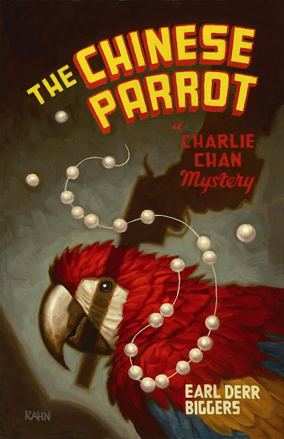
But if Charlie Chan as a fictional player isn’t new, Academy Chicago Publishers’ paperback reissues of the six Chan novels certainly are. While Biggers’ works have gone through numerous editions over the last eight decades, few have been as noirishly handsome as Academy Chicago’s line, the final two of which--Charlie Chan Carries On (1930) and Keeper of the Keys (1932)--were released only last month. Credit for their visual appeal lies primarily with cover artist Chris Rahn (photographed above), a 25-year-old San Francisco-born illustrator whose work decorates electronic games as well as book jackets.
I took the opportunity recently to interview Rahn (via e-mail). We talked at length about his work on the Chan novels, his favorite book illustrators, the recent trend toward noir-influenced cover art, and his fondness for the old Conan the Barbarian yarns.
J. Kingston Pierce: Tell us a bit about your background in design and illustration. How did you come to work in this field? Were there people in your family who fueled your interest?
Chris Rahn: Well, both of my parents are very creative, my dad’s a professional photographer, so I was supported in my interests from an early age. I’ve always enjoyed drawing, especially when it involves telling an interesting story, so I decided somewhere in high school to pursue that interest and become an illustrator. After high school I moved back to San Francisco [from my then home in eastern Washington] to attend the Academy of Art, majoring in Illustration.
JKP: Have you always freelanced as a designer, or are there some more conventional jobs in your background?
CR: Well, aside from a summer driving a wheat truck on the family farm when I was 17, I’ve always worked as an illustrator.
JKP: Much of the work you feature on your Web site is fantasy-like. Are you drawn more to fantasy paintings than to other sorts?
 CR: I’ve always had a soft spot for fantasy and science fiction, but I enjoy working in all genres. At this point my portfolio reflects what type of clients like my style of painting as much as it does my interests.
JKP: What media do you use to create your illustrations? And what size were your original paintings for the Chan covers?
CR: I work in oils, which has become kind of rare in illustration anymore. That’s probably half the reason I landed the Charlie Chan job--they really wanted someone who could work in the style and media of the old pulp illustrators. The Charlie Chan covers are all 20 inches high by about 15 inches wide.
JKP: Tell us how your work load breaks down. What percentage of your effort goes toward books, and what goes percentage toward periodicals and other projects?
CR: I’d say at this point it’s about 30 percent books and periodicals, and 70 percent gaming.
JKP: What book covers have you created in the past?
CR: Actually, in my short career, I’ve only designed the cover of one book aside from the Charlie Chan series. It was a fantasy novel called Alara Unbroken [by Doug Beyer, 2009].
JKP: So how did you come to be hired by Academy Chicago Publishers? Had you worked for that company before taking on the Chan series?
CR: They had actually contacted my reps at Lindgren & Smith asking about getting another one of their artists, Chuck Pyle, to do the covers. Chuck wasn’t able to take them, but recommended me instead. I suppose it was a bit of a gamble on the part of Academy Chicago Publishers, but I think they were pleased with the results.
JKP: How much did you know about Charlie Chan before you were asked to create cover art for these reissued Earl Derr Biggers’ novels? Had you the read any of the books prior to this assignment? Or had you watched the old Chan films?
CR: I knew the name Charlie Chan, but not with much understanding of the story. When I got the Charlie Chan series I made it a point to quickly read the entire first two books to be sure the covers [I had in mind] would do them justice. I really wanted them to feel authentic.
JKP: And what was your opinion of author Biggers’ characters and storytelling style?
CR: I really enjoyed the books. I believe it was the first two that I read all the way through: The House Without a Key and The Chinese Parrot. I was amazed at how accessible and modern the stories and characters were, considering that they were written so long ago. It was also great to see an Asian man portrayed so early on in a capable and less stereotypical role, even if some of the writing would be considered insensitive by today’s standards.
JKP: Do you usually read books prior to creating their covers?
CR: I do when I can. Sometimes with new books you don’t get the chance. I feel that artists should at least read enough to get a sense of the world the author is working in and the mood of the story. In a lot of ways that’s what a cover should be, a concentrated reflection of the world contained in the book. If you can’t get ahold of the book at all it’s definitely more difficult, and for me has resulted in some very in-depth question-and-answer sessions with art directors.
JKP: What were the things you most wanted to communicate with these new Charlie Chan covers?
CR: I just wanted them to feel dark and compelling, with a bit of a cinematic, film noir mood to them.


Illustrating how his Charlie Chan covers evolved, Rahn sent along these four “roughs” of his artwork for Academy Chicago’s edition of Behind That Curtain (1928). The three black-and-white treatments offer options of what might be seen behind the titular drapery; the fourth is a color workup of the image the publisher liked best. (Click on the images for enlargements.)
JKP: What sorts of requests did the folks at Academy Chicago make in regard to these jackets? Were there a lot of parameters? And how many versions did you go through of each cover?
CR: With this series I would submit three rough black-and-white sketches, then once we settled on one I would do a color study, then move on to the final. In terms of requests, they really wanted the covers to feel like authentic pulp covers done in that classic pulp style. That’s also the reason they had me hand-paint all the lettering for the covers instead of using digitally inserted text.
JKP: All of the Chan books have gone through various incarnations over the years. Were you at all influenced by earlier Chan covers?
 CR: While I did look at a few of them, I tried not look at the older covers too much. It’s easy to lose direction when you see someone else’s vision of the same story.
JKP: Do you have favorites among those older Chan covers?
CR: Yes, I’m not sure if it’s the original cover or not, but there’s a great version of The Chinese Parrot that I found that really got me thinking. [Editor’s note: The paperback edition he’s referring to here was actually published by Avon Books in 1952, and is shown at left.]
JKP: Do you often read crime and mystery fiction? Or do you favor different sorts of books?
CR: The books I read are all over the map, everything is fair game (when I have time, that is).
JKP: Do you have favorite book illustrators, both historic and contemporary? If so, who are they?
CR: There are too many to name. Robert McGinnis comes to mind, David Grove, Jon Foster, N.C. Wyeth, [Gerald] Brom.
JKP: I’ve written a good deal about “copycat covers,” multiple modern books that employ the same jacket photographs. This seems to me to be a growing and pernicious trend that’s indicative of publishers’ unwillingness to spend for original art and their disinterest in giving readers something new for their dough. Do you agree? And do you think readers actually notice when they are given the same sorts of covers over and over again?
CR: I guess I can’t blame publishers for trying to save money when book sales are down, but it really is insulting to the reader when the cover to their book isn’t even really the cover to their book. I’m sure the majority of readers don’t notice every time, but some do and I’m sure they feel a bit cheated.
JKP: On the other hand, thanks to Hard Case Crime’s paperback covers, the work Richie Fahey has done for Megan Abbott’s noirish novels, and some other retro-cover ventures over the last few years, there also seems to be slightly more interest in giving books stylish illustrated jackets, rather than generic photographic ones. Do you think that’s a development with a healthy future?
CR: I sincerely hope the trend of newly commissioned covers continues. I have to believe that an original and compelling cover could boost sales of any book.
JKP: Are there authors whose work you would especially like to illustrate in the future?
CR: I would really get a kick out of illustrating one of Robert E. Howard’s Conan stories. That would be a lot of fun.
JKP: What is it about Howard’s tales that you find most appealing?
CR: There’s just something about those classic adventure/fantasy stories that call to me--and to a lot of illustrators, I think. They were written in a time when people were less analytical and critical, so they have a touch of naïve excitement that is pretty rare in modern writing. It’s also worth mentioning that some of the best illustrators in the world, past and present, have done work for Conan. Frank Frazetta, Greg Manchess, and Justin Sweet to name a few. It would be amazing to follow in such titanic footsteps.
JKP: You said earlier that you do a lot of work in the gaming field. How did you get into that business?
CR: Well, as I mentioned before, one of my major interests in illustration is in the genre of sci-fi and fantasy. It became obvious pretty early on in art school that the gaming industry is where most of that work was being done, so I had started approaching companies on my own with some success. But
 once I signed with my reps at Lindgren & Smith, they showed my work around to art directors that they had existing relationships with, and it went from there.
JKP: Can you tell us specifically what doing gaming illustrations entails? And in the course of playing which games might people have spotted your work?
CR: Most of the gaming work I’ve done so far has been for Wizards of the Coast, doing illustrations for a game called Magic: The Gathering. I’ve also done work for Fantasy Flight Games on a [card] game entitled A Game of Thrones, and for Blizzard Entertainment’s World of Warcraft.
JKP: How does your work in gaming differ from what you do for books? Does either offer greater freedom or control over your art?
CR: There’s often a bit more creative freedom working in gaming as opposed to books, because the publisher has less riding on each individual piece. With books, publishers will sometimes want to have a real hand in the creative process, and at it’s worst, you can find yourself just being a hired hand, painting out someone else’s vision. Another thing worth mentioning is that with book illustration you have to design your art around text that will be added later--the title, author’s name, etc. In the case of the Charlie Chan books, I was asked to design and hand-paint all of the cover text to give the cover the feel of the old, totally hand-painted pulp covers. It was challenging to say the least, but I certainly learned a lot about typography in the process.
JKP: Has your work on the Charlie Chan covers brought you nibbles from other publishers who appreciate your illustrating style?
CR: It’s always hard to say which pieces spark the interest of publishers and art directors. I’m not sure if any of the work I have coming came directly from interest in the Charlie Chan covers, but I think they definitely helped to round out my portfolio. It definitely makes a difference when potential clients can see that you can work in a variety of ways.
JKP: Without prying too much, can you tell us what an illustrator is paid to create a single book cover? I don’t think most people have the slightest idea. And are there factors other than which publisher is making the assignment that affect the rate of payment?
CR: Well, without getting too specific, the artist’s fee for a book cover usually ranges from $1,000 to $4,000 depending on the publisher, as you said, but also how well-known the artist is and how widely the book will be distributed. And of course, if the artist has a rep, a percentage of the fee will go to them.
JKP: You currently live in Portland, Oregon. Is there a huge art and design community there? Or do you feel rather isolated.
CR: Portland is a really creative city, but in terms of illustration, if you’re not in New York, you’re isolated.
JKP: Have you considering relocating to the Big Apple?
CR: I have considered it, but pretty quickly after leaving art school it became clear that it wasn’t necessary. It used to be that location mattered a lot in illustration and that you had to have face-to-face relationships with clients; but anymore, almost all communication is done over the Internet and clients rarely even bother with a phone call, let alone a meeting. Even the final art is delivered over the Internet now. While part of me wishes that I could work in a more personal way with clients, at least with the way things are now I have the freedom to live anywhere I like.


5 comments:
Great interview. And lovely covers.
Terrific - fun to hear about the process
Ditto Evan Lewis's comment. Makes me want to read Charlie Chan mysteries.
Hey, JKP, a great piece! I wish I had seen it earlier. Have you seen my new book "Charlie Chan: The Untold Story of the Honorable Detective and His Rendezvous with American History"? thanks! -YH
http://www.yuntehuang.com
"A day late and a dollar short" am I, but I had to say how interesting a read this was! I'll look at those covers from Academy Chicago Publishers with new appreciation for the hand painted designs. Ciao, Lou.
Post a Comment