


As I already noted in The Rap Sheet, today marks the 100th anniversary of the birth of Kenneth Millar, who—using the byline “Ross Macdonald”—would write two dozen crime novels between the 1940s and the 1970s. Eighteen of those would star an especially compassionate Los Angeles private eye named Lew Archer.
My introduction to Macdonald came during high school, when I devoured the first book in the Archer series, The Moving Target (later to be adapted into the Paul Newman film Harper.) Although that novel was originally published by Alfred A. Knopf in 1949, I had access only to a much later edition, a paperback version released by Bantam Books in the 1970s. It was part of a series of Macdonald works, all using the same cover-design format, which featured bold and shadowed serif type, with narrow panels at the bottom through which could be glimpsed portions of photographs, most often featuring women. (That format was also used in the main opening titles for the 1974 NBC-TV pilot film The Underground Man, starring Peter Graves and based on Macdonald’s 1971 novel of the same name.)
I wound up collecting most of those Bantam editions, though I missed two—The Wycherly Woman and Black Money—probably because I began buying them all at a time when they were being replaced by newer editions. Those paperbacks have traveled with me from apartment to apartment, house to house over the years, and they still make up a prized part of my crime-fiction library. Earlier today, as I was writing about Macdonald for The Rap Sheet, I pulled those handsome Bantam editions off my shelves and scanned them. You can see the results above and below (click for enlargements).


My recollection is that The Goodbye Look was the final Macdonald novel to follow that familiar Bantam format. In the late ’70s, new cover illustrations were commissioned from American artist Mitchell Hooks. Being young at the time, I didn’t realize how interesting those revised paperback editions looked, so failed to pick up any but the last installment in the Archer series: The Blue Hammer.
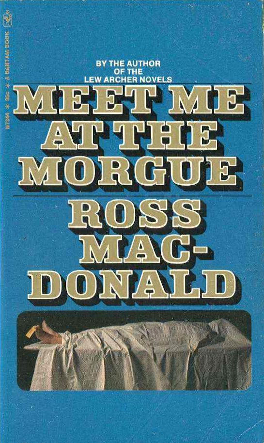
Incidentally, it wasn’t only Macdonald’s Archer tales that were uniformly formatted by Bantam during the 1970s. So were his less-well-remembered, non-Archer novels, including Trouble Follows Me, Blue City, Meet Me at the Morgue, and The Ferguson Affair.


Finally, let me pose a question: How many of you out there still have some of these Bantam Macdonald editions decorating your tall bookcases? They used to be everywhere!
READ MORE: “Two New Lews” and “Getting Hooks into Archer,”
by J. Kingston Pierce (Killer Covers).


7 comments:
Love these covers! ...though sadly don't have any of them. Used to see them a lot, though. Nice collection, nice post!
My collection of Macdonald books does include a few of those Bantams (love the design), but also a few of the earlier editions from publishers like Dell and Pocket Books. I also have one of the later Mitchell Hooks covers, The Chill. All in all, very enjoyable.
Use to see Macdonald around when l llved ln Santa Barbara. Read all, and enjoyed the helr apparent to Chandler. Also llke hls wlfe's wrltlng
They are still my favorite covers of the Macdonald novels! I used to scrounge the used bookstores for them on my visits to the U.S. in the nineties, but they were pretty scarce even then.
The ones I own are: Trouble Follows Me, Blue City, The Drowning Pool, The Way Some People Die, Meet Me at the Morgue, The Galton Case, The Wycherly Woman, The Far Side of the Dollar and The Goodbye Look.
The spines are getting faded with age, but the binding still holds up. No loose pages that I know of!
I have nearly all of the Mitchell Hooks covers on my shelves. (By the way, SLEEPING BEAUTY isn’t a Hooks cover. It’s one of the subsequent set that followed Hooks’ run on the books, using the same cover design concept.) I keep thinking I might start collecting those chunky letter covers. They were virtually everywhere, on every book rack when I was a kid/
Hey, Tim: Thanks for the note about Sleeping Beauty. It was only after I wrote this post originally that I realized that paperback's cover probably wasn't painted by Hooks. I have now removed my mention of it from this article.
Cheers,
Jeff
They make a nice set, but to hyphenate the author's name to fit in with a rigid, prearranged design template is an unforgivable sin.
Post a Comment