Showing posts sorted by relevance for query "lesser look". Sort by date Show all posts

Thursday, June 21, 2018

The Lesser Look: But Wait, There’s More

Part of a month-long celebration of Ron Lesser’s artistic legacy.


(Above) According to Lesser, this painting was featured in a “Cold Case Detective” calendar he created some years ago.


In addition to the many finished, Ron Lesser-illustrated book covers packed into my computer photo files, there’s also a scattering of paintings he intended for other uses, preliminary body sketches, and original images later cropped or overlaid with type by various paperback book publishers. As Killer Covers’ tribute to this American artist winds down, I want to showcase at least some of those works. I asked Lesser, via e-mail, to comment on the 16 paintings featured above and below, and have based my captions on his remarks.


“For most of my models,” Ron Lesser tells me, “I went through a model agency. Either Ford or Wilhelmina Models. There were several other New York agencies as well. Only models who did illustration photography were available to artists. The price for a model for illustration photography in the 1960s and ’70s was about $100 an hour. In the late ’70s that price went to $150 an hour. In the ’80s the artist was paid $200 an hour. The client paid all of the expenses—photographer, model, and print costs.” Referring to two of his favorite cover models, Lesser says: “Steve Holland, who was never with an agency, kept his price at $100 an hour. Jane Minion had an agency for acting, but not a model agency. So I booked her directly, as I did for Steve. Jane was a dancer in the [1979] Bob Fosse-directed movie All That Jazz.”


The lovely brunette shown reclining in the image above was Elaine Reynolds, a onetime Playboy model who, Lesser explains, “was in the magazine several times. I used her many times. She was a great model and a very nice lady. I wish her well.” Reynolds can be seen, as well, on the cover of Target for Their Dark Desire.


This art appeared on a 1966 Avon paperback edition of Charlotte Jay’s Beat Not the Bones, a work that in its original hardcover release had won the Edgar Allan Poe Award for Best Novel. Lesser remarks: “I do not like the painting. Not up to my standards.”


In case there was any question about this, Lesser notes that “The babe on the chaise longue is Elaine Reynolds.”


Lesser says this promotional poster for the TV spy series The Man from U.N.C.L.E., starring Robert Vaughn and David McCallum, “would have been done around 1964-65. NBC used several illustrators to make paintings for the coming TV schedule for a few years. Jimmy Bama made several paintings, among other artists. I also did the art for The Dean Martin Show … It was cool to see my paintings on my television, advertising the coming schedule.”


This painting, which Lesser says “was done several years ago for a sale,” bears a striking resemblance to his cover illustration for Carter Brown’s Tomorrow Is Murder.


Lesser remembers he wasn’t particularly impressed with the male model he employed for this painting, and that “the small babe in a bikini” is one of his favorite female subjects, Jane Minion.


“I never met Sophia Loren …,” Ron Lesser confesses, “[but] I loved to paint her face. Great bones.” He created the image shown above for the 1979 Baronet paperback edition of Forever Sophia: An Intimate Portrait, by Alan Levy. Meanwhile, the distinctly more provocative image of Loren displayed below graced the 1967 Signet edition of Lament for a Lousy Lover, an Al Wheeler/Mavis Seidlitz novel by Carter Brown. Says Lesser: “I plead guilty to placing [Loren’s] head over a different body. In this painting the body belonged to Elaine Reynolds. I did this several times. No one ever seemed to notice.” By the way, Lesser had at least one more opportunity to paint the lovely Loren, for the poster promoting her 1979 film, Firepower.


One other screen queen Lesser has painted more than once is Marilyn Monroe. Of the image shown above, titled “Marilyn in Silk Scarf,” he writes: “A gallery that represented me wanted me to make this painting. I sold the painting to The Illustrated Gallery,” located in Fort Washington, Pennsylvania. To enjoy another of Lesser’s Monroe paintings, click here.


“I have no idea what these drawings were for,” Lesser admits. “Probably preliminary sketches for a book cover.”


The armed man in the painting presented above is the seemingly ubiquitous Steve Holland. Lesser identifies the blonde posing behind him as “a very cute model, Vickie Chesire.”


The title of this historical painting is “Reflection.”


Fredric Brown’s The Wench Is Dead was originally published in 1955. However, Centipede Press brought out a new hardback edition of that novel (plus bonus stories) in 2017, compete with the Ron Lesser wraparound artwork shown above. “The book sold out,” Lesser recalls. His female model here was again Jane Minion. The artist relates his uncomplicated technique for lightening her dark locks in this pose: “If the babe in the story was a blonde, I posed her with a wig. [Minion’s] hair was auburn. I had a cheap blond wig that Jane could make look pretty good. Being of Italian heritage, she was great with hair.”


Another famous figure who’s shown up on more than one Lesser canvas in the past is the so-called Queen of Pinups, former Playboy model and fashion icon Bettie Page. As with the second Sophia Loren illustration in this post, the final two paintings here show Page’s head mounted atop curvaceous bodies conceived by Lesser. The image above is called “Too Hot to Touch,” while the painting below carries the title “I’m No Angel.”

Saturday, June 2, 2018

The Lesser Look: “Blue Mascara Tears”

Part of a month-long celebration of Ron Lesser’s artistic legacy.


Blue Mascara Tears, by James McKimmey (Ballantine, 1965). According to Lesser, the cover model used in this painting was Lisa Karan, who also features in his cover—shown below—for The Darkest Urge, by John Nemec (Private Edition, 1966).


This is one of many paperback fronts that have been misidentified over the decades as having been painted by Robert McGinnis, while it’s actually Ron Lesser who deserves the credit. When I ask him about such confusions, Lesser says: “I know my work from the late 1960s until 1978 is often compared to Bob’s. I do take that as a compliment. However, if you study my work after 1978 you will see a very different look. It was at that time I switched to oils and I deliberately changed my painting approach, for many reasons. Before 1978, I was using water-based paint—casein white for body, and then designers’ colors, which have more ‘body’ (covering ability) than watercolors, but less than casein.”

He recalls further how he changed his paint mediums over the years: “When I left [Frank J.] Reilly’s class [at New York’s Art Students League], I continued to paint in oil for awhile. All of the paintings I did in class were in oil, so it was natural for me to paint in oil. But because of the influence of McGinnis and [Mitchell] Hooks, paperback publishers were looking for a more modern-style technique than the very ‘painty’ look of oil art … that was very popular since the ’40s. … So I altered my technique away from what I was doing to what was rapidly a changing market in the look of paperback covers. McGinnis used egg tempera which he made himself. Egg tempera uses eggs in the mixture. I tried making this, but the smell from rotting eggs was terrible. I guess I wasn’t doing it right.”

Finally, I ask Lesser a question that has been on my mind and that of others as well: “If I understand correctly, during the 1960s you were brought in occasionally by publishers to work on some series (I’m thinking here particularly of the Carter Brown and John D. MacDonald books) that were known for their McGinnis cover illustrations. It may have been that McGinnis himself was too busy at the time with other projects, but in any case, you were seemingly asked to maintain a continuity of style. And you did a terrific job of it. As a commercial artist, you knew you were beholden to the clients to deliver the sort of covers they wanted. But did it bother you at all that you weren’t given the opportunity in those instances to come up with something showcasing your own approach and ideas?”

To which Lesser responds: “I never felt that I was not painting what came naturally to me at the time … I was never asked to maintain a style. I knew what publishers expected from me in regard to these kind of covers. As I said, it was a natural fit for me.

“I had a long career painting paperbacks. I strongly believe I succeeded because I never gave the art directors problems. Before 1980, the art directors had a lot of power in regard to the selection of the artist, the content of the art, the sketch approval, etc. For whatever reason, that power was ceded to the editorial department during the ’80s. I knew if the art director gave me instructions, it was coming from editorial. There were times I disagreed with the instructions: from my point of view there was an approach that would have made for a better cover than the approach I was given. I would offer my opinion one time only. After that I would obey the wishes of the AD, knowing he had to please editorial. To argue with the AD would embarrass him, because no AD would admit he had very little control over what the editorial department wanted.

“Note: the only [book-publishing] company I worked for that had female art directors was Harlequin.”

Saturday, June 10, 2023

The Lovely Ladies of Lesser’s Life

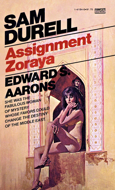
Assignment Zoraya, by Edward S. Aarons (Fawcett Gold Medal, 1977). Deadly Dames and Sexy Sirens explains that when Ron Lesser’s painting was printed on this novel, “the image was flipped, which is why his signature is backwards.”


This is the first time my byline has appeared on the front of a book without my expecting to find it there. The work in question is The Art of Ron Lesser Volume 1: Deadly Dames and Sexy Sirens, a gorgeous, full-color collection of 81-year-old artist Ron Lesser’s classic paperback and movie poster art. It was published late last month, and has already won a flurry of favorable critical responses.

According to Robert Deis, a South Florida authority on the art of vintage men’s adventure magazines, it was a lengthy 2018 interview I conducted with Lesser for Killer Covers that gave him the idea to create this 145-page book. Together with Bill Cunningham, the Southern California-based head of Pulp 2.0 Press (and his collaborator on Men’s Adventure Quarterly magazine), and with Lesser’s enthusiastic approval, they set about gathering together prime examples of the painter’s work from the last six and a half decades. Because they introduce this hardcover book with a slightly edited version of my original interview, I was given a cover credit.

Much to my delight, I should add.

I have a much-prized collection of volumes having to do with paperback cover art and artists, among them Ed Hulse’s The Art of Pulp Fiction: An Illustrated History of Vintage Paperbacks, Colin Larkin’s Cover Me: The Vintage Art of Pan Books: 1950-1965, Art Scott’s The Art of Robert E. McGinnis, and Mort Künstler: The Godfather of Pulp Fiction Illustrators, which was co-edited by Bob Deis and Wyatt Doyle. Deadly Dames and Sexy Sirens certainly holds it own with the best of those. Not only is it handsomely illustrated with Lesser’s finished pieces, original art, and some of the model photographs to which he referred when creating his canvasses, but it also features comments from Lesser about his artistic techniques and spreads that highlight a selection of his favorite female models, including his wife of four decades, Claudia. (Click here to enjoy an online sneak peak at some of this book’s contents.)
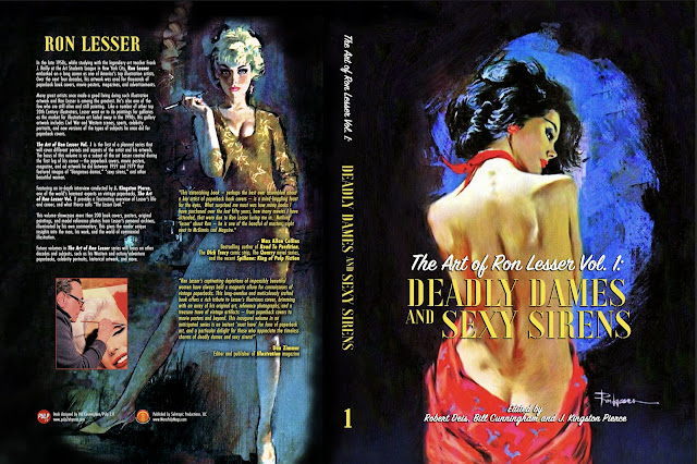
The full cover of Deis and Cunningham’s tribute volume.


Recently I took the opportunity to question Deis and Cunningham—via e-mail—about their new book. The results are quite wide-ranging, and cover everything from their introductions to Ron Lesser’s prolific artistry and their innovative design for Deadly Dames, to their collaboration process with the book’s subject and the lengths to which they went in acquiring specimens of his work (an endeavor that often drew the aid of South Carolina resident Tim Hewitt, a former tech writer and “web monkey,” now an ardent paperback collector who says he owns “somewhere around 350 books with Lesser covers”).

Amazingly, this study of Lesser’s life and labors is only the initial installment in a planned series of similar tributes. Bob Deis (who also co-edited a recently released compilation of Lawrence Block’s early stories) says “there could be more than three volumes” to come, exploring differerent periods of the painter’s career and the diversity of literary genres to which he has contributed. Like other old paperback fans, I shall be waiting anxiously to snap those up, too—whether they have my name on their fronts or not.

J. Kingston Pierce: Do you recall how you were introduced to Ron Lesser’s artistry? And what was it about his work that most caught your eye? Are you, perhaps, longtime collectors of his book covers?

Robert Deis: About 20 years ago, I began collecting and studying men’s adventure magazines published in the 1950s, 1960s, and 1970s. That led me to write a blog about them and the artists and writers who worked for them. I sought out and did interviews with a number of those artists and writers who were still alive, and that led to connections with other MAM fans. One of them was Wyatt Doyle, head of the New Texture indie publishing company. In 2012, Wyatt and I started publishing books that reprint MAM stories and artwork. We’ve also done a series of art books focusing on particular artists, including Mort Künstler, Samson Pollen, Gil Cohen, and George Gross.
(Right) Girl from Havana, by Eric Colby
(All Star, 1966).


Most of the artists who did MAM artwork also did paperback cover art. Ron Lesser only did a handful of paintings for MAMs. I was vaguely aware that he was a major paperback cover artist, but it wasn’t until I saw your in-depth interview with Ron in 2018 that I realized just how major. And, it wasn’t until I saw the Lesser covers and artwork in that interview and your later “Lesser Look” posts that I focused on how great his artwork is. I was struck by how it reflects the beautifully rendered, often dramatically lit, attention-getting style common to other top paperback cover artists, like James Bama, Frank McCarthy, Robert Maguire, and Robert McGinnis. When I found out that, unlike those artists, there was no book about Ron’s artwork, I decided to try to fill that void. I contacted him and he was excited about the idea of doing a book.

That’s when I got into collecting books with Lesser cover art in a big way. Since paperback cover art was not a focus of the books I do with Wyatt, I asked book designer and publisher Bill Cunningham if he’d like to do a Lesser art book with me. I’d been working with Bill for about two years on a lushly illustrated magazine that showcases MAM stories and artwork, called the Men’s Adventure Quarterly, so I asked if he wanted to do a Lesser art book. He said yes—enthusiastically.

Bill Cunningham: To be honest, I wasn’t aware of Ron Lesser as an artist until Bob started sending over paperback covers, and I thought, “OK, this seems familiar.” Then I worked as the designer for Michael Stradford’s book Steve Holland: The World’s Greatest Illustration Art Model and realized that Ron created the covers for one of my favorite western paperback series, Fargo. That’s when I had an appreciation for what he did, as it was based on that emotional connection I had with the Fargo series. I branched out after that.

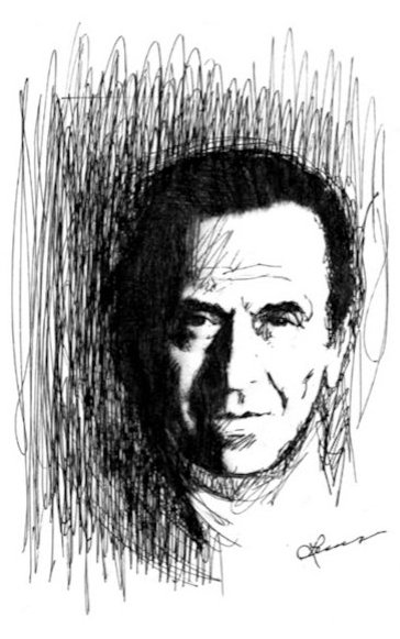
(Left) Lesser’s self-portrait sketch.

JKP: How would you rank Lesser among paperback cover artists?

BC: Obviously, my appreciation for him and his body of work has only grown as I’ve worked on this book. One aspect to the project that we’ve tried to explore is showcasing the man, his work, and the world he worked within. He was able to apply his skills to a variety of media—paperbacks, magazines, advertising, movie posters, and even landscapes and portraiture—and not every artist is able to pull that off. The fact he was skillful, talented, and flexible enough to do that is amazing and should be celebrated far more than it has been.

RD: To me, Ron ranks right up there among the top illustration artists who started out doing paperback cover art in the ’50s and ’60s. Clearly, the art directors at paperback companies felt that way. He did covers for almost every major publisher. I am especially fond of illustration art in the realistic style championed and taught at the Art Students League of New York, where Ron and many other great artists studied. Artists such as Jim Bama, Stan Borack, Mel Crair, Jack Faragasso, Roger Kastel, Robert Maguire, Frank McCarthy, Lou Marchetti, Rudy Nappi, Tom Ryan, and Robert E. Schulz.

JKP: How long ago did you decide to put this book together?

RD: We started working with Ron in 2021. After we realized he’d done thousands of book covers and movie posters, we decided a series of books was needed to do justice to Ron’s career.

For the first book, we decided to focus on his early illustration art from the ’50s, ’60s, and ’70s that features sexy women, one of the most common eyeball-grabbing subjects on books covers from those decades. I asked Bill to create a layout that would give a book showcasing vintage covers and artwork a fresh look, and figure out how to intersperse those visual elements with quotes I put together from phone interviews I did with Ron and reference photos he gave us. Bill succeeded far beyond my expectations.
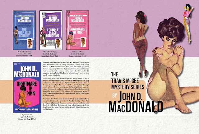

Ron Lesser and Robert McGinnis are the artists most closely associated with John D. MacDonald’s best-selling Travis McGee detective novels. “Both did many cover paintings for the 21 books in the series,” explains Deadly Dames, “and Lesser’s covers are often wrongly credited to McGinnis.”


BC: Applying our thoughts to celebrate the man, his work, and the world he worked in, we began to break down how we could accomplish this. We broke it down by years with sub-groupings of series here and there—the Travis McGee books, the Johnny Liddell series, etc.—and groupings of Ron’s model reference photos. It was comical at times, because we would get to a point where, after I had the layout going, Ron would send us an e-mail with some new piece for the puzzle—a cover we hadn’t seen, a note about a model, or even just an anecdote that would spin us off in a new direction. Then we would get a note from über paperback collector Tim Hewitt, who kept finding covers that Ron had forgotten about—and that would get the merry-go-round spinning again.

As far as the look of the book, I didn’t ever want to create a book that anyone could make. That is, a book with white pages and the art placed just so. It had to be a book that again reflected the man, the work, and the world. Many of the early pages mimic a mid-20th-century modern design aesthetic (or my version of it, anyway) to showcase that era of his work. We then progress into the “mod” ’60s, the’70s, and onward. Hopefully, the reader will subconsciously pick up on that and set the artwork within the right framework of time.
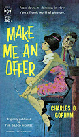
(Right) Make Me an Offer, by Charles O. Gorham (Berkley, 1962).

JKP: What were your initial expectations for this book? Who did you see as your audience?

RD: My interests—vintage paperbacks and magazines—are niches. Luckily, there are enough people interested in those niches that there is now a pretty good following for projects I do with Bill or Wyatt. And, I think books featuring Ron Lesser’s artwork will have broader appeal than say, the Men’s Adventure Quarterly Bill and I publish. You don’t really have to be a major vintage paperback or illustration aficionado to enjoy Ron’s amazing artwork and read what he says about what it was like to be an illustration artist in the ’50s and ’60s. As I write this, the book has only been available for a couple of weeks via Amazon worldwide, but early sales suggest that it will likely be one of our best sellers.

BC: My initial expectations for any project, whether it’s comics, pulp, or an art book like Deadly Dames, is to best tell the story that’s presented. If I take care of that first and foremost, I know that I can count on the book to have “legs.” I’m certain this book is going to appeal to paperback collectors, commercial art collectors, and those who appreciate good artwork. We tell Ron Lesser’s story during that period of time between 1959 and 1979. For most people, that would be a full career, but for Ron he was just getting started!

JKP: When did you first go about contacting Long Island, New York, resident Lesser and convincing him to participate in this venture? Did he agree right away to help, or was there arm-twisting Involved?

BC: I didn’t come aboard the project until Bob had already finagled the deal. That made it especially easy for me.

RD: I e-mailed Ron not long after I saw your interview with him on the Killer Covers blog. I told him I had published illustration art books featuring artists he knew, like the book Mort Künstler: The Godfather of Pulp Fiction Illustrators, and wanted to do a book about him. Naturally, he wanted to see those books before he agreed to anything, so I sent them to him and he liked them. As we talked about my love for illustration artwork and what elements we could showcase in a book about his, I think he realized we would do justice to his legacy and quickly became enthusiastic. No arm-twisting required.

(Left) Make My Bed Soon, by Jack Webb (Avon, 1965).

JKP: What was your working relationship with Lesser like? How involved was he in bringing this exceptional project to market?

RD: After Ron got on board, he was very heavily involved and very responsive to any requests we had, which were many. He sent us lists of his books, covers scans, anecdotes, photos, and suggestions on a regular basis. He also helped identify book covers as his (or not) that we thought looked like his, but didn’t have his signature. He also very carefully reviewed and weighed in on the layout, and the quotes we used, and sent us new images and quotes along the way as he saw layouts for various pages. For me, it was great fun to talk with Ron and learn about his life and work and what it was like to be an illustration artist during the heyday of illustration art. It was sometimes a bit hard on Bill, since we went through nine versions of the layout to address his suggestions and additions before it was complete.

BC: Ron is a lovely man, but he can be a bit picky and prickly. He is often overly critical of his own work. He would look at certain pages and say he didn’t like certain covers we wanted to include. Sometimes it was because there was an emotional component to it. Sometimes he didn’t like some minor aspect of a cover. Sometimes he had a different view on how to design certain pages. After a while, I understood that Ron approached every aspect with a critical eye, but didn’t realize that readers would enjoy certain things he didn’t like. For example, I think some of the covers he didn’t want to include for some reason are going to be the covers readers will remember most. Bob interviewed Ron several times, and I sat in with both of them when we reviewed several drafts of the book. My job as the designer was to listen more closely than anyone else and try to understand the nature of Ron’s critical eye on his work. Understand the man and begin to understand the work.

JKP: What’s the most interesting thing you learned about Lesser and his career over the course of putting this book together?

RD: The most amazing thing to me was when I began to realize just how much great artwork Ron has done over the past six decades and how varied it is. Between 1959, when he first became a professional artist, and the 1990s, when the market for high-quality illustration art faded away, he did thousands of paintings for book covers, movie posters, album covers, and ads for TV shows. Then, like many artists who started out in those realms, he went on to do western and Civil War paintings for galleries. He also did sports paintings and in recent years a lot of paintings of old and new female celebrities such as Marilyn Monroe, Bettie Page, Margo Robbie, and Gal Gadot. He’s also been doing new versions of his early paperback cover paintings. In fact, Ron is one of the last of the top mid-20th-century illustration artists who is not only still alive but still painting. He calls himself “the last man standing.” I also learned that Ron is a workaholic. Throughout his long career, he has worked on some painting virtually every day.
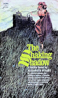
BC: Again, I think it’s the variety within his career. He did a bit of everything and has been doing it well for a very, very long time. That is something to be celebrated.

(Right) The Shaking Shadow, by Elizabeth Stuart (Signet, 1967).

JKP: What sort of challenges did you face in gathering all of the art for this volume? My presumption is that Lesser didn’t have most of the paintings you needed, so how did you find everything?

BC: Bob can speak to this better than I can, but Ron provided a wealth of material from his archives. The running joke was we would get a draft done and wait for Ron to find something new in his attic.

RD: One big challenge we faced was that Ron had been incredibly busy and he was so focused on getting paintings done and meeting deadlines, he didn’t keep a record of everything he did. So, we had to piece together the list of Lesser covers from various sources. The Killer Covers posts and Ron’s Web site provided good starting points. But he did many more covers between ’59 and ’79 than are shown on those. So, I had to do a lot of Googling and a lot of sleuthing on Facebook groups that feature paperback covers.

The other challenge was that many of the old paperbacks Ron did cover art for are hard to find and there weren’t good-quality scans of them online. Luckily, through Facebook, I connected with Tim Hewitt, who has a huge collection of vintage paperbacks and a great eye for IDing the artists. Tim had or searched out and bought scores of books we would not have otherwise had scans of. We also got help from other folks who hang out in those Facebook groups, who had certain books, or who owned original Lesser paintings and gave us photos of them. People such as art dealer Rubén Azcona, artist Joe Jusko, and art collectors Brian Emrich and Jimmy Willis.

JKP: Were there examples of Lesser’s early artistry that you just couldn’t locate, no matter how hard you tried?

RD: Oh, yeah. In fact, almost all of the original paperback cover and movie poster paintings Ron did between 1959 and 1979 are lost in space. They were not returned to him [by the folks who commissioned them], and he was too busy to worry about it at the time. He was focused on getting the next assignment done. And, unfortunately, Ron didn’t think about taking high-quality photos of them for later use. So, we could only find photos of a limited number of his originals from that period that have appeared on online art auction sites or that we were given by a handful of vintage art collectors. In other words, as far as specific examples of his original art are concerned, almost all are missing from the period covered by this first book. The good news is that, starting around 1979, Ron had large-format transparencies shot of his paperback cover paintings, and he gave us hundreds of those to use for Volumes 2 and 3.
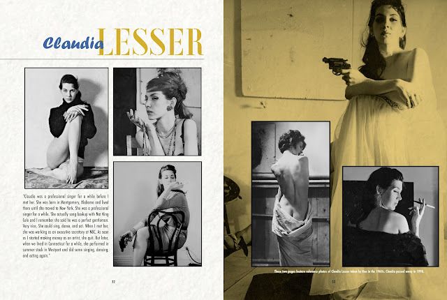

Lesser often used his wife, Claudia, as a model for his paperback cover paintings. Unfortunately, she passed away in 1998.


JKP: How did you choose the two Lesser paintings that made the front and back of this book? Did you know from the outset that those were going to be on the covers?

RD: Bill chose the front cover art, and Ron and I loved his choice. It’s Ron’s original painting for the 1962 Lancer paperback Curtains for a Lover, by Robert Dietrich, a pseudonym for Watergate conspirator and prolific novelist E. Howard Hunt. The model was Ron’s wife, Claudia, which made it doubly cool to me. Bill’s initial pick as artwork for the back cover turned out to be one of the ones Ron didn’t think was one of his best, so Bill suggested the painting Ron did for the 1965 novel The April Robin Murders, by Craig Rice and Ed McBain, and that was blessed by Ron. The model was Lisa Karan, one of his favorites in the ’60s other than his wife.

BC: The front cover has always been the front cover. From a design perspective, how could you go wrong with a single subject, brightly colored on a black background? You can recognize the cover immediately from yards away. The back cover changed when Ron didn’t like my choice of Crime of Their Life, by Frank Kane (Dell, 1962), because he thought the image looked “cartoony.” I initially chose it because it was a composition that stood out against a black background. It was a canvas that I could easily compose text against without intruding on the image itself. We went back and forth about it, because I really liked the painting and thought it worked for the book cover as a whole, and reflected what he was doing at the time. He thought it wasn’t his best work. We compromised by using the April Robin Murders artwork. It was also black with blue accents, and I could accomplish what I wanted to accomplish design-wise.
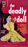
(Left) The Deadly Doll, by Henry Kane (Zenith, 1961).

JKP: And how hard was the culling process, when it came to choosing which examples of Lesser’s artistry could be squeezed into this book and which you had to leave out?

BC: By breaking things up into years, we were able to edit things rather rigorously at the outset. Occasionally, as I said earlier, Ron would find something we would want to add or store for future volumes. It blurs together sometimes, but Bob and I were usually on the same page when it came to what we thought readers would want to see. When layout edits came, I would take Bob’s initial ideas and lay them out, then rework or edit them as necessary in order to enhance the presentation and tell Ron’s story.

JKP: So Bob, you have said that Bill’s design for this book “is particularly fresh for an art book.” Can you be more specific?

RD: Sure. A lot of illustration art books tend to have page after page of full-page reproductions of original paintings or scans of a set of covers on a white background. Often the text is limited to the initial introduction. I told Bill I wanted to intersperse quotes from Ron and other text with images throughout the entire book, similar to what he does on layouts for the Men’s Adventure Quarterly magazine. I’d been working with Bill on the MAQ for over a year, and his layouts for those have design elements I said I’d like him to use for the Lesser book. Those elements are things like adding a “texture” to the pages and tinted patterns, so the pages are not simply white; blowups of parts of the artwork; sidebar-style text paragraphs; and other touches that are not common in art books. His designs for MAQ and other projects he’s done that I’ve seen, reflect Bill’s special vision as a graphic designer who likes to make people say “Wow!” when they see them. They are works of art in themselves, in my opinion, that creatively incorporate art and text elements. Ron told us he really loves the book design, too, which makes us very happy.

JKP: And Bill, what did you try to do with the presentation of this volume that was particularly innovative, satisfying, or a stretch for you to accomplish? What aspect of its design makes you most proud?

BC: Every project is a learning project—or should be. My goal was to figure out the best way to showcase Ron. Period. I especially like that I was able to take scans of Ron’s art and develop some good two-page spreads to focus on his brush strokes. It’s invaluable for the reader’s understanding of illustration. I look at Isle for a Stranger, The Third Spectre, and Horror at Gull House and see the swirl of a brush that creates a stormy landscape, or a dab of a dry brush that renders beautiful hair around a face. The thinking in “layers” I find fascinating, because I must think the same way in using Photoshop and InDesign in order to put the book together.

(Right) Horror at Gull House, by Patty Brisco (Belmont Tower, 1973).

JKP: You identify this work as “Volume 1.” Can you say yet how many more volumes you plan for the Lesser series, and what specific subject matter those sequels will cover?

BC: We have several planned, but as always, how many more volumes we create depends on how many books we sell. We are a boutique publishing entity. We live and breathe by readers buying our books and, more importantly, telling their friends they bought the books. We do this for the love of books, but we don’t get to do it if it costs us money.

RD: One future volume will focus on Ron’s western, crime, and action/adventure cover art. Another will showcase his post-1979 artwork featuring beautiful women.

BC: Ron has a diverse and extensive archive of art that appeals to different audiences, so there could be more than three volumes in the series. I am ready to design a book that showcases the celebrity portraits and gallery paintings he’s done. I’m also ready to design a book featuring all of the romance art he’s done for Harlequin and other romance publishers. Wherever there’s an eager audience, I want to be able to give them a book they can enjoy.

JKP: Is there going to be a paperback edition of Deadly Dames and Sexy Sirens released, or are you happy just putting out the hardcover?

BC: Yes, we plan to release a paperback, but it will be a while. Maybe late 2023.

JKP: After celebrating Ron Lesser in this major way, are there other vintage book illustrators whose work you’re hoping to explore with equal depth in the near future?

RD: Well, most of my other favorite artists who did paperback, magazine, and movie art in the ’50s, ’60s, and ’70s are dead, so we couldn’t do projects with them in the quite the same way we have with Lesser. But I do plan to do more books featuring the men’s adventure magazine artwork of Mort Künstler and Gil Cohen. And, although Samson Pollen has passed since Wyatt Doyle and I did two books with him (Pollen’s Women and Pollen’s Action), his wife, Jacqueline, has made his art and reference photo archive available to us. We recently tapped that for a third book, Pollen in Print: 1955-1959, and there’s plenty there for more books.

BC: We both have a lot of projects in the future. I am working with Michael Stradford to bring international adventure comics here to the U.S. in English. I’m also working with award-winning film editor Allan Holzman on the second volume in his Celluloid Wars film books, and republishing the Tom Corbett Space Cadet series of YA books. Of course, Bob and I are continuing to deliver Men’s Adventure Quarterly, and I have ideas to expand our offerings in that arena.

Monday, May 21, 2018

The Lesser Look: Bringing a Taste for Classical Realism to the Realm of “Sexy Crime Babes”


Curtains for a Lover, by “Robert Dietrich,” aka E. Howard Hunt (Lancer, 1962). This was Hunt’s seventh novel starring Washington, D.C.-based accountant-cum-detective, Steve Bentley. Enjoy Ron Lesser’s original artwork here.


When I asked Charles Ardai, the editor of Manhattan-based book publisher Hard Case Crime, for a comment about once-prominent U.S. paperback artist Ron Lesser, he was quick to respond.

“I’m delighted you’re going to be featuring Ron on the site!” wrote Ardai, who has purchased at least three paintings from Lesser for use on Hard Case releases over the last decade. “He’s a terrific guy, and one of the last painters of the paperback-only era still working today. Like his contemporaries, but unlike most current painters, he’s got the training and skill at draftsmanship and anatomy to give the people he paints that extra degree of realism that makes classical painting just leap from the cover of a book. He works traditionally, not digitally, and that shows too: you can tell when a painter is manipulating pigment rather than pixels. You can see Robert McGinnis’ influence in his work, and at his best I think his work is in that league, which I mean as the highest possible praise—very few painters have ever come close to McGinnis, even at their best.”

Lesser, at 76 years old, isn’t nearly as quick to toot his own horn when I ask him how his artistry compares with that of the numerous paperback illustrators he competed against during the mid- to late-20th century, most of whom are no longer around. “I would sound like an ass if I answered that question,” he remarked in a recent e-mail note. “I am not that conceited.” Lesser later explained that he’s talked occasionally with his agent about assembling a handsome book-length collection of the paintings he has devised over the last half-century, but jokes that there may be no market for such an opus. As an alternative, he suggests “maybe a pamphlet, about three pages [long].”

(Right) Ron Lesser

But really, three pages wouldn’t even begin to tell the story of Lesser’s influence on what was once a thriving business in paperback-cover art, much less elucidate the many successes he has seen since that market dried up.

Born in the central New York City borough of Manhattan, Lesser was the only child of a father in the ice-cream trade and a housewife mother. As early as his grade-school years, he developed an interest in drawing and painting, which eventually led him to enroll at the city’s eminent Pratt Institute, and subsequently at the Art Students League of New York (ASL), where he studied with Frank J. Reilly. As Lesser’s Web site explains, “Reilly taught drawing, painting, color theory, and educated Ron in what he needed to learn most—the fundamental principles behind creating art.” Lesser fashioned his first paperback cover illustration while he was still an ASL pupil; he continued to generate such canvases into the 1990s, by which time he had produced “several thousand paperback covers”—the majority of them for crime and Western novels—and become one of the field’s foremost practitioners. Meanwhile, he took on assignments painting advertisements as well as Hollywood movie posters, the latter enterprise resulting in his design for such iconic placards as those plugging the 1973 picture High Plains Drifter and the James Coburn/Kris Kristofferson flick, Pat Garrett and Billy the Kid, which also debuted that same year.

Keeping busy was important to Lesser for more reasons than one. He had a family to support, having met and proposed to a woman named Claudia (a onetime back-up singer for Nat King Cole) when they were both 18. “I was a baby,” he remembers. “My parents disapproved. It was a problem for many years.” After their marriage, the couple bore a son, and Lesser enlisted Claudia periodically as one of many cover models he used over the years. Sadly, Claudia passed away in 1998.

Book and magazine illustration saw its heyday from about the 1930s through the 1970s. After that, publishers started cutting back on the expense of commissioned paintings. Cheaper photography encroached on demand for drawn art, and the 1990 introduction of Adobe Photoshop substituted computer manipulations for what artists had previously accomplished by hand. At the height of his long career, Lesser had turned out cover illustrations for books by John D. MacDonald, Frank Kane, Carter Brown, Richard S. Prather, and many others. As demand for such works fell off, Lesser—then in his 50s—painted and sold what have been called “visual sagas of the Old West and Civil War.” In the years since, says his Web site, Lesser’s work “has graced the covers of the most prestigious Civil War publications and has been exhibited at the Gettysburg National Park Museum and the National Civil War Museum,” both of which are located in Pennsylvania. In addition, he has painted action scenes focusing on polo horses and their riders, historical still-lifes, distinctive celebrity images, and “romantic fantasy” works.

Lesser currently lives on New York’s Long Island, where I reached him via e-mail. He was kind enough to answer my myriad questions about his life and career, and to separate cover paintings he’s actually done from others that have been mislabeled (on the Web) as demonstrating his talents. During our interview, we talked about his education as an artist, his early work for “big-time illustration agencies,” his “sexy girly covers” for paperback crime fiction, his movie-poster endeavors, his preferred models, and his continuing labors on behalf of book publishers and movie-production companies. Ron Lesser doesn’t seem remotely inclined toward giving up his artistic occupations at any time soon. And he might not have to—after all, Robert McGinnis is 92 and still turning out beautiful canvases.

J. Kingston Pierce: How did you develop your interest in art? Were there people in your family or among your friends who influenced you to become an artist?

RL: I loved comic-book drawings when I was very young, around 9 to 12 years old. Especially the best-drawn comics. I loved Alex Raymond—he was the cartoonist best known for Flash Gordon. I loved Milton Caniff—he made Terry and the Pirates and Steve Canyon. I liked Al Capp, who made Li’l Abner and Daisy Mae. Also Superman, Batman, etc. I still love Caniff and Alex Raymond, both outstanding artists.

JKP: At what point in your boyhood did you start to draw? And what were you drawing then—your own comic books, perhaps?

RL: I don't remember when I started to draw, probably when I was around 12. Probably comics.

JKP: You showed artistic potential early in life. How was that potential demonstrated, and was it your parents who recognized it?

RL: That is a tough question. My parents showed little interest in my “artistic potential.” It was never discussed.

JKP: Biographical notes available online say that you graduated from New York City’s High School of Music & Art. In what year did you graduate from there?

RL: I believe it was 1958.

JKP: After leaving high school, you studied at the Pratt Institute of Art in New York. During what years were you a student there?

RL: I went to Pratt in 1958, but stayed less than a semester.

JKP: You dropped out of Pratt early? Why?

RL: I realized that my goal was to be an illustrator and I would never achieve my goal at Pratt. The illustration program was for amateurs. I went to the dean and told him I was leaving. He tried to talk me out of leaving, but I would not be persuaded. I would never reach my potential if I stayed at Pratt. For me, it was a waste of time.

JKP: So, I am given to understand that shortly after leaving Pratt, you enrolled in the Art Students League of New York (ASL). Was it an eye-opening or intimidating experience to be among students as concentrated as you were on artistic expression?

RL: At the League I studied with the great teacher of drawing, painting and illustration, Frank J. Reilly. I certainly was intimidated at first. The best students were outstanding. And these were students. I realized that if I was to succeed I had a lot to learn. I was talented, but not close to competing as a professional.


Ron Lesser recruited his wife, Claudia, as a model in many of his paperback covers. Above are six of the artist’s favorite fronts on which she appears: The Crossroads, by John D. MacDonald (Crest, 1960); The Temptress, by Carter Brown (Signet, 1966—see Lesser’s original artwork here); So Willing, by Sheldon Lord and Alan Marshal (Midwood, 1960); The Deep Blue Good-by, by John D. MacDonald (Fawcett Gold Medal, 1981); Concerning a Woman of Sin, edited by Daniel Talbot (1960); and The Name Is Jordan, by Harold Q. Masur (Pyramid, 1962). Claudia also modeled for Curtains for a Lover, shown atop this post.


JKP: I’ve read an abundance of favorable comments about Reilly’s teaching style and his ability to inspire students. But how did he come across to you? And was Reilly especially influential in your own artistic development? What classes did you have with Reilly?

RL: I only studied with Reilly at the League, no other teacher. The ASL is not like a “normal” school or college. There are no grades, no graduation. You enroll with a specific teacher, not with a series of teachers and classes.

Reilly was much more than influential. I would never have learned to draw and paint if I had not studied with Reilly. A Reilly class was like going back in time to what is now considered the “Golden Age of Illustration.” He taught me the tradition and techniques of the French Fine Arts Academy of the 19th and 20th centuries. Reilly was a link to Jean-Léon Gérôme, Paul Delaroche, Jules-Joseph Lefebvre [as well as to] American artists George Bridgman, Dean Cornwell, and Howard Pyle. I do not believe anything like that exists today. I also attended his classes at Woodstock [New York] in the summer; those were for landscape. I really do not recall exactly how I came to enroll with Reilly. I am sure I must have heard about him at Pratt.

JKP: Were you also studying art beyond the classroom, too?

RL: I went to the Metropolitan Museum of Art many times to look at the amazing paintings there. Since the Met is a public museum, all paintings are open to the public, but only a portion are on exhibit. [Others can be retrieved by request.] I remember I gave whoever was in charge of this sort of thing a list of paintings I wanted to see. Several months later I received a notice to appear at a date certain at the museum. I went down into the bowels of the Met with the slip I was given, along with a guard. A huge door was opened. The guard pulled out the paintings I requested to study. It was like a Norman Rockwell cover for The Saturday Evening Post: The guard sat in a chair with a newspaper looking bored and thinking what kind of nuisance and fool I was. Hundreds of paintings in the museum, and I was making all this work for him. All the while I was getting as close as I could to these marvelous paintings to study their craft.

JKP: How long did you wind up studying with Reilly at the ASL?

RL: Four years. The last year, I was a monitor—like a student teacher.

JKP: So in what year did you graduate from the Art Students League?

RL: One does not “graduate” from the League. I went back to visit on occasion. Reilly left the League soon after I left his class, to set up his own school. That was a mistake. He needed the League. He died shortly after he left.

JKP: What did you do for work in those first years after leaving the ASL? Did you move into commercial art/illustration, or did you take another path? Were you working freelance or for a company?

RL: I was making paperback covers while I was at the ASL. I was with the Fredman-Chaite Studios for a short time. There were several big-time illustration agencies that partnered with illustrators through the late ’30s and ’50s. The agencies took their cut from advertising jobs. [But] the illustrators were not required to give the agency a cut from editorial work, magazines, paperback covers, etc. The idea being, from the agencies’ point of view, [that] magazine commissions were good for promotion, [helping] to acquire the advertising jobs which paid a lot more. However, photography was rapidly moving into the space that the illustrator had had to himself for years. So by 1965 the large illustration agencies, like Fredman-Chaite and [Charles E.] Cooper Studios, went out of business. When I was starting I made Western and sexy crime babes to be used for paperback covers on spec, and sold them. Since Westerns were for the most part generic, as were the sexy girls, they were not hard to fit for a cover.


Ron Lesser produced two full-color promotional posters for the 1970 film Ryan’s Daughter. “My wife posed for all three, of course,” he says. “It was not common for one artist to make three paintings for the same movie. The [James] Bond movies were an exception.” Lesser also created a third, black-and-white poster, which was used in newspapers and can be seen here.


JKP: How did you start selling movie-poster art to the Hollywood studios? Were you mostly doing that on spec, too? And what was your first movie poster sale?

RL: Movie art was never on spec, except on this one occasion for [Metro-Goldwyn-Mayer’s 1970 romantic drama] Ryan’s Daughter. That was my first movie painting, for Ryan’s Daughter. I came onto that opportunity very late. While at my agents’ office, I noticed some artists were making sketches for the movie. I asked what that was about. I was told they were making sketches for Ryan’s Daughter, a big-time movie directed by David Lean. I wanted to get in on that. Remember, I was a novice at that time—no résumé at all. My agents laughed at the idea [of me winning the job]. I was told that every illustrator with a reputation in New York was working on this. There were meetings that they attended with the client. No way could I expect to get this opportunity. But I would not be deterred. Somehow, I was given a fact sheet and acquired some movie stills. I made two paintings. They were submitted to MGM … and they loved them both. I won the contest!

JKP: How many film posters have you painted over the years?

RL: Probably over 100, if you include ads for television.

JKP: I’ve heard that your favorite from among those posters was the one you did for the 1973 film High Plains Drifter.

RL: Only because it became an iconic poster and led to several Clint Eastwood movie commissions. Other than that it is not my favorite.

JKP: Which leads me to ask, of course, which was your favorite?

RL: Probably both paintings I made for Ryan’s Daughter. Claudia was my model for both of these paintings.

JKP: Were you actually employing her for that work?

RL: She was not employed. I did not pay Claudia. She did not like to pose, although she was a very good model. As soon as I could afford to pay models, I stopped using her most of the time, although I could get her to pose when I wanted to. One time I lost all of a [model pose] shooting I took in New York City, and I recovered by shooting Claudia. I’d left the photography on the subway.

JKP: Do you continue to take on movie-poster assignments?

RL: Of course, but there are very few opportunities for movie art today. I recently did the art for Atomic Blonde with Charlize Theron. [You can see his work here.] That was a pleasure painting the beautiful Charlize Theron. I have always loved to paint gorgeous women. Beautiful women are the most fun for me to paint.

JKP: Let’s move on to the subject of your book covers. Do you remember which of those was the first one you worked on?

RL: Reilly had several contests during the year [at the ASL]. I came in second in one contest. It was [for] a Western scene and was used by the client, Berkley Books, [on a 1960 William O. Turner novel] titled War Country. I think that was the first time I was published.*

JKP: Approximately how many paperback book covers have you painted over the years?

RL: I made several thousand covers. Too many to list a favorite. I was awarded several gold medals and best-of-show certificates from The Society of Illustrators. [I also won] Best Movie Art from the Art Directors Club of New York. That painting was for [the 1974 science fiction/fantasy film] Zardoz, starring Sean Connery.

JKP: I’m surprised to say I don’t know the answer to this: Have you painted covers for hardback books as well as paperbacks?

RL: Yes, many covers.

JKP: Which paperback publishers kept you the busiest?

RL: Dell, Fawcett/Gold Medal, New American Library/Signet, Harlequin, Avon—really, all of them.

JKP: How have you usually gone about creating book-cover art?

RL: I am assuming you are talking about a commission. During my major illustration career, the client paid for all expenses. I would photograph the job using models. Often I would make sketches after the photography was done. If additional photography was needed, I usually could piggyback the additional photography [on] the next session. This was not a problem, since I was always booked for several months, so there was always another job.

JKP: And can I assume you didn’t actually read the books for which you were creating art, but that publishers gave you suggestions of what they’d like to see in your finished work?

RL: That would depend on the type of cover. You are right, I never read the books. The “girly books” rarely fit the book cover [art]. I had two different paperback careers. For the first nine to 10 years, I made Western and girly covers. I am best-known for my “sexy girly covers.” However, for the years I was very successful, I made mass-market covers with famous authors. That was for about 15 years … For these covers, the art did fit the story.

JKP: I am most familiar with those sexy girly covers. When you say you later “made mass-market covers with famous authors,” to which authors do you refer? Two or three names will suffice.

RL: Jack Higgins, Helen Hooven Santmyer, Peter Albano.

JKP: Have you had some favorite models for your paperback work? It looks as if the extremely popular Steve Holland might have appeared on some of your Westerns—is that correct?

RL: I used Steve Holland a lot; however, he was used so much by so many artists, that some publishing companies asked me not to use him. The only other time I can think of that a company asked me to use a model less, because I used her so much, was Harlequin Books. The model's name is Jane Minion. I hope she will not have an issue with my naming her. She was the best female model I ever used.


Here’s a selection of Ron Lesser cover art featuring model Jane Minion. Above: The full, original painting for Goodly Heritage, by Beverly McGlamry (Ballantine, 1986—published cover here). Below: When Dragons Dance, by Elliot Tokson (Avon, 1982); Cover Stories, by Robert Rosenblum (Dell, 1980—original artwork here); The Armor and the Veil, by Jeanne Lancour (Dell Emerald, 1982); and Flowers of Betrayal, by June Triglia (Onyx, 1981—original artwork here). Click on these images for enlargements.


JKP: Did you paint your book covers in oil, or in some other medium? And what size canvases did you prefer for such assignments?

RL: Early in my career, I used water-based designers’ colors with casein white. Most of my career I used oil. Size varied.

JKP: You’re probably best known for having painted the fronts for crime and Western novels. But have you also created covers for many romance novels, or for works of science fiction?

RL: I made several hundred covers for Harlequin [in the 1980s]. I was given a two-year contract from Harlequin. I was required to make at least one cover a month. That was to leave me time for other publishing covers and different subjects. However, Harlequin gave me so much work for the length of the contract, that there was no time available for anything else. I refused to renew, because I did not want to do another romance cover. I still continued to paint for Harlequin, but not exclusive. No science fiction.

JKP: You created a large quantity of book covers during the 1960s and ’70s. Not long after that, though, publishers started to substitute photographs for drawn or painted artwork. What was that transition like? Did it seem sudden and frightening, or was there ample forewarning? And was the reason for the switch-over based solely on money (photos being cheaper), or were there other considerations in play back then? I’m interested to know your perspective.

RL: The transition from art to photography for paperback covers did not happen until 1992, for the most part. During the ’60s through the ’80s, there was not a problem regarding photography and Photoshop. However, since 1985 there has been very little movie art done. The movie posters were all done in California using movie stills. Advertising using illustrators had been long gone, back to the early ’60s.

Yes, [the transition] was sudden. Overnight, many excellent illustrators were out of business. The publishing companies discovered Photoshop. They could get a cover made for $1,000 instead of $3,500 to $5,500. That was the biggest reason. I switched to galleries, painting Western art.

JKP: In recent years, you’ve begun painting paperback covers again, this time for Hard Case Crime. Did Charles Ardai have to do much persuading to get you back into the business, or were you ready to tackle such art again? And can we expect to see more of your work on Hard Case releases in the near future?

RL: I loved painting [Ardai’s] covers. As to my doing more for Hard Case, you’ll need to ask Charles. [Editor’s note: Ardai tells me, “We don’t currently have any covers assigned to [Lesser], but I was chatting with his representative just the other day about the possibility of getting him involved with our comic-book line at some point, so who knows? We don’t publish nearly as many new books per year now as we did a decade ago, so we don’t have as many covers to assign, but it would certainly be fun to work with Ron again at some point.”]

JKP: You’ve firmly established your artistic reputation as a realist. What made you inclined toward fine realism, while many others preferred more abstract expression?

RL: I do not recognize abstract or any other -ism as a legitimate form of art, except fine realism.

JKP: At what point did you become interested in Old West still-life paintings, as opposed to Western book-cover art?

RL: I have a large collection of western material, Indian weapons and material. About three years ago I made this series.

JKP: How did a New Yorker become enamored of Old West subjects? Can we credit your work on Western novel covers for that?

RL: I loved making Western paintings. Not as much as painting sexy babes, but after that. Jimmy Bama and Frank McCarthy were New York artists. Bama was also a Reilly student.

JKP: Finally, let me ask what projects you’re working on now.

RL: I started this new series of paintings about seven weeks ago. It is market- and sales-driven. The series is the “Timeless Beauty of European Medieval Village Streets.” I plan to make these paintings as long as they sell. I have never made paintings for vanity reasons. Since I left Reilly I have always been a commercial artist.


Two pieces from Lesser’s new “Timeless Beauty of European Medieval Village Streets” series. Above: “Beautiful Ancient Village of Provence, France.” Below: “Ancient Village Street in Southeastern France.” More can be found here.


* Subsequent to this interview being posted, I was contacted by Killer Covers reader Rubén “DaCollector” Azcona. He suggested that Lesser had erred when he identified 1960’s War Country as the first book on which one of his paintings was featured, and said an example of Lesser’s art had earlier appeared on a different Western novel, 1958’s Lead in His Fists, by “Tom West,” aka Fred East (Ace D-276). Naturally, I asked Lesser about this, and he agreed that Azcona was right, but added: “I really do not like the [Lead in His Fists] painting.”

* * *

To see more of Ron Lesser’s fine-art work, check out the following Web sites: Going to the Sun Gallery, Whitefish, Montana; Aspen Grove Fine Art, Aspen, Colorado; West Lives On Gallery, Jackson Hole, Wyoming; and River Road Gallery, Wilton, Connecticut.