
 Slay Ride, by Frank Kane (Popular Library, 1952)
Friday, December 25, 2015
Wednesday, December 23, 2015
Now Vixens!

I remember when I was a child at Christmastime, listening to my mother read Clement C. Moore’s famous 1823 poem, “A Visit from St. Nicholas” (better known as “The Night Before Christmas” or “’Twas the Night Before Christmas”). Slightly less than halfway through Moore’s work can be found these verses:
When, what to my wondering eyes should appear,Well, after I’d heard those lines a few dozen times (or more), I started to wonder about the names of jolly old St. Nicholas’ eight high-flying reindeer. Dasher, Dancer, Prancer, and Comet all seemed suggestive of the creatures’ career-making fleet-footedness. Cupid, I conjectured, was the lover-not-a-fighter among the group. Donner and Blitzen never made a whole lot of sense to me. The former I could associate solely with California’s 19th-century Donner Party (though that pioneering group’s disastrous mountain crossing didn’t take place until two decades after Moore sat down to pen his poem); the latter moniker seemed even less connectable, for surely it could have nothing to do with Nazi Germany’s World War II Blitz attacks on Great Britain, yet I had no other ideas on its source. Only in recent years has “blitzen” become synonymous with “amazing” or “cool,” and also been linked with drug culture (“blitzen” meaning “getting high,” usually via marijuana). To learn that Donner and Blitzen weren’t even those reindeers’ original names further confuses the matter.
But a miniature sleigh, and eight tiny rein-deer,
With a little old driver, so lively and quick,
I knew in a moment it must be St. Nick.
More rapid than eagles his coursers they came,
And he whistled, and shouted, and called them by name:
“Now, Dasher! Now, Dancer! Now, Prancer, and Vixen!
“On, Comet! On, Cupid! On, Donner and Blitzen!
“To the top of the porch! to the top of the wall!
“Now dash away! dash away! dash away all!”
So what about Vixen? The name has been applied to ships and computer games, sports teams, films, and even an all-female rock band, though all of those date from many years past Clement Moore’s time. Vixen is the term, as well, for a female fox. And in the same way that “fox” has come to mean an unusually attractive woman, so “vixen” has been applied to women who are sexy and flirtatious, or those with fiery tempers. It’s impossible to guess what
 Moore’s inspiration might have been, but it seems more likely that he had a female fox (of the canine sort) in mind when he christened his reindeer than some observably curvaceous lass.
The other day, while browsing through the amazing Pulp Covers site, I happened across the front from the 1959 Crest Books edition of The Vanishing Vixen (shown atop this post). Composed by Roy B. Sparkia (1924-1992), who also produced such works of fiction as 1956’s Build My Gallows High (not to be confused with Geoffrey Homes’ 1946 book of the same title) and Paradise County (1974), The Vanishing Vixen is described as “a power-packed novel of suspense, sex, and sabotage.” I can’t attest to those contents, but this volume certainly offers an eye-catching cover, painted by Barye Phillips, that’s complete with an inviting young blonde and a rocket that’s busy blasting past its gantry.
This reminded me that there are other novels out there bearing “vixen” in their titles. Above and on the left, for instance, is Not I, Said the Vixen, Bill S. Ballinger’s 1965 legal thriller, with cover art by Bill Johnson. I don’t have information about all of the illustrators represented below, but I do know that Robert McGinnis created the artwork for The Velvet Vixen (Signet, 1964), by Carter Brown; Michael Koelsch was responsible for the cover of The Frost-Haired Vixen (DAW, 2006); Frank Yerby’s The Vixens (Pocket, 1950), like The Vanishing Vixen, boasts a Phillips graphic; Robert Bonfils gave us the front for Vice Ring Vixen, by J. X. Williams (Greenleaf/Pleasure Reader, 1969); and it’s Carl Stricker’s talents being displayed on that 1948 Avon edition of Valley Vixen, by Ben Ames Williams.
Click on any of these images to open an enlargement.


Furthermore, there are a number of novels with cover lines that contain “vixen.” The 1963 U.S. edition of Hank Janson’s Kill Her with Passion (with cover art by Harry Barton) being one example; John Pleasant McCoy’s Big As Life (Pocket, 1951) being another.


Something tells me that Clement C. Moore, a onetime president of New York City’s Columbia College (later Columbia University) and the developer of the General Theological Seminary, would not have approved of any of these works. No, not at all.
READ MORE: “The New York Christmas Tradition in an Uptown Cemetery” (The Bowery Boys).
Tuesday, December 15, 2015
The Kids Aren’t Alright

Childhood’s End, by Arthur C. Clarke (Ballantine Books, 1974,
with cover art by Dean Ellis).
Nowadays my genre fiction reading is confined almost exclusively to crime, mystery, and thriller novels. But like many people, I was a big science-fiction enthusiast during my teenage years. I consumed a fair breadth of works in the field, though my favorite authors were definitely Arthur C. Clarke and Larry Niven.
I can’t tell you without question which SF novel I first purchased, but I’m pretty sure it was Childhood’s End, Clarke’s 1953 alien-invasion yarn. I’ve read that book several times over the decades since, and manage to enjoy it on every occasion (even though I know how the story will end). Due to other commitments, I missed seeing last night’s premiere of the Syfy channel’s three-part adaptation of Childhood’s End, but hope to catch up with it very soon. Meanwhile, I’ve collected below a variety of the covers that have graced Clarke’s novel at different times, including the first, white-backdropped one on the left below (1971, with artwork by Dean Ellis), which is the edition I originally read and still have in my library.
Click on any of these images to open an enlargement.


READ MORE: “Childhood’s End and Remembering Arthur C. Clarke,” by David Brin (Contrary Brin); “Here’s 10 Best Sci-fi (Science Fiction) and Fantasy Books You Must Read” (Shelfie).
Sunday, December 13, 2015
Facing Up to Macdonald’s Fiction


As I already noted in The Rap Sheet, today marks the 100th anniversary of the birth of Kenneth Millar, who—using the byline “Ross Macdonald”—would write two dozen crime novels between the 1940s and the 1970s. Eighteen of those would star an especially compassionate Los Angeles private eye named Lew Archer.
My introduction to Macdonald came during high school, when I devoured the first book in the Archer series, The Moving Target (later to be adapted into the Paul Newman film Harper.) Although that novel was originally published by Alfred A. Knopf in 1949, I had access only to a much later edition, a paperback version released by Bantam Books in the 1970s. It was part of a series of Macdonald works, all using the same cover-design format, which featured bold and shadowed serif type, with narrow panels at the bottom through which could be glimpsed portions of photographs, most often featuring women. (That format was also used in the main opening titles for the 1974 NBC-TV pilot film The Underground Man, starring Peter Graves and based on Macdonald’s 1971 novel of the same name.)
I wound up collecting most of those Bantam editions, though I missed two—The Wycherly Woman and Black Money—probably because I began buying them all at a time when they were being replaced by newer editions. Those paperbacks have traveled with me from apartment to apartment, house to house over the years, and they still make up a prized part of my crime-fiction library. Earlier today, as I was writing about Macdonald for The Rap Sheet, I pulled those handsome Bantam editions off my shelves and scanned them. You can see the results above and below (click for enlargements).


My recollection is that The Goodbye Look was the final Macdonald novel to follow that familiar Bantam format. In the late ’70s, new cover illustrations were commissioned from American artist Mitchell Hooks. Being young at the time, I didn’t realize how interesting those revised paperback editions looked, so failed to pick up any but the last installment in the Archer series: The Blue Hammer.
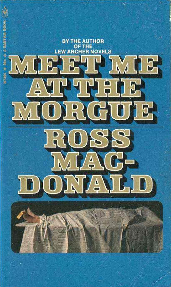
Incidentally, it wasn’t only Macdonald’s Archer tales that were uniformly formatted by Bantam during the 1970s. So were his less-well-remembered, non-Archer novels, including Trouble Follows Me, Blue City, Meet Me at the Morgue, and The Ferguson Affair.


Finally, let me pose a question: How many of you out there still have some of these Bantam Macdonald editions decorating your tall bookcases? They used to be everywhere!
READ MORE: “Two New Lews” and “Getting Hooks into Archer,”
by J. Kingston Pierce (Killer Covers).
Thursday, December 3, 2015
A Face to Fall For
This cover of Angel Face (Macfadden, 1970) makes no visual sense. In the upper left-hand corner, we have the giant noggin of ubiquitous paperback model Steve Holland. In the middle appears a shapely blonde wearing either a blouse or a short, see-through negligee, and high heels on her feet, but evidently nothing in between. Finally, there’s a dark-haired, dark-suited gent falling to his death from the heights of a brick building--he’s the only one, it seems, who is unable to defy gravity in this illustration. I can only surmise by the cover line (“Her profession was love, but all she knew was hate”) that the blonde had some complicity in that man’s tumble.

I don’t know who was responsible for this peculiar artwork, but the author of Angel Face was Fan Nichols (married name Frances Nichols Hanna), who concocted romance and crime novels during the mid-20th century. Among Nichols’ other books were Be Silent, Love, One by One, and The Loner.

I don’t know who was responsible for this peculiar artwork, but the author of Angel Face was Fan Nichols (married name Frances Nichols Hanna), who concocted romance and crime novels during the mid-20th century. Among Nichols’ other books were Be Silent, Love, One by One, and The Loner.
Tuesday, December 1, 2015
Would You Like to Have a Seat?

Frankly, I didn’t even notice it when I put up the front of Leslie Charteris’ Thanks to the Saint last week, but that Pocket edition’s cover painting by Darrel Greene shows a well-proportioned redhead seated in what’s known as a Butterfly chair, a style of sling chair often associated with mid-20th century architecture. After seeing my post, Art Scott, an authority on book-cover illustrations and the co-author of last year’s The Art of Robert E. McGinnis, wrote to point out that Thanks to the Saint doesn’t represent the only instance of a Butterfly chair landing on a classic crime novel’s façade.
In fact, Scott explains, “one of the sidelight digressions” of a paperback cover-art slideshow he has presented at Bouchercon and other events looks at “popular props,” including sling chairs. Or as he calls them, “Chinese finger traps for your butt.”
Probably like a great many of you, I have found myself sinking down into many Butterfly chairs over the years, but I’ve never known anything about their history. Until today. Anna Hoffman, a contributor to the Web site Apartment Therapy, writes that
The Butterfly Chair is known by many aliases: the Hardoy chair, the sling chair, or the BKF chair. In my college dorm room, it was the Nap Chair, as close to a hammock as we could get inScott sent along half a dozen examples of other paperback fronts incorporating Butterfly chairs. At the top of this post, for instance, you’ll see The Living End, by Frank Kane (Dell, 1957), showcasing an illustration by Victor Kalin. On the right is Case of the Laughing Virgin, by Jonathan Craig (Gold Medal, 1960), with artwork again by Darrel Greene. And you’ll find embedded below: Felicia, by Mark Dane (a pseudonym used by the prolific Mike Avallone; Belmont, 1964); Gold Comes in Bricks, by A.A. Fair (actually, Erle Stanley Gardner; Dell, 1961), with a cover illustration by Robert McGinnis; Strangle Hold, by Mary McMullan (Dell, 1953), featuring cover by Fred Scotwood; and The Myopic Mermaid, by Carter Brown (Signet, 1961).the wintry Northeast. By any name, the chair has been wildly popular since its creation, offering users an easy-going surfer dude of a lounger. But despite these relaxed associations, the chair’s origins are rooted in serious history, from 19th-century military furniture to Le Corbusier’s architecture studio.
The first of the Butterfly chairs came out of the Argentinian architectural firm, Grupo Austral, in 1938. The Austral Group was comprised [sic] of Jorge Ferrari-Hardoy, Juan Kurchan and Antonio Bonet, who had met as assistants in Le Corbusier’s Paris atelier. The chair is occasionally known as the BKF chair, for Bonet-Kurchan-Ferrari, but an official letter from the firm attributed primary authorship of the design to Ferrari-Hardoy, which is why it is also occasionally known as the Hardoy chair.
The chair may have been designed for a project the Austral Group was building in Buenos Aires, but it was first introduced at the 3rd Salon de Artistas Decoradores, a design exhibition held in that city in 1940, where it won two prizes. …
First mass-produced in the U.S. by Alvar Aalto’s company Artek (the name a contraction of “art” and “technology”), the chair was composed of two bent tubular steel rods welded together, over which a leather sling was hooked, creating a suspended seat. … While the Butterfly chair was perhaps the first of its kind in tubular steel, similar constructions in wood had been around at least since the 1850s, when an English engineer named Joseph Beverly Fenby created a folding “campaign” sling chair for use by the British military …

Click on any of these images to open an enlargement.


Subscribe to:
Comments (Atom)


